Tutorials · Interfaces · Chapter 16
A gallery of interfaces
By the end
- Six screens in
scenes, each opened from the title’s Gallery and left by Escape: a shop, a dialogue, a level select, rings and meters, key hints and quitting - Twenty-two new scripts, and
title_menu.rgswith a fourth button - For each, its values in tables, what it costs, and which fields change it in your own game
On this page
Six screens
The first fifteen chapters built The Delve’s interface, one control at a time. A game has screens The Delve does not, and this chapter builds six of them, each a case you will meet again: a shop, a dialogue, a level select, rings and meters, key hints, and a question asked before the game is left. Each is a scene of its own, opened from a new Gallery button on the title and left by Back or Esc. They use the controls you know, and every field of them that The Delve’s own screens left as it came.
Twenty-two new scripts run them, each short, and title_menu.rgs gains the Gallery button.
| Screen | The case | What carries it |
|---|---|---|
| A shop | A merchant, an upgrade screen, a vending machine. | A Grid of wares with tooltips, a field that takes only whole numbers, arrows that step it by a click, a key or a pad, a Buy that refuses what the purse cannot pay, and a Clip on a window in the room |
| A dialogue | Someone talking: a shopkeeper, a tutorial, a cutscene. | A box that grows to its line, rich text that wraps and types itself out, a name drawn from a distance field, Next, a Speed slider and two cinema bars |
| A level select | A world map, a list of stages, a chapter menu. | A Grid of six levels in a strip that scrolls sideways, its Scrollbar, locked levels, links that wrap round, a code typed as dots and a list that is not open yet |
| Rings and meters | Health round a portrait, a charged shot, an ability waiting. | Three Radial Progress rings with a Start, a Direction and Segments, a Button held down, and a signal from the meter to the pie |
| Key hints | The controls in a corner, which the player may hide. | Shortcut labels on hints in a Stack that closes up, lit while their key is held, and tick boxes that hide them, one of them off |
| Quitting | Asking before the game is left with work unsaved. | A Modal with three answers, the first off until the notes change, over a page a Canvas Group dims and makes inert |
An exported game opens the project’s startup scene, the title, and the Gallery button is on it, so the six ship with the game. In your own game, lift the one you need and give it your own art and words.
Every recipe has the same parts, in the same order:
- What it is for: the case, in a game.
- The steps, with a picture at each place the result changes.
- Why: a note wherever the result is not what you would guess.
- The values, in tables, each with the reason for it. Every field this chapter sets for the first time is defined where you set it; the others were defined in the chapter that first used them.
- What it costs: the draws its picture takes, as the player counts them.
- Make it yours: which field gives which result in your own game.
The pictures, the controls and the words
The screens take four more pictures from UI Pack: a star earned and a star not yet, for the level select, and two plain arrows, for the shop. The padlock a locked level wears, lock.png, came with the starter.
- Copy the four files below into
art, each from where the list says, and press Refresh in the Assets panel.
Three new actions go in the input map: one a button is held down for, and two for the shop’s arrows.
- Choose View → Input map…. Type
chargeinto New action and press Add. Withchargeselected, press Record a control and press C, then press Record a control again and pull a pad’s right trigger. The window names themKeyCandRightTrigger. - Add
shop_fewerthe same way, on - and a pad’s left shoulder:MinusandLeftShoulder. - Add
shop_more, on = and a pad’s right shoulder:EqualandRightShoulder. - Press Save. The map now holds
17actions.
Every word on the six screens is in the string tables, as chapter 13 put the game’s. There are seventy-six new keys.
- Choose Language → Edit tables…. For each key below, press Add key, type the key, and type its English and its French in the two columns. Press Save.
| Key | English | French |
|---|---|---|
title.gallery | Gallery | Galerie |
gallery.name | Gallery | Galerie |
gallery.shop | A shop | Une boutique |
gallery.dialogue | A dialogue | Un dialogue |
gallery.levels | A level select | Choix du niveau |
gallery.rings | Rings and meters | Anneaux et jauges |
gallery.hints | Key hints | Aide des touches |
gallery.quit | Quitting | Quitter le jeu |
gallery.back | Back | Retour |
shop.name | The shop | La boutique |
shop.wares | Wares | Articles |
shop.window | In the window | En vitrine |
shop.how_many | How many | Combien |
shop.fewer | Fewer | Moins |
shop.more | More | Plus |
shop.buy | Buy | Acheter |
shop.sold | Sold! | Vendu ! |
shop.choose | Choose a ware. | Choisissez un article. |
shop.total | Total: {total} coins. | Total : {total} pièces. |
shop.short | Total: {total} coins. You have {coins}. | Total : {total} pièces. Vous en avez {coins}. |
shop.purse | Coins: {coins} | Pièces : {coins} |
tip.gem | Gem: it sparkles, and it sells. | Gemme : elle brille, et elle se vend. |
dialogue.name | A dialogue | Un dialogue |
dialogue.speaker | The keeper | Le gardien |
dialogue.line_1 | Welcome, delver. This shrine keeps the [color=#fee761]light[/color] of every hero who walked these halls before you, and it will keep yours. | Bienvenue, aventurier. Ce sanctuaire garde la [color=#fee761]lumière[/color] de chaque héros venu ici avant vous, et il gardera la vôtre. |
dialogue.line_2 | Take what you need from the room, but [b]mind the spikes[/b] by the door: they never sleep, and they never miss. | Prenez ce qu'il vous faut, mais [b]gare aux pics[/b] près de la porte : ils ne dorment jamais, et ne manquent jamais leur coup. |
dialogue.line_3 | Go now, and [wave]may the dark be kind[/wave]. | Partez, et [wave]que l'ombre vous soit douce[/wave]. |
dialogue.next | Next | Suivant |
dialogue.speed | Speed | Vitesse |
levels.name | Choose a level | Choisissez un niveau |
levels.code | Secret code | Code secret |
levels.code_prompt | Type the code | Tapez le code |
levels.difficulty | Difficulty | Difficulté |
levels.normal | Normal | Normale |
levels.hard | Hard | Difficile |
levels.hard_tip | Finish every level to choose Hard. | Finissez chaque niveau pour choisir Difficile. |
levels.choose | Choose an open level, or type the secret code. | Choisissez un niveau ouvert, ou tapez le code secret. |
levels.chosen | Level {n}: off you go. | Niveau {n} : en route. |
levels.open | The secret level is open. | Le niveau secret est ouvert. |
levels.wrong | That is not the code. | Ce n'est pas le code. |
rings.name | Rings and meters | Anneaux et jauges |
rings.health | Health | Vie |
rings.charge | Charge | Charge |
rings.cooldown | Cooldown | Recharge |
rings.hurt | Hurt | Blesser |
rings.heal | Heal | Soigner |
rings.hold | Hold to charge | Maintenir |
rings.fills | Fills | Remplit |
rings.both | Both ways | Des deux côtés |
rings.clockwise | Clockwise | Sens horaire |
rings.anticlockwise | Anticlockwise | Sens antihoraire |
rings.seconds | Seconds | Secondes |
rings.after | Fills when the charge is let go; the meter waits until it empties. | Se remplit au lâcher ; la jauge attend qu'elle se vide. |
hints.name | Key hints | Aide des touches |
hints.bag | Open the bag | Ouvrir le sac |
hints.journal | Read the journal | Lire le journal |
hints.use | Use the first slot | Utiliser la case 1 |
hints.back | Go back | Revenir |
hints.show_bag | Bag | Sac |
hints.show_journal | Journal | Journal |
hints.show_use | Slot 1 | Case 1 |
hints.show_back | Back | Retour |
hints.show | Show | Afficher |
hints.press | Press a key: its hint lights up. | Appuyez sur une touche : son aide s'allume. |
quit.name | Quitting | Quitter le jeu |
quit.notes | Notes | Notes |
quit.notes_prompt | Write a note | Écrivez une note |
quit.game | Game | Jeu |
quit.save | Save | Sauvegarder |
quit.quit | Quit | Quitter |
quit.title | Quit the game? | Quitter le jeu ? |
quit.body | Your notes are not saved yet. | Vos notes ne sont pas encore sauvegardées. |
quit.unchanged | Your notes have not changed. | Vos notes n'ont pas changé. |
quit.dont_save | Don't save | Ne pas sauvegarder |
quit.cancel | Cancel | Annuler |
key.Enter | Enter | Entrée |
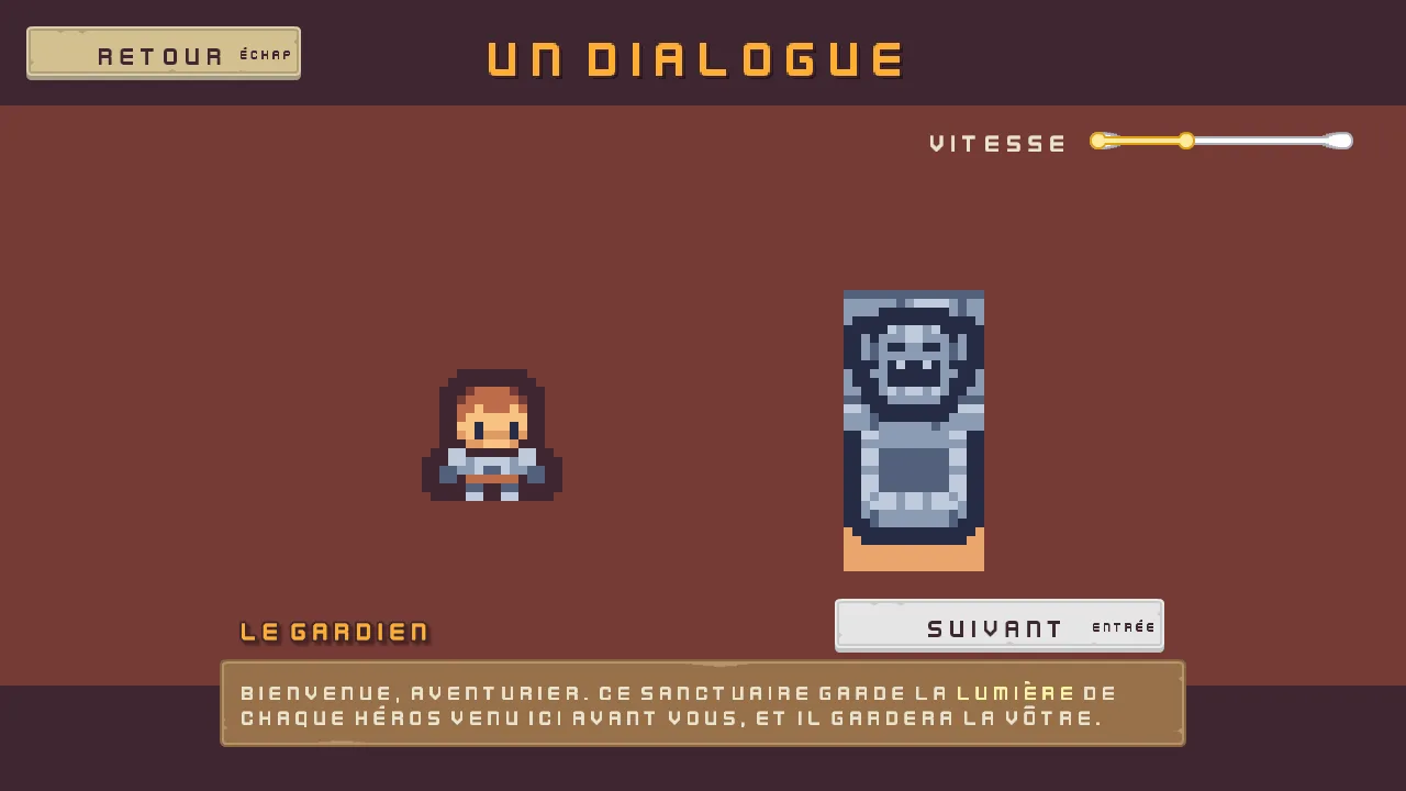
The keeper’s three lines are written in markup, which a Text with Rich ticked reads: [color=#fee761] and [/color] colour a word, [b] and [/b] make it bold, and [wave] and [/wave] set it moving. The dialogue’s recipe says how. key.Enter renames the Enter key, which Next shows, as chapter 13’s key. keys rename the others: Entrée in French.
The gallery’s menu
The menu is a screen built as the settings screen is: a canvas that fits any window, the screen’s name across the top, a plate holding six buttons in a Stack, and Back. It starts as a copy of the settings screen.
- Open
scenes/settings.ronand choose File → Save as…. Save it asscenes/gallery.ron. The editor now holds the copy. - In the Hierarchy, rename
SettingstoGallery,settings_canvastogallery_canvasandsettings_nametogallery_name. Selectsettings_frameand press Delete: its rows and its Back go with it. - Select
gallery_name. In its Rect, set Anchor Min and Anchor Max both to0.5,0, Offset Min to-360,24, Offset Max to360,104and Pivot to0.5,0: the top of the screen. Set its Text toGallery, and its Localized Text’s Key togallery.name. Its Scale, outline, shadow and role stay the settings name’s. - Select
gallery_canvas, click + Add node and choose Panel. Rename itgallery_frame. In its Rect, set Anchor Min and Anchor Max both to0.5,0.5, Offset Min to-200,-157and Offset Max to200,237. In its Panel, set Texture topanel_brown.pngand Border to8. - Select
gallery_frame, click + Add node and choose Stack. Rename itgallery_menu. Its Rect stays as it comes, filling the frame. In its Stack, set Fit to Fixed, Item to49, Spacing to12, Padding to20and Align to Center, as the title’s menu is: six rows of49, five gaps of12and20above and below make the frame’s394. - Click Add component and choose AudioSourceComponent. Untick Positional in its Spatial fold, and add two triggers, as the title’s menu has: Name
click, Clipaudio/click_001.ogg, and Nameback, Clipaudio/back_001.ogg, each with Mode Shuffle, and Pitch and Volume from1to1. - Select
gallery_menu, click + Add node and choose Button. Rename itshop. Its Rect stays as it comes: the Stack places it. In its Panel, set Texture tobuttonLong_beige.pngand Border to8. In its Text, set Text toA shop, Scale to0.75and Align to Center. In its Button, set Action toshop, Hovered Texture tobuttonLong_grey.png, Pressed Texture tobuttonLong_beige_pressed.pngand Disabled Texture tobuttonLong_blue.png, as the title’s buttons have. - Click Add component and choose LocalizedTextComponent. Set its Key to
gallery.shop. - With
shopselected, press Ctrl+D five times. Rename the copies, top to bottom,dialogue,levels,rings,hintsandquit, and give each the Text, Action and Key the table below gives it. - Select
gallery_canvas, click + Add node and choose Menu Button. Rename itback. In its Rect, set Anchor Max to0,0, Offset Min to24,24, Offset Max to274,73and Pivot to0,0: the top left corner,250by49. Anchor Min stays0,0. - Give
backthe faces the buttons have: TexturebuttonLong_beige.png, Border8, TextBack, Scale0.75, Align Center, Actionback, and the same three textures. Set its Shortcut’s Action toui_cancel, so Esc and a pad’s East press it. - Give
backa LocalizedTextComponent with Keygallery.back, and an AudioSourceComponent with Positional unticked and one trigger, Nameback, Clipaudio/back_001.ogg. - Give each of the six buttons and
backa FocusComponent. Then link them in a ring: each one’s Down and Next are the one below it,quit’s arebackandback’s areshop; each one’s Up and Previous are the one above it,shop’s arebackandback’s arequit. - Select
gallery_canvasand press Apply theme at the foot of its Theme. It writes the palette into the ring, the name, the frame, the six buttons and Back.
Apply theme writes every colour the tables of this chapter leave out, on every screen, from the canvas’s palette: a Panel’s Color white, 255, 255, 255, alpha 255; a screen’s words the cream 236, 227, 206, and an Accent word the gold 254, 174, 52; a control’s words the plum 63, 38, 49; a Button’s, a Toggle’s and a field’s Normal and Hovered white, and their Pressed 211, 211, 211, the white sunk by the Press Sink of 0.35; a list’s lit row and a field’s Selection the light gold 254, 231, 97; a field’s Hint and a menu’s Disabled and Rule the plum at half strength, alpha 128; and the Focus Ring’s Color the gold. Press it again after any change, and every control under the canvas takes them.
The menu’s script sends each button to its screen. Each screen is a scene called gallery_ and the button’s action, so shop opens gallery_shop.
- In Assets, click Assets in the path bar over the tree, so the script is written at the project’s top, then press Create, choose New script, type
gallery_menu, and press Enter. - In the Code tab, replace everything in
gallery_menu.rgswith the script below, and press Ctrl+S. - Select
gallery_menu, click Add component and choose GalleryMenu. Press Ctrl+S.
/// The gallery's menu: each button opens a small screen of its own, which
/// shows one kind of interface at work, and Back goes to the title.
component GalleryMenu {
    fn loop() {
        // A click on a button, Enter or a pad's South while it holds the
        // focus, presses its action on the game's next step. Each screen is
        // a scene of its own, named gallery_ and its button's action.
        if pressed("shop") {
            play_sound("click");
            change_scene("gallery_shop");
        }
        if pressed("dialogue") {
            play_sound("click");
            change_scene("gallery_dialogue");
        }
        if pressed("levels") {
            play_sound("click");
            change_scene("gallery_levels");
        }
        if pressed("rings") {
            play_sound("click");
            change_scene("gallery_rings");
        }
        if pressed("hints") {
            play_sound("click");
            change_scene("gallery_hints");
        }
        if pressed("quit") {
            play_sound("click");
            change_scene("gallery_quit");
        }
        // Back, or Escape or a pad's East through its Shortcut, presses back.
        if pressed("back") {
            play_sound("back");
            change_scene("title");
        }
    }
}
pressed("shop") is true for one step, the first after A Shop is pressed: by a click let go on it, or by Enter or a pad’s South while it holds the focus. Each of the other five is the same for its button. pressed("back") is true the same way for Back, and also on the step after Esc or a pad’s East, because Back’s Shortcut presses its action.
The title gets a fourth button, Gallery, between Settings and Quit.
- Open
scenes/title.ron. Selecttitle_frameand set its Offset Max to150,592: one more button of49and a gap of12taller than it was. - Select
settingsand press Ctrl+D. The copy lands under it. Rename itgallery, and set its Text toGallery, its Action togalleryand its Key totitle.gallery. - Relink the ring:
settings’s Down and Next becomegallery;gallery’s Up and Previous aresettings, and its Down and Next arequit;quit’s Up and Previous becomegallery. - In the Code tab, open
title_menu.rgsand replace everything in it with the script below. Press Ctrl+S.
/// The title's menu: Play opens the save slots, where a game is started or
/// carried on, Settings opens the settings screen, Gallery opens the gallery
/// of interfaces, and Quit closes the game.
component TitleMenu {
    fn loop() {
        // A button pressed by a click, by Enter while it holds the focus, or
        // by its Shortcut presses its action on the game's next step.
        if pressed("play") {
            // A sound asked for on the step that changes scene plays on after
            // it.
            play_sound("click");
            change_scene("slots");
        }
        if pressed("settings") {
            play_sound("click");
            change_scene("settings");
        }
        if pressed("gallery") {
            play_sound("click");
            change_scene("gallery");
        }
        if pressed("quit") {
            play_sound("back");
            // The game closes at the end of the step that asks, which would
            // cut the sound off, so it waits a tenth of a second first.
            await wait(0.1);
            quit();
        }
    }
}
The new lines are pressed("gallery") and what follows it: true for one step after Gallery is clicked, or after Enter or a pad’s South while it holds the focus. Press F5, and choose Gallery.
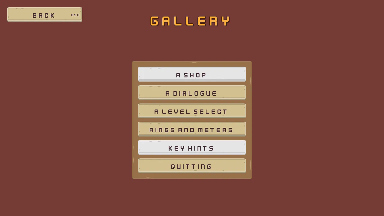
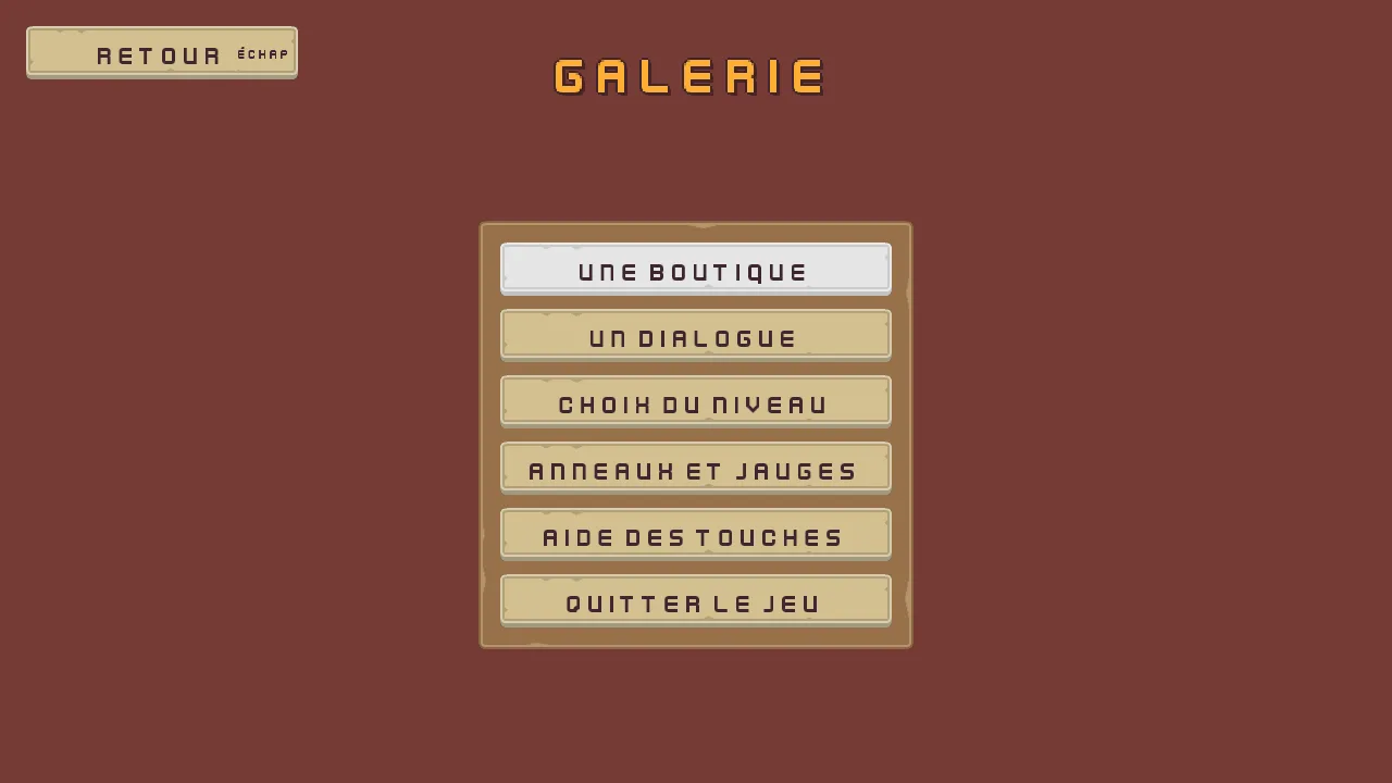
360.The gallery’s menu, in one table
| Node | Values | Why this value |
|---|---|---|
Gallery | A Node, the scene’s root, with nothing on it | The settings screen’s root, renamed. |
camera | Scaling Letterbox, Extent 180, Width 320, Background 118, 59, 54, alpha 255 | The title’s camera, on the same dark rock, so every screen opens on the colour the last one closed on. |
gallery_canvas | Scale Mode ShrinkToFit; its Theme the title’s palette: Panel and Button 255, 255, 255, alpha 255, Panel Accent 254, 231, 97, Panel Danger 232, 69, 55, Text 236, 227, 206, Text Accent 254, 174, 52, Text Danger 255, 228, 220, Button Text 63, 38, 49, each alpha 255, Hover Lift 0.15, Press Sink 0.35; a Focus Ring, Color 254, 174, 52, alpha 255 by Apply theme; and TextSize, Small 1536, 864, Normal 1280, 720, Large 1066, 600 | The settings canvas, renamed: chapter 6’s text size reaches every screen, and the ring shows the keys where they are. |
gallery_name | Anchor Min and Anchor Max 0.5, 0, Offset Min -360, 24, Offset Max 360, 104, Pivot 0.5, 0; Text Gallery, Scale 1.5, Align Center, Outline 63, 38, 49, alpha 255, Outline Width 2, Shadow 0, 0, 0, alpha 153, Shadow Offset 3, 3, Shadow Softness 0; role Accent; Key gallery.name | The settings name, moved to the top of the screen, where every screen of the gallery puts its own. |
gallery_frame | Anchor Min and Anchor Max 0.5, 0.5, Offset Min -200, -157, Offset Max 200, 237; Texture panel_brown.png, Border 8 | 400 by 394: the buttons’ 360 and the padding, a little below the middle. |
gallery_menu | Fit Fixed, Spacing 12, Padding 20, Item 49, Align Center; Audio Source, Positional unticked, triggers click on click_001.ogg and back on back_001.ogg, Mode Shuffle; GalleryMenu | The title’s menu, and its sounds. |
shop, dialogue, levels, rings, hints, quit | A Button each: Texture buttonLong_beige.png, Border 8, Scale 0.75, Align Center, Hovered Texture buttonLong_grey.png, Pressed Texture buttonLong_beige_pressed.png, Disabled Texture buttonLong_blue.png; Text A shop, A dialogue, A level select, Rings and meters, Key hints and Quitting; Action its own name; Key gallery. and its name; Focus links in a ring through back | The title’s buttons, one a screen. The action names the scene, so the script needs no list. |
back | A Menu Button: Anchor Max 0, 0, Offset Min 24, 24, Offset Max 274, 73, Pivot 0, 0; the buttons’ faces; Text Back, Action back; Shortcut Action ui_cancel; Key gallery.back; Audio Source, Positional unticked, trigger back on back_001.ogg; Up and Previous quit, Down and Next shop | The top left corner, where every screen keeps its Back, and Escape through the input map’s ui_cancel. |
Every other colour, the buttons’ tints and their words’, came from Apply theme. On the title, title_frame’s Offset Max is 150, 592, and gallery is settings copied, with Text Gallery, Action gallery, Key title.gallery, and its links between settings and quit.
Every screen starts the same way
Each of the six screens is a copy of the gallery’s menu with the menu taken out: its camera, its canvas, its name and its Back stay. Back goes back to the gallery, not to the title, through a script of its own. Write it once, now.
- In Assets, click Assets in the path bar over the tree, so the script is written at the project’s top, then press Create, choose New script, type
gallery_back, and press Enter. In the Code tab, replace everything ingallery_back.rgswith the script below, and press Ctrl+S.
/// The way back from one of the gallery's screens: Back goes back to the
/// gallery.
component GalleryBack {
    fn loop() {
        // A click on Back, Enter or a pad's South while it holds the focus,
        // or Escape or a pad's East through its Shortcut, presses back on the
        // game's next step. Escape answers an open question, or shuts an open
        // list or menu, first, and goes back on the next press.
        if pressed("back") {
            // A sound asked for on the step that changes scene plays on after
            // it.
            play_sound("back");
            change_scene("gallery");
        }
    }
}
pressed("back") is true for one step after Back is clicked, after Enter or a pad’s South while it holds the focus, or after Esc or a pad’s East, through its Shortcut. An Esc that closes something first, a question or an open list, does not reach it: the next one does.
Then each screen begins with these steps. Each recipe gives the names: its scene, its root, its canvas and its name, with the name’s words and key.
- Open
scenes/gallery.ronand choose File → Save as…. Save it under the screen’s scene name, inscenes. - Rename
Galleryto the screen’s root,gallery_canvasto its canvas andgallery_nameto its name. Set the name’s Text and Key. - Select
gallery_frameand press Delete: the menu and its six buttons go with it. - Select
back. Remove its FocusComponent with the bin at the right of its header: its links named buttons that are gone. Click Add component and choose GalleryBack. - Build the screen. Then drag
backonto the canvas’s row in the Hierarchy: a node dropped onto another goes in as its last child, so Back comes last again. - Select the canvas, press Apply theme, and press Ctrl+S.
A shop
What it is for. A merchant, an upgrade screen, a vending machine: wares with a price, a choice of how many, and a purchase the player can or cannot afford. It joins a Grid that fits as many fixed cells as its width holds, buttons that wear a tooltip, a field that takes only whole numbers, arrows that step it by a click, a key or a pad, and a Buy that refuses. Behind it, in the room, a window display shows a Clip on a node that is not part of the interface.
- Start the screen as every screen starts: the scene
gallery_shop.ron, the rootShop, the canvasshop_canvas, and the nameshop_name, its TextThe shopand its Keyshop.name. - Select
shop_canvas, click Add component and choose TooltipStyleComponent. Set Texture topanel_brown.png, Border to8, Scale to0.625and Padding to14,8. Click Edge and set its alpha to0, leaving its colour,54,67,63, as it comes: no frame. Set Max Width to260. Apply theme writes its Panel and Ink. - Select
shop_canvas, click + Add node and choose Localized Label. Rename itdisplay_caption. In its Rect, set Anchor Max to0,0, Offset Min to860,128, Offset Max to1196,168and Pivot to0,0. In its Text, set Text toIn the window, Scale to0.625and Align to Center, and its Key toshop.window.
The wares
- Select
shop_canvas, click + Add node and choose Panel. Rename itwares_frame. In its Rect, set Anchor Max to0,0, Offset Min to48,128, Offset Max to348,492and Pivot to0,0. In its Panel, set Texture topanel_brown.pngand Border to8. - Select
wares_frame, add a Localized Label and rename itwares_title: the bag’s title, chapter 3’s. In its Rect, set Anchor Max to1,0, Offset Min to16,0, Offset Max to-16,36and Pivot to0.5,0. In its Text, set Text toWares, Scale to0.75, Outline to63,38,49, alpha255and Outline Width to1. Give it a ThemeRoleComponent with Role Accent, and set its Key toshop.wares. - Select
wares_frame, click + Add node and choose Grid. Rename itwares. In its Rect, set Offset Min to0,36: the plate below its title. In its Grid, set Fit to Cell, Cell to132,150, Spacing to12,12and Padding to12. Columns stays4.
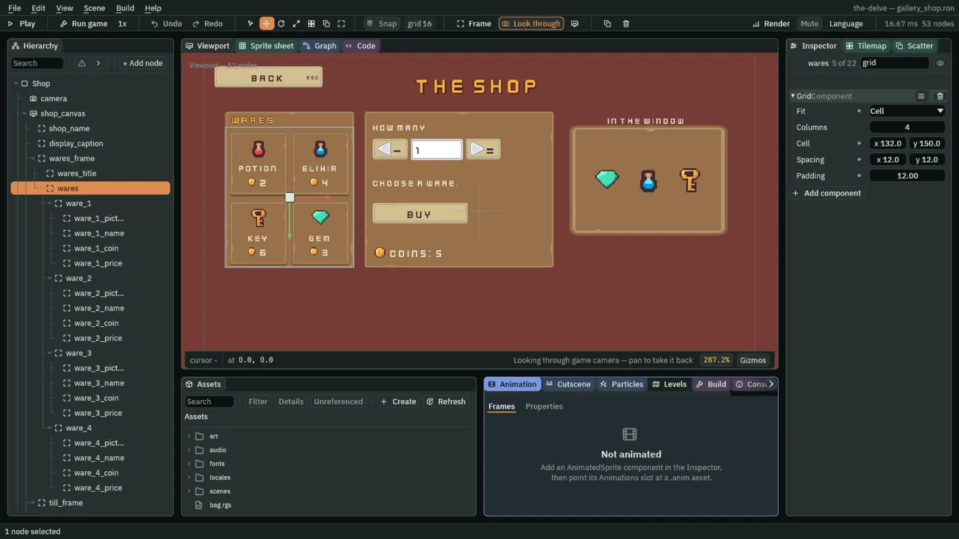
132 by 150, as many across as fit. Two do.- Fit
- A Grid’s Fit: what decides how many columns it has.
Columns, as a new Grid has it and the bag uses, makes exactly Columns columns, each as wide as the grid’s width divides into, and reads only the height of Cell.Cellmakes as many columns of Cell’s width as fit, so a wider plate holds more wares, not wider ones. The wares takeCell: the plate is300wide, the padding takes24, and two cells of132and a gap of12fill the276left. - Columns
- How many columns a Grid with Fit Columns has,
1or more; a Grid with Fit Cell ignores it. The wares leave it at4, as it comes. The level select’s Grid sets6, one column for each level.
Each ware is a button with no words of its own: its picture, its name and its price are three children, and a tooltip says what it does.
- Select
wares, click + Add node and choose Button. Rename itware_1. Its Rect stays as it comes: the Grid places it. Remove its Text: press the bin at the right of its TextComponent header. - In its Panel, set Texture to
buttonSquare_brown.pngand Border to8: the hotbar’s face. In its Button, set Action toware_1and Pressed Texture tobuttonSquare_beige_pressed.png. - Click Add component and choose TooltipComponent. Set Text to
Potion: restores 3 health., Delay to0.3and Placement to Right, as chapter 8’s hotbar tooltips. Add a LocalizedTextComponent and set its Tooltip totip.potion. - Select
ware_1, add a Panel and rename itware_1_picture. In its Rect, set Anchor Min and Anchor Max both to0.5,0, Offset Min to-24,14, Offset Max to24,62and Pivot to0.5,0. In its Panel, set Texture toitems.pngand Atlas Region topotion: the flask,48units square. - Select
ware_1, add a Localized Label and rename itware_1_name. In its Rect, set Anchor Max to1,0, Offset Min to4,68, Offset Max to-4,98and Pivot to0.5,0. In its Text, set Text toPotion, Scale to0.625and Align to Center, and its Key toitem.potion. - Select
ware_1, add a Panel and rename itware_1_coin. In its Rect, set Anchor Min and Anchor Max both to0.5,0, Offset Min to-28,104, Offset Max to-4,128and Pivot to1,0. Set its Texture tocoin.png. - Select
ware_1, add a Label and rename itware_1_price. In its Rect, set Anchor Min and Anchor Max both to0.5,0, Offset Min to4,100, Offset Max to52,132and Pivot to0,0. In its Text, set Text to2and Scale to0.75. A number is a number in either language, so it has no key.
A ware’s script says which it is and what it costs, and draws the chosen one lit.
- In Assets, click Assets in the path bar over the tree, so the script is written at the project’s top, then press Create, choose New script, type
ware, and press Enter. In the Code tab, replace everything inware.rgswith the script below, and press Ctrl+S. - Select
ware_1, click Add component and choose Ware. Ware1and Price2are the potion’s, as the script gives them. Lit is the coin’s light gold, written0.99,0.8,0.12,1in the script, and Plain is white; both stay as they come.
/// A ware in the shop: a click on it, or Enter or a pad's South while it
/// holds the focus, chooses it, and the till, the quantity and Buy follow the
/// choice. The chosen ware is drawn lit.
component Ware {
    /// Which ware it is: 1 the potion, 2 the elixir, 3 the key, 4 the gem.
    /// Its button presses ware_ and this number.
    ware: f32 = 1.0,
    /// What one of it costs, in coins.
    price: f32 = 2.0,
    /// The tint its face is drawn in while it is the chosen ware: the coin's
    /// light gold.
    #[color]
    lit: Vec4 = vec4(0.99, 0.8, 0.12, 1.0),
    /// The tint its face is drawn in otherwise: white, which leaves the face
    /// its own colours.
    #[color]
    plain: Vec4 = vec4(1.0, 1.0, 1.0, 1.0),

    fn loop() {
        if pressed("ware_" + text(ware)) {
            // The shop keeps which ware is chosen and what one costs, which
            // the till and Buy read.
            keep_number("shop_ware", ware);
            keep_number("shop_price", price);
        }
        // A button's face is drawn in its Normal tint while the pointer is
        // not on it and the ring is not round it.
        if kept_number("shop_ware", 0.0) == ware {
            set_colour("ButtonComponent", "normal", lit);
        } else {
            set_colour("ButtonComponent", "normal", plain);
        }
    }
}
pressed("ware_" + text(ware)) is true for one step after the ware is clicked, or after Enter or a pad’s South while it holds the focus: text(ware) makes the number 1 into the word 1, so the potion listens for ware_1. Every ware reads shop_ware each step, and the chosen one sets its Button’s Normal to its Lit gold.
- Select
ware_1and press Ctrl+D three times. Rename the copiesware_2,ware_3andware_4, and the four children of each to its own number:ware_2_picture,ware_2_name,ware_2_coinandware_2_price, and so on. A copy’s children keep their names. - Give each copy the values in the table below: its Action, its tooltip’s Text and Tooltip key, its Ware and Price, its picture’s Atlas Region, its name’s Text and Key, and its price’s Text.
| Ware | Action, Ware, Price | Tooltip Text, Tooltip key | Atlas Region, name Text and Key, price Text |
|---|---|---|---|
ware_1 | ware_1, 1, 2 | Potion: restores 3 health., tip.potion | potion, Potion, item.potion, 2 |
ware_2 | ware_2, 2, 4 | Elixir: you walk faster for 5 seconds., tip.elixir | elixir, Elixir, item.elixir, 4 |
ware_3 | ware_3, 3, 6 | Key: opens the locked door., tip.key | key, Key, item.key, 6 |
ware_4 | ware_4, 4, 3 | Gem: it sparkles, and it sells., tip.gem | gem, Gem, item.gem, 3 |
The till
The till is a second plate: how many, typed into a field or stepped by an arrow either side of it; what that comes to; Buy; and the purse.
- Select
shop_canvas, add a Panel and rename ittill_frame. In its Rect, set Anchor Max to0,0, Offset Min to372,128, Offset Max to812,492and Pivot to0,0. In its Panel, set Texture topanel_brown.pngand Border to8. - Select
till_frame, add a Localized Label and rename ithow_many. In its Rect, set Anchor Max to0,0, Offset Min to20,20, Offset Max to420,52and Pivot to0,0. In its Text, set Text toHow manyand Scale to0.625, and its Key toshop.how_many. - Select
till_frame, add a Button and rename itfewer. Remove its Text, as a ware’s. In its Rect, set Anchor Max to0,0, Offset Min to20,64, Offset Max to100,113and Pivot to0,0:80by49. In its Panel, set Texture tobuttonLong_beige.pngand Border to8. In its Button, set Action tofewer, tick Disabled, and set the three textures the gallery’s buttons have. - Click Add component and choose FocusComponent, and set its Mode to Click. Then add a ShortcutComponent and set its Action to
shop_fewer. - Select
fewer, add a Panel and rename itfewer_arrow. In its Rect, set Anchor Min and Anchor Max both to0,0.5, Offset Min to10,-18, Offset Max to42,14and Pivot to0,0.5. Set its Texture toarrow_basic_w.png. - Select
fewer, add a Localized Label and rename itfewer_label. In its Text, set Text toFewer, Scale to0.625and Align to Center, and its Key toshop.fewer. Untick its Visible: it never draws. It names the arrow for a screen reader and for the Problems panel, as each save slot’s Delete has one. - Select
fewerand press Ctrl+D. Rename the copymore, and its childrenmore_arrowandmore_label. Set its Offset Min to236,64and Offset Max to316,113, its Action tomore, its Shortcut’s Action toshop_more, its arrow’s Texture toarrow_basic_e.png, and its label’s Text toMoreand Key toshop.more.
- Select
till_frame, click + Add node and choose Text Entry. Rename itquantity. In its Rect, set Anchor Max to0,0, Offset Min to108,64, Offset Max to228,113and Pivot to0,0. In its Panel, set Texture toinput_rectangle.pngand Border to8. - In its Text Entry, set Action to
quantity, Text to1, clear Placeholder, and set Max Length to2, Mode to Integer, Padding to12, Scale to0.75and Caret Width to3. Tick Disabled. - Select
quantity, add a Localized Label and rename itquantity_label: TextHow many, Scale0.625, Align Center, Keyshop.how_many, and Visible unticked. A field that is off has no words to be read out by.
- Mode
- A Text Entry’s Mode: what the field takes.
Text, as a new field has it, takes any letter.Integertakes only digits, and its action’samountanswers the number typed,0while it is empty.Decimaltakes digits and one point, and answers the same way: the rings’ Seconds field.Passwordtakes any letter and draws each as a dot: the level select’s code. The quantity isInteger. - Disabled
- A Text Entry’s Disabled: whether it is off. An off field takes no click and no keystroke, is drawn greyed, and the ring passes it by. The quantity starts off, as there is nothing to count before a ware is chosen; a script turns it on.
One script waits on the choice for all three controls, told which component to switch.
- Create the script
waits_for_wareand replace everything in it with the script below. Givefewerandmorea WaitsForWare each, its Control left atButtonComponent, and givequantityone with ControlTextEntryComponent.
/// Keeps a control of the shop off until a ware is chosen: the quantity's
/// field and its two arrows, which have nothing to count before then.
component WaitsForWare {
    /// The control it switches on: ButtonComponent for an arrow,
    /// TextEntryComponent for the field.
    control: String = "ButtonComponent",

    fn loop() {
        // A ware's button keeps shop_ware, from 1, once it is chosen.
        set_flag(control, "disabled", kept_number("shop_ware", 0.0) == 0.0);
    }
}
The field and the arrows read shop_ware, which a ware keeps once it is chosen, and turn their own Disabled off with set_flag.
- Create the script
quantityand replace everything in it with the script below. Givequantitya Quantity, Most99.
/// The shop's quantity: how many of the chosen ware to buy, a whole number
/// typed into the field, or stepped by the arrows beside it from 1 to most.
component Quantity {
    /// The most the arrows step it up to.
    most: f32 = 99.0,

    fn loop() {
        // A field in Integer mode takes only digits, and its action answers
        // the number typed in it, 0 while it is empty.
        let count = amount("quantity");
        // A click on an arrow, Enter while one holds the focus, or its
        // Shortcut, - or = or a pad's shoulders through the input map's
        // shop_fewer and shop_more, presses fewer or more on the game's next
        // step. An arrow that is off presses nothing, by its keys either. The
        // field's words are written here, and its number read back on the
        // next step.
        if pressed("fewer") && count > 1.0 {
            set_text("TextEntryComponent", "text", text(count - 1.0));
        }
        if pressed("more") && count < most {
            set_text("TextEntryComponent", "text", text(count + 1.0));
        }
    }
}
amount("quantity") is the number in the field, read as the step began: 1 as it opens, the number typed, and 0 while it is empty. pressed("fewer") and pressed("more") are true for one step after an arrow is clicked, after Enter while it holds the focus, or after its Shortcut’s key or shoulder. The script writes the new number into the field’s Text, which amount reads on the next step.
- Select
till_frame, add a Localized Label and rename ittill. In its Rect, set Anchor Max to0,0, Offset Min to20,133, Offset Max to420,197and Pivot to0,0. In its Text, set Text toChoose a ware., Scale to0.625, and tick Wrap: a long total runs onto a second line, as it does in French. - In its Localized Text, set Key to
shop.choose, and add two Substitutions: Nametotaland Namecoins, each with Value0. - Create the script
tilland replace everything in it with the script below. Givetilla Till.
/// The shop's till: what the chosen ware comes to in the quantity asked for,
/// and, when the purse holds less, how much it does hold. It asks for a ware
/// while none is chosen.
component Till {
    fn loop() {
        let ware = kept_number("shop_ware", 0.0);
        let total = kept_number("shop_price", 0.0) * amount("quantity");
        // The purse keeps its coins as gallery_coins from the step the shop
        // opens on.
        let coins = kept_number("gallery_coins", 0.0);
        // Each of the till's sentences is a key in the string tables, which
        // the Localized Text beside this script writes in the game's
        // language, its substitutions total and coins filled in.
        let words = "shop.choose";
        if ware > 0.0 && total > coins {
            words = "shop.short";
        } else if ware > 0.0 {
            words = "shop.total";
        }
        set_text("LocalizedTextComponent", "key", words);
        set_text("LocalizedTextComponent", "substitutions.0.value", text(total));
        set_text("LocalizedTextComponent", "substitutions.1.value", text(coins));
    }
}
amount("quantity") is the field’s number, as in the quantity’s script. The till picks one of three keys, and its Localized Text fills {total} and {coins} in the game’s language.
- Select
till_frame, add a Button and rename itbuy. In its Rect, set Anchor Max to0,0, Offset Min to20,213, Offset Max to240,262and Pivot to0,0. Give it the gallery buttons’ faces, TextBuy, Actionbuy, and tick Disabled. Add a LocalizedTextComponent with Keyshop.buy, and an AudioSourceComponent, Positional unticked, with the triggerclickonaudio/click_001.ogg. - Create the script
buy_buttonand replace everything in it with the script below. Givebuya BuyButton, Sold For1.
/// The shop's Buy button: it spends the chosen ware's price for each one in
/// the quantity, and refuses, greyed out, while the purse holds less than
/// that, or while there is nothing to buy. After a sale it reads Sold! for a
/// moment.
component BuyButton {
    /// How long it reads Sold! after a sale.
    #[suffix("s")]
    sold_for: f32 = 1.0,
    /// How much longer it reads Sold!, in seconds, counted down every step.
    #[hidden]
    selling: f32 = 0.0,

    fn loop(dt: f32) {
        // The quantity's field answers its number; the ware chosen keeps its
        // price, 0 while none is chosen. The purse keeps its coins as
        // gallery_coins from the step the shop opens on.
        let total = kept_number("shop_price", 0.0) * amount("quantity");
        let coins = kept_number("gallery_coins", 0.0);
        // A click, or Enter or a pad's South while it holds the focus,
        // presses buy on the game's next step. A disabled button presses
        // nothing, so a purchase the purse cannot pay for never happens.
        if pressed("buy") && total >= 1.0 && total <= coins {
            keep_number("gallery_coins", coins - total);
            play_sound("click");
            selling = sold_for;
        }
        set_flag("ButtonComponent", "disabled", total < 1.0 || total > coins);
        // dt is how long a step is, in seconds.
        if selling > 0.0 {
            selling -= dt;
            set_text("LocalizedTextComponent", "key", "shop.sold");
        } else {
            set_text("LocalizedTextComponent", "key", "shop.buy");
        }
    }
}
amount("quantity") is the field’s number. pressed("buy") is true for one step after Buy is clicked, or after Enter or a pad’s South while it holds the focus, and a Buy that is off presses nothing. dt is how long a step is, in seconds, so selling -= dt counts Sold For down in seconds at whatever step rate Project Settings sets.
- Select
till_frame, add a Panel and rename itpurse_coin. In its Rect, set Anchor Max to0,0, Offset Min to20,312, Offset Max to52,344and Pivot to0,0. Set its Texture tocoin.png. - Select
till_frame, add a Localized Label and rename itpurse. In its Rect, set Anchor Max to0,0, Offset Min to60,312, Offset Max to300,344and Pivot to0,0. In its Text, set Text toCoins: 5and Scale to0.75. Set its Key toshop.purse, with one Substitution, Namecoins, Value5. - Create the script
purseand replace everything in it with the script below. Givepursea Purse, Start5.
/// The shop's purse: the coins the gallery's shopper has, which start at five
/// the first time the shop opens and are kept while the game runs.
component Purse {
    /// The coins in the purse the first time the shop opens.
    start: f32 = 5.0,

    fn on_create() {
        // Nothing is kept under gallery_coins before the shop first opens.
        if kept_number("gallery_coins", -1.0) < 0.0 {
            keep_number("gallery_coins", start);
        }
    }

    fn loop() {
        // The Localized Text beside this script writes the purse's words in
        // the game's language, its substitution named coins filled with the
        // count.
        let coins = kept_number("gallery_coins", start);
        set_text("LocalizedTextComponent", "substitutions.0.value", text(coins));
    }
}
The purse keeps its coins with keep_number, so they last while the game runs, through the gallery and back: a shop left and opened again still holds what was spent.
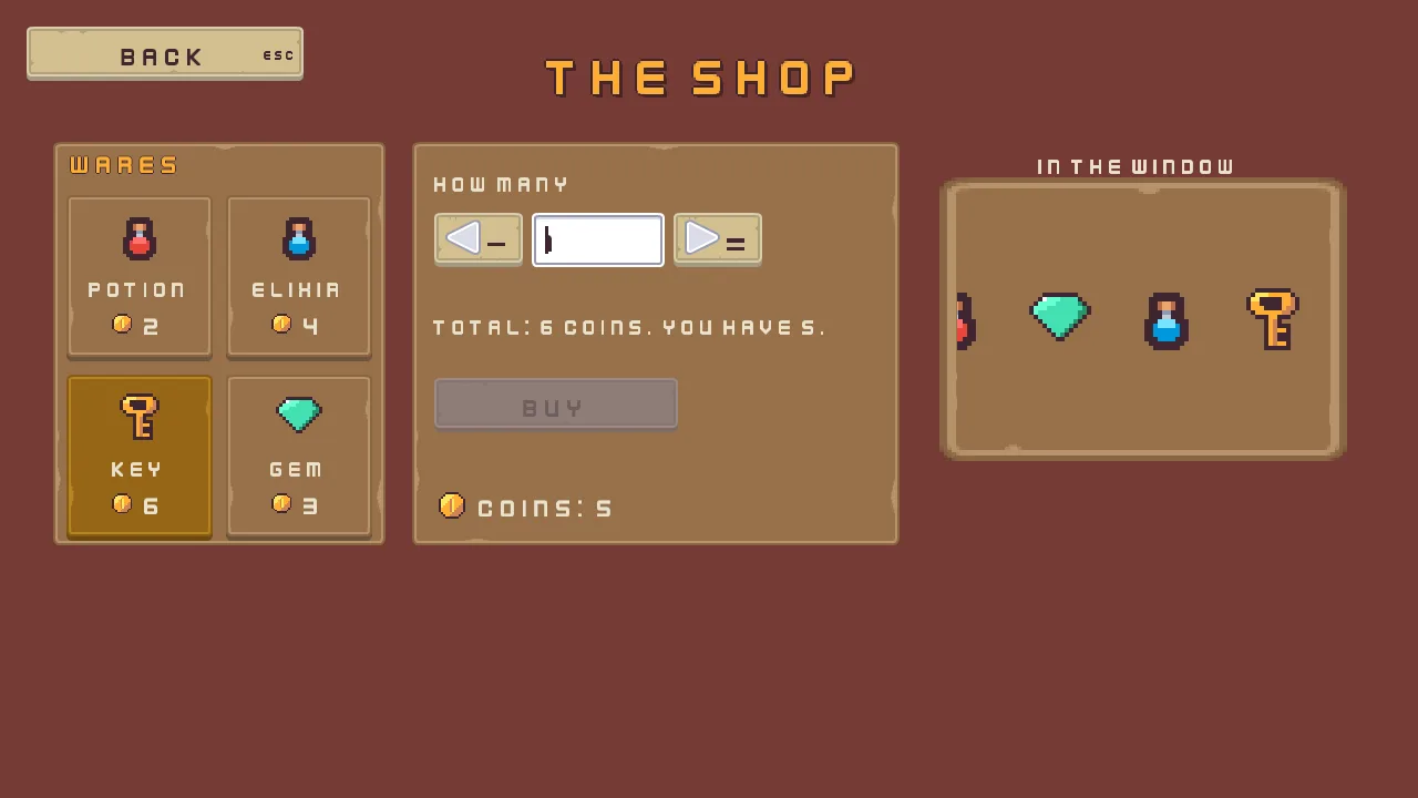
6 coins, and the purse holds 5. Buy is off, and the till says why.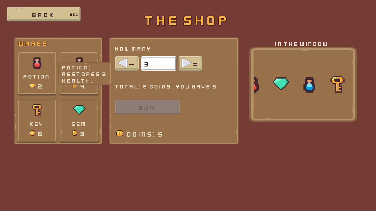
3 potions come to 6 coins, one more than the purse holds. The pointer still rests on the potion, so its tooltip is up and its face takes its Hovered tint.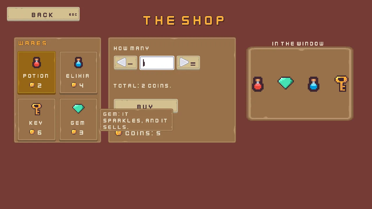
260.- Max Width
- A Tooltip Style’s Max Width: the widest a tooltip’s box may grow, in UI units, before its words wrap onto another line.
0, as it comes, keeps every tooltip on one line, however long. The shop’s is260: at Scale0.625and Padding14, a ware’s sentence takes three short lines beside the ware, and none runs off the screen.
The window display
The shop has a window in the room behind its interface, with wares on a shelf that sways past it. The window is a Clip on a node in the room, which cuts everything under it to a rectangle of its own.
- Select
Shop, click + Add node and choose Node. Rename itwindow_display, and set its Position to98,10: the window’s sill. Click Add component and choose ClipComponent. Set Size to84,56and Anchor to0.5,1. Enabled stays ticked. - Select
window_display, click + Add node and choose Sprite. Rename itdisplay_wall, and set its Position to0,-28, the window’s middle. Set Texture topanelInset_brown.png, Size to126,84and Sort Layer to1: the window’s back wall, larger than the window, which shows its middle. - Select
window_display, add a Node and rename itdisplay_shelf. Set its Position to-48,-28. - Select
display_shelf, add a Sprite and rename itshelf_1. Set Texture toitems.png, Atlas Region topotion, Size to16,16and Sort Layer to2. Press Ctrl+D five times, rename the copiesshelf_2toshelf_6, and set their Position and Atlas Region from the table:24apart, a gem, an elixir, a key, a coin and a potion. - Select
Shop, add a Sprite and rename itdisplay_frame. Set its Position to98,-18, the window’s middle, its Texture topanel_brown.pngand its Size to92,64: the frame round the window. Its Sort Layer stays0, behind the wall. - Create the script
display_shelfand replace everything in it with the script below. Givedisplay_shelfa DisplayShelf, Sway48,0and Seconds3.
/// The shelf behind the shop's window: it sways its wares slowly past the
/// window and back, so the window's Clip cuts them as they go by.
component DisplayShelf {
    /// How far it sways, in world units, before it comes back.
    sway: Vec2 = vec2(48.0, 0.0),
    /// How long each way takes.
    #[suffix("s")]
    seconds: f32 = 3.0,

    fn on_create() {
        // Forever, easing at each end.
        pulse_by(sway, seconds, .InOutSine);
    }
}
pulse_by moves the node by Sway and back, for ever, Seconds each way, easing at each end. The shelf’s six wares stand 24 apart, a row wider than the window’s 84, so the window cuts the wares at its edges as they pass, as the picture of the refused key shows at the window’s left.
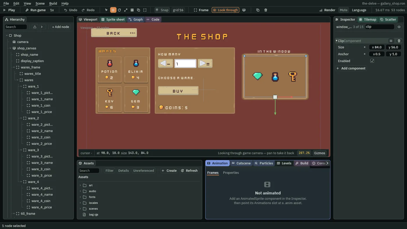
84 by 56, standing on its sill.- Size
- A Clip’s Size, on a node in the room: the rectangle it cuts everything under it to, in the room’s units, the art’s pixels.
84,56is the window. On an interface node the Clip cuts at the node’s own rect and ignores Size, as the bag’s did in chapter 3. A new Clip’s is128,128. - Anchor
- A Clip’s Anchor, on a node in the room: where its rectangle sits on the node, from
0,0, the node at the rectangle’s top left, to1,1, at its bottom right.0.5,1stands the node at the middle of the rectangle’s foot, so the window rises from its sill at98,10. A new Clip’s is0.5,0.5, centred.
Last, drag back onto shop_canvas, select shop_canvas, press Apply theme, and press Ctrl+S.
The shop, in one table
| Node | Values | Why this value |
|---|---|---|
Shop, camera, shop_canvas, shop_name, back | Every screen’s, with Text The shop and Key shop.name; shop_canvas also has a Tooltip Style | The gallery’s frame. |
shop_canvas’s Tooltip Style | Texture panel_brown.png, Border 8, Edge 54, 67, 63, alpha 0, Scale 0.625, Padding 14, 8, Max Width 260; Panel and Ink by Apply theme | The HUD’s plate with no frame, and a width the tooltips wrap at. |
display_caption | Anchor Max 0, 0, Offset Min 860, 128, Offset Max 1196, 168, Pivot 0, 0; Text In the window, Scale 0.625, Align Center; Key shop.window | Over the window, which the room draws at the screen’s 860 to 1196 across. |
wares_frame | Anchor Max 0, 0, Offset Min 48, 128, Offset Max 348, 492, Pivot 0, 0; Texture panel_brown.png, Border 8 | A plate 300 by 364. |
wares_title | Anchor Max 1, 0, Offset Min 16, 0, Offset Max -16, 36, Pivot 0.5, 0; Text Wares, Scale 0.75, Outline 63, 38, 49, alpha 255, Outline Width 1; role Accent; Key shop.wares | The bag’s title. |
wares | Offset Min 0, 36; Fit Cell, Cell 132, 150, Spacing 12, 12, Padding 12 | Two fixed cells across the plate, under its title. |
ware_1 to ware_4 | A Button without its Text: Texture buttonSquare_brown.png, Border 8, Action ware_1 to ware_4, Pressed Texture buttonSquare_beige_pressed.png; Tooltip Delay 0.3, Placement Right, and its words; Localized Tooltip; Ware and Price, Lit and Plain as they come | The hotbar’s slot face, so a ware reads as a thing you can take; its words in the table above. |
ware_1_picture to ware_4_picture | Anchor Min and Anchor Max 0.5, 0, Offset Min -24, 14, Offset Max 24, 62, Pivot 0.5, 0; Texture items.png, Atlas Region its own | The item, 16 pixels drawn at three times. |
ware_1_name to ware_4_name | Anchor Max 1, 0, Offset Min 4, 68, Offset Max -4, 98, Pivot 0.5, 0; Scale 0.625, Align Center; Text and Key its own | Under the picture, as wide as the ware. |
ware_1_coin to ware_4_coin | Anchor Min and Anchor Max 0.5, 0, Offset Min -28, 104, Offset Max -4, 128, Pivot 1, 0; Texture coin.png | A coin 24 square, left of the middle. |
ware_1_price to ware_4_price | Anchor Min and Anchor Max 0.5, 0, Offset Min 4, 100, Offset Max 52, 132, Pivot 0, 0; Text its price, Scale 0.75 | The price, right of the coin. |
till_frame | Anchor Max 0, 0, Offset Min 372, 128, Offset Max 812, 492, Pivot 0, 0; Texture panel_brown.png, Border 8 | A second plate, 440 wide, beside the wares. |
how_many | Anchor Max 0, 0, Offset Min 20, 20, Offset Max 420, 52, Pivot 0, 0; Text How many, Scale 0.625; Key shop.how_many | Its label. |
fewer, more | A Button without its Text: Anchor Max 0, 0, Offset Min 20, 64 and 236, 64, Offset Max 100, 113 and 316, 113, Pivot 0, 0; Texture buttonLong_beige.png, Border 8; Action fewer and more, Disabled ticked, the three textures; Focus Mode Click; Shortcut Action shop_fewer and shop_more; WaitsForWare, Control ButtonComponent | 80 wide: the arrow 10 in from the left, and the Shortcut’s key clear of it at the right. |
fewer_arrow, more_arrow | Anchor Min and Anchor Max 0, 0.5, Offset Min 10, -18, Offset Max 42, 14, Pivot 0, 0.5; Texture arrow_basic_w.png and arrow_basic_e.png | The arrow, 32 square. |
fewer_label, more_label, quantity_label | Hidden: Text Fewer, More and How many, Scale 0.625, Align Center; Key shop.fewer, shop.more and shop.how_many | A name for each wordless control. |
quantity | A Text Entry: Anchor Max 0, 0, Offset Min 108, 64, Offset Max 228, 113, Pivot 0, 0; Texture input_rectangle.png, Border 8; Action quantity, Text 1, Placeholder empty, Max Length 2, Mode Integer, Disabled ticked, Padding 12, Scale 0.75, Caret Width 3; Quantity, Most 99; WaitsForWare, Control TextEntryComponent | Whole numbers, two digits at most: 99, as the arrows go. |
till | Anchor Max 0, 0, Offset Min 20, 133, Offset Max 420, 197, Pivot 0, 0; Text Choose a ware., Scale 0.625, Wrap ticked; Key shop.choose, Substitutions total and coins; Till | Two lines’ room, for the French total. |
buy | A Button: Anchor Max 0, 0, Offset Min 20, 213, Offset Max 240, 262, Pivot 0, 0; the gallery buttons’ faces, Text Buy, Action buy, Disabled ticked; Key shop.buy; Audio Source, trigger click; BuyButton, Sold For 1 | Off until the purse can pay. |
purse_coin | Anchor Max 0, 0, Offset Min 20, 312, Offset Max 52, 344, Pivot 0, 0; Texture coin.png | The coin, 32 square. |
purse | Anchor Max 0, 0, Offset Min 60, 312, Offset Max 300, 344, Pivot 0, 0; Text Coins: 5, Scale 0.75; Key shop.purse, Substitution coins 5; Purse, Start 5 | Five coins: the key, at 6, is one too many. |
window_display | A Node at Position 98, 10; Clip Size 84, 56, Anchor 0.5, 1 | The window, standing on its sill. |
display_wall | A Sprite at 0, -28: Texture panelInset_brown.png, Size 126, 84, Sort Layer 1 | The back wall, larger than the window. |
display_shelf | A Node at -48, -28; DisplayShelf, Sway 48, 0, Seconds 3 | Sways right 48 and back, three seconds each way. |
shelf_1 to shelf_6 | A Sprite each: Texture items.png, Size 16, 16, Sort Layer 2; at Position 0, 24, 48, 72, 96 and 120 across, Atlas Region potion, gem, elixir, key, coin and potion | A shelf wider than the window, so it is always cut. |
display_frame | A Sprite at 98, -18: Texture panel_brown.png, Size 92, 64 | The frame, outside the Clip. |
The camera, the canvas’s Theme, the name and Back are as the gallery’s, and every other colour came from Apply theme.
What it costs. 18 draws, and 19 while a tooltip is up. It has many pictures side by side, the plates, the wares’ faces and items, the coins, the arrows, the field and the words, and the window display behind, and each change of picture between neighbours is a draw.
A dialogue
What it is for. Someone talking: a shopkeeper, a tutorial, a cutscene. A box at the foot of the screen that grows to its line, a line that wraps, colours a word and types itself out, the speaker’s name over it, Next, and a Speed slider; and two dark bars across the whole window, top and bottom, as a film’s. It joins a canvas that ignores the phone’s safe area, a Content Size Fitter on a box whose Text wraps inside its padding, rich text, Visible Characters counted up by a script, and a name drawn from a distance field.
- Start the screen as every screen starts: the scene
gallery_dialogue.ron, the rootDialogue, the canvasdialogue_canvas, and the namedialogue_name, its TextA dialogueand its Keydialogue.name. Set the name’s Offset Min to-360,8and Offset Max to360,88: higher than the other screens’, inside the top bar. - Select
Dialogue, click + Add node and choose Sprite. Rename itlistener, and set its Position to-48,8. Set Texture totilemap_packed.png, Atlas Region tohero, Size to32,32and Sort Layer to1: the hero, at twice a tile. - Add two more Sprite nodes under
Dialoguethe same way:keeper_topat48,-8, Atlas Regionshrine_top, andkeeper_baseat48,24, Atlas Regionshrine_base. The shrine’s gargoyle over its basin is the keeper, who speaks.
The cinema bars
- Select
Dialogue, click + Add node and choose Canvas. Rename itcinema, and drag it abovedialogue_canvasin the Hierarchy: a canvas earlier in the list draws first, so the dialogue draws over the bars. - In its Canvas, set Scale Mode to ShrinkToFit and untick Use Safe Area. In its Theme, type the palette
dialogue_canvashas, from the gallery’s table. - Select
cinema, add a Panel and rename itbar_top. In its Rect, set Anchor Max to1,0, Offset Max to0,96and Pivot to0.5,0: the full width,96high, at the top. In its Panel, set Color to63,38,49, alpha255, the plum the words are outlined in, and leave Texture empty. Give it a ThemeRoleComponent with Role Custom, so Apply theme leaves its colour alone. - Select
bar_topand press Ctrl+D. Rename the copybar_bottom. Set its Anchor Min to0,1and Anchor Max to1,1, its Offset Min to0,-96and Offset Max to0,0, and its Pivot to0.5,1: the same bar at the foot.
- Use Safe Area
- Whether the canvas is kept inside the screen’s safe area: the part of a phone’s screen that no notch, rounded corner or camera hole covers. Ticked, as a new Canvas has it and every other canvas in The Delve keeps it, a HUD’s corner is never under the notch.
cinemaunticks it: its bars are not words to read, and they should reach the very edges of the window, under the notch too. On a monitor the safe area is the whole window, so the two look the same there.
The box
The box is a Panel with the line on it. A Content Size Fitter grows its height to the line, and the line wraps to the box’s width.
- Select
dialogue_canvas, add a Panel and rename itdialogue_box. In its Rect, set Anchor Min and Anchor Max both to0.5,1, Offset Min to-440,-160, Offset Max to440,-40and Pivot to0.5,1:880wide, its foot40above the window’s. In its Panel, set Texture topanel_brown.pngand Border to8. - Click Add component and choose TextComponent. Set Text to the keeper’s first line, as
dialogue.line_1holds it in English, and Scale to0.625. Tick Wrap and Rich, and tick Visible Characters, leaving its number at0. - Click Add component and choose ContentSizeFitter. Set Padding to
20, Min to0,64and Anchor to0.5,1. Horizontal stays Unconstrained, Vertical Preferred, and Max0,0. - Add a LocalizedTextComponent with Key
dialogue.line_1.
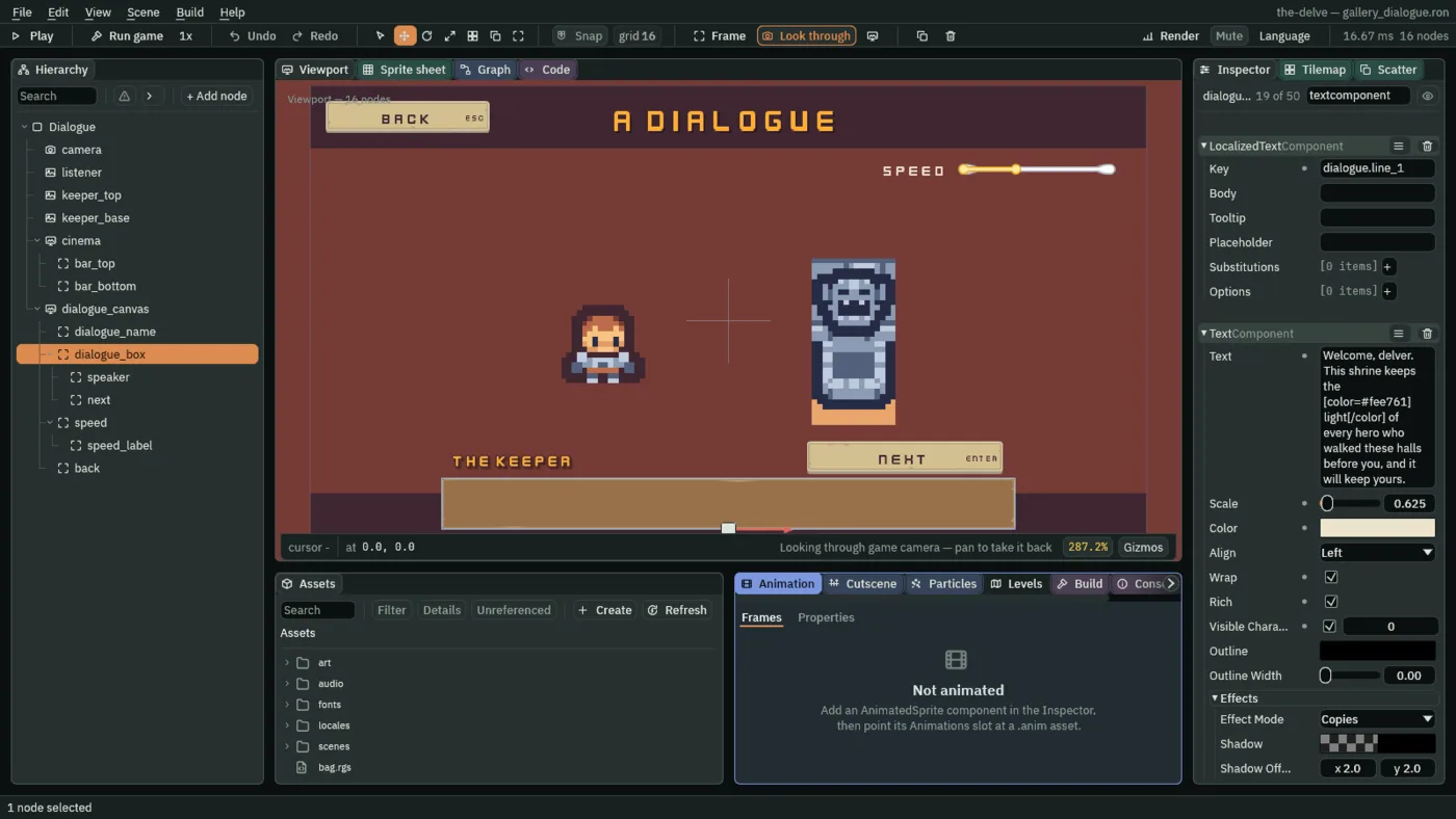
0 shows none of it: the editor does not play the script that counts it up.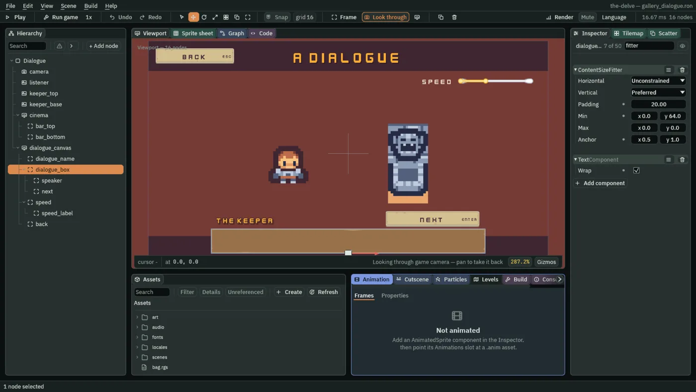
- Wrap
- Whether a Text breaks its words onto more lines, at spaces, to fit its rect’s width, or the Max width of a fitter that sizes its width. Off, as it comes, a long line runs out past the rect’s edge. The box ticks it: its line wraps at the box’s
880less the fitter’s Padding of20each side,840, onto two lines. The shop’s till and the rings’ cooldown words wrap the same way. - Rich
- Whether a Text reads its words as markup. Ticked,
[b],[i],[color=#rrggbb],[size=N],[wave]and[shake], each closed by its[/…], style the words between them, and the tags are not drawn; a tag it does not know is drawn as it was typed, so a mistake shows. Off, as it comes, every bracket is drawn: a quest name[REDACTED]stays as it is. The keeper’s lines colourlightin#fee761, the coin’s light gold, makemind the spikesbold and setmay the dark be kindmoving. - Visible Characters
- A tick box and a whole number: ticked, the Text shows only that many of its letters, counted after the markup is read, so a
[color]tag costs no letter. Unticked, as it comes, it shows them all. The box ticks it at0, so a line starts with nothing showing, and its script counts it up: a typewriter. A script that writes-1unticks it.
The speaker, Next and Speed
- Select
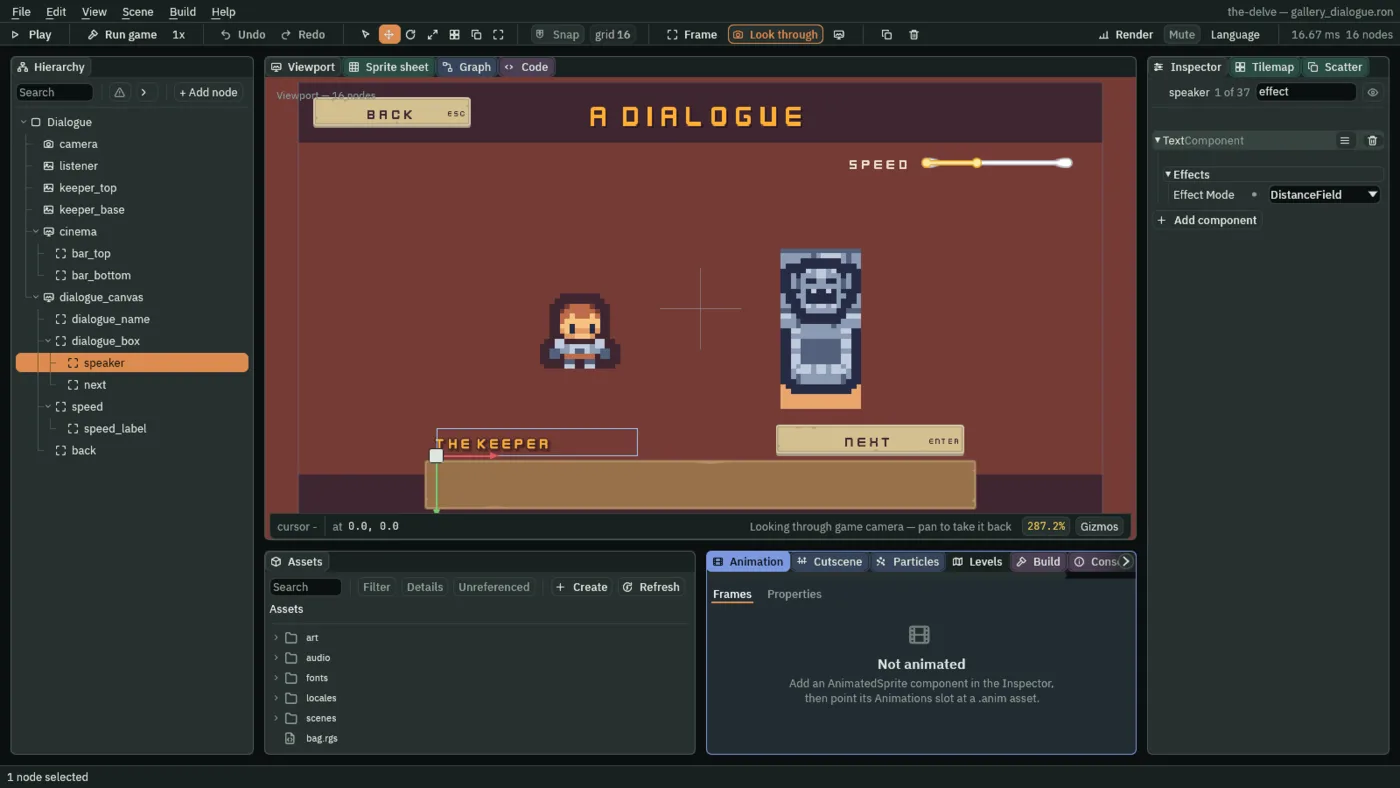
dialogue_box, add a Localized Label and rename itspeaker. In its Rect, set Anchor Max to0,0, Offset Min to20,-50, Offset Max to340,-6and Pivot to0,1: over the box’s top left corner. In its Text, set Text toThe keeper, Scale to0.75, Outline to63,38,49, alpha255and Outline Width to2. - Under Effects, set Effect Mode to DistanceField, Shadow to
0,0,0, alpha153, Shadow Offset to3,3and Shadow Softness to2. Give it a ThemeRoleComponent with Role Accent, and set its Key todialogue.speaker.
- Effect Mode
- How a Text draws its outline and its shadow.
Copies, as it comes, draws them as copies of the words, shifted, behind the words: it works with any face, and its edge is as hard or as soft as the face’s own pixels.DistanceFielddraws each letter once, from a distance-field copy of the face, and the outline and the shadow come out of the same picture, so they stay smooth at any size and Shadow Softness blurs the shadow’s edge. It needs the project to build that copy, below; without it the Text draws its copies as before. A Text that is Rich draws its outline and shadow as copies either way.speakerisDistanceField: one string in one colour, outlined and dropped a soft shadow.
The distance-field copy is the project’s, not the Text’s: one box in Project Settings builds it for every Text that asks.
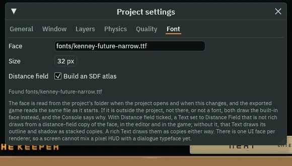
- Choose File → Project settings… and open its Font tab. Tick Build an SDF atlas, beside Distance field. The paragraph under the box says what it does.
- Build an SDF atlas
- Project Settings’ Font tab: also bakes a distance-field copy of the face, from the same file, at the same Size, which the editor and the game both draw from. Every Text set to DistanceField that is not Rich draws from it and stays sharp at any size; a rich Text draws its outline and shadow as copies either way, and every other label draws from the face itself. It is worth it for a name or a title that is scaled, or drawn with an outline and a soft shadow, as the keeper’s name is. It changes nothing for a plain label, which keeps the face’s hard pixels, The Delve’s look. Ticked here; chapter 1 left it unticked.
- Select
dialogue_box, add a Menu Button and rename itnext. In its Rect, set Anchor Min and Anchor Max both to1,0, Offset Min to-320,-55, Offset Max to-20,-6and Pivot to1,1: over the box’s top right corner. Give it the gallery buttons’ faces, TextNextand Actionnext, and set its Shortcut’s Action toui_accept, so Enter and a pad’s South press it wherever the ring is. Add a LocalizedTextComponent with Keydialogue.next. - Select
dialogue_canvas, click + Add node and choose Slider. Rename itspeed. In its Rect, set Anchor Min and Anchor Max both to1,0, Offset Min to-288,120, Offset Max to-48,136and Pivot to1,0: under the top bar, at the right. - In its Slider, set Action to
speed, Value to30, Min to10, Max to60and Step to5. Under Textures, set Fill Texture toslide_horizontal_color.png, Track Texture toslide_horizontal_grey.pngand Border to8, as the settings’ sliders have. - Select
speed, add a Localized Label and rename itspeed_label. In its Rect, set Anchor Max to0,0, Offset Min to-176,-16, Offset Max to-16,32and Pivot to0,0: hung to the slider’s left. In its Text, set Text toSpeed, Scale to0.75and Align to Right, and its Key todialogue.speed.
- Min
- A Slider’s Min: its value at its left-hand end, in the slider’s own units. A new Slider’s is
0, as the settings’ volumes keep it. The Speed slider’s is10, letters a second, and its Max60, so the line types no slower than ten a second and no faster than sixty, in steps of5. Value30puts the knob two fifths along.
The typewriter
- Create the script
typewriterand replace everything in it with the script below. Givedialogue_boxa Typewriter: Letters Per Second30and Lines3, as the script gives them. - Last, drag
backontodialogue_canvas, select it, press Apply theme, and press Ctrl+S.
/// The dialogue box: it types its line out a few letters at a time, and Next,
/// or Enter, finishes a line still typing, then shows the next of its lines,
/// and the first again after the last. Each line is a key in the string
/// tables, so it types out in the game's language.
component Typewriter {
    /// How many letters appear each second, until the Speed slider is moved.
    #[suffix("/s")]
    letters_per_second: f32 = 30.0,
    /// How many lines there are: dialogue.line_1 onward.
    lines: f32 = 3.0,
    /// The line it shows, from 1.
    #[hidden]
    line: f32 = 1.0,
    /// How many letters of it have been typed, fractions included; below zero
    /// once the whole line shows.
    #[hidden]
    typed: f32 = 0.0,

    fn loop(dt: f32) {
        // The Speed slider's value, in letters a second, once it reports one.
        let pace = letters_per_second;
        if amount("speed") > 0.0 {
            pace = amount("speed");
        }
        // How long the line is, its markup aside, in the language the game
        // is in, as the step began.
        let length = letters();
        // A click on Next, Enter or a pad's South through its Shortcut,
        // presses next on the game's next step.
        if pressed("next") {
            if typed >= 0.0 {
                // Still typing: the whole line at once.
                typed = -1.0;
            } else {
                line += 1.0;
                if line > lines {
                    line = 1.0;
                }
                typed = 0.0;
                set_text("LocalizedTextComponent", "key", "dialogue.line_" + text(line));
            }
        } else if typed >= 0.0 {
            // dt is how long a step is, in seconds.
            typed += pace * dt;
            if typed >= length {
                typed = -1.0;
            }
        }
        // The field counts whole letters, so the fraction is rounded down,
        // and below zero shows them all.
        set_number("TextComponent", "visible_characters", floor(typed));
    }
}
amount("speed") is where the Speed slider stands, from 10 to 60; it reads 0 until the slider first moves, so until then the script types at its own Letters Per Second. pressed("next") is true for one step after Next is clicked, or after Enter or a pad’s South, through its Shortcut: while a line is still typing, it shows the line whole; once it is whole, it starts the next.
- letters
- How many letters the Text on this node shows in all, its markup left out, as the step began:
117for the first line in English,114for it in French. The Localized Text writes the step’s words first, so a line has its own length in each language. It reads0on a node with no Text, and0in the editor while the game is not playing. - floor
- A number rounded down to the whole number at or below it:
2.7gives2. The typewriter countstypedin fractions of a letter, and Visible Characters takes only whole numbers, so it writesfloor(typed). dt- The number a
loop(dt: f32)is given: how long a step is, in seconds. A pace timesdtkeeps its speed at whatever step rate Project Settings sets:30letters a second is half a letter a step at60steps a second, and a whole letter at30.
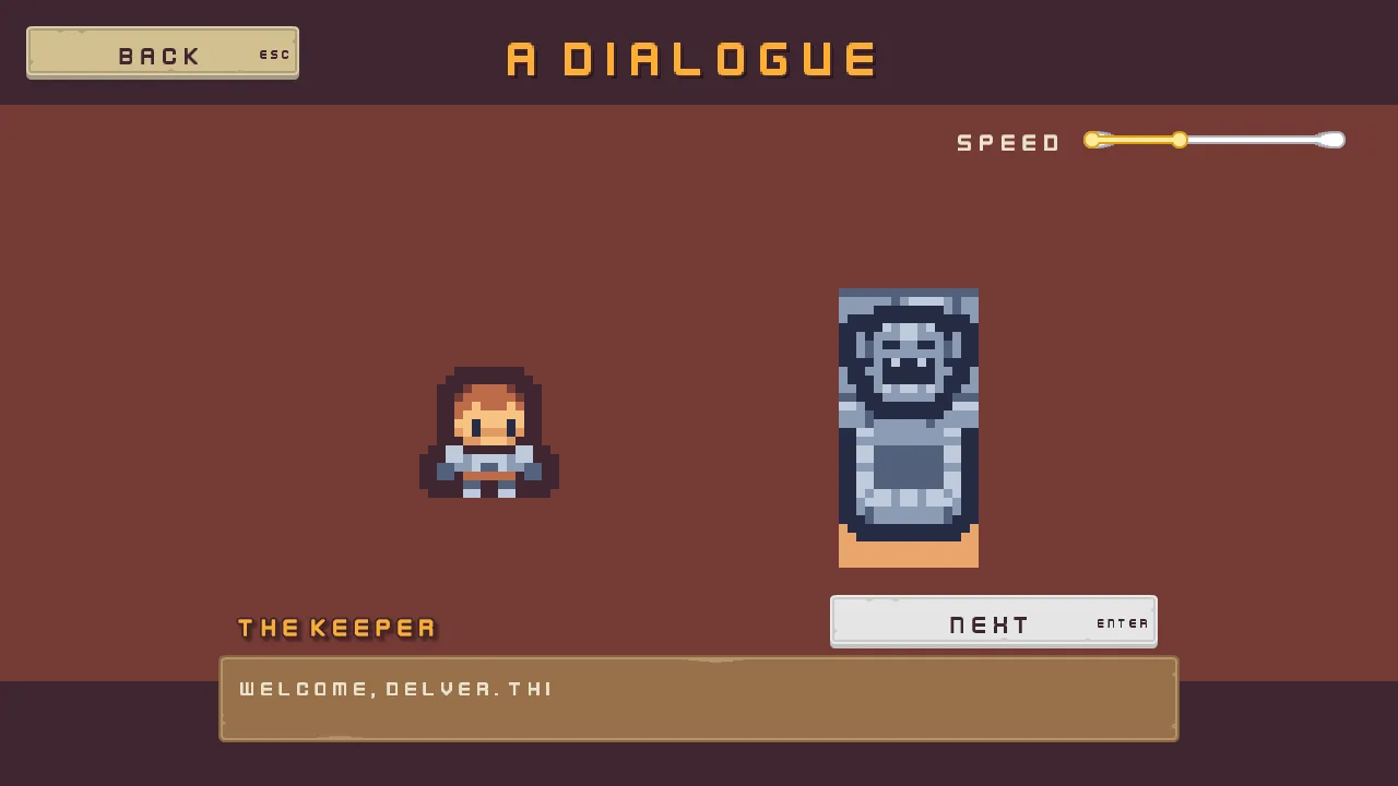
30 a second. Next holds the focus.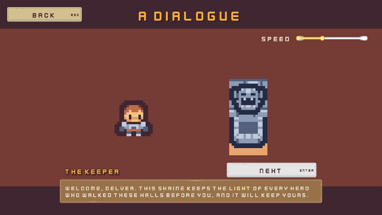
light in the coin’s light gold.The name is drawn from the distance field. Beside the copies it drew before Build an SDF atlas was ticked, its plum outline is an even line of the same width round every letter, with rounded corners, where the copies left a ragged edge, a step of pixels at each corner; and its shadow is soft, a blurred dark haze falling right and down, where the copies drew a second hard-edged name behind it.
The dialogue, in one table
| Node | Values | Why this value |
|---|---|---|
Dialogue, camera, dialogue_canvas, back | Every screen’s | The gallery’s frame. |
dialogue_name | Every screen’s name, with Offset Min -360, 8, Offset Max 360, 88; Text A dialogue; Key dialogue.name | Inside the top bar. |
listener | A Sprite at -48, 8: Texture tilemap_packed.png, Atlas Region hero, Size 32, 32, Sort Layer 1 | The hero, listening. |
keeper_top, keeper_base | A Sprite each at 48, -8 and 48, 24: Texture tilemap_packed.png, Atlas Region shrine_top and shrine_base, Size 32, 32, Sort Layer 1 | The shrine’s keeper, who speaks. |
cinema | A Canvas: Scale Mode ShrinkToFit, Use Safe Area unticked; its Theme the gallery’s palette | Bars to the window’s edges, drawn before the dialogue. |
bar_top | Anchor Max 1, 0, Offset Max 0, 96, Pivot 0.5, 0; Color 63, 38, 49, alpha 255; role Custom | A plum bar 96 high across the top, which keeps its colour through Apply theme. |
bar_bottom | Anchor Min 0, 1, Offset Min 0, -96, Pivot 0.5, 1; the same colour and role | The same bar at the foot. |
dialogue_box | Anchor Min and Anchor Max 0.5, 1, Offset Min -440, -160, Offset Max 440, -40, Pivot 0.5, 1; Texture panel_brown.png, Border 8; Text the first line, Scale 0.625, Wrap, Rich and Visible Characters 0; fitter Padding 20, Min 0, 64, Anchor 0.5, 1; Key dialogue.line_1; Typewriter, Letters Per Second 30, Lines 3 | Pinned by its foot, grown upward to its line, typed out from nothing. |
speaker | Anchor Max 0, 0, Offset Min 20, -50, Offset Max 340, -6, Pivot 0, 1; Text The keeper, Scale 0.75, Outline 63, 38, 49, alpha 255, Outline Width 2, Effect Mode DistanceField, Shadow 0, 0, 0, alpha 153, Shadow Offset 3, 3, Shadow Softness 2; role Accent; Key dialogue.speaker | A name with a soft shadow, drawn from the distance field. |
next | A Menu Button: Anchor Min and Anchor Max 1, 0, Offset Min -320, -55, Offset Max -20, -6, Pivot 1, 1; the gallery buttons’ faces, Text Next, Action next; Shortcut Action ui_accept; Key dialogue.next | Over the box’s right corner, and Enter through the map’s ui_accept. |
speed | A Slider: Anchor Min and Anchor Max 1, 0, Offset Min -288, 120, Offset Max -48, 136, Pivot 1, 0; Action speed, Value 30, Min 10, Max 60, Step 5, Fill Texture slide_horizontal_color.png, Track Texture slide_horizontal_grey.png, Border 8 | Ten to sixty letters a second, in fives. |
speed_label | Anchor Max 0, 0, Offset Min -176, -16, Offset Max -16, 32, Pivot 0, 0; Text Speed, Scale 0.75, Align Right; Key dialogue.speed | The slider’s word, at its left. |
Project Settings’ Font tab has Build an SDF atlas ticked. Every other colour came from Apply theme: the line’s cream, the name’s gold, the slider’s Fill and Track.
What it costs. 9 draws, for the room’s sprites, the bars, the box, the buttons, the slider and the words. The name’s distance-field run is a draw of its own, which the player’s count leaves out, and with its outline and its soft shadow it costs what a plain name costs. Drawn as copies, its outline and shadow would be four to eight more copies of every letter.
A level select
What it is for. A world map, a list of stages, a chapter menu: levels in a row, some open with the stars they earned, some locked, and more of them than the screen holds at once. It joins a Scroll view that scrolls sideways, its Scrollbar across, a Grid of columns inside it, buttons that are off under a padlock, Focus links that go round from the last level to the first, a field that shows dots, and a list that is not open yet.
- Start the screen as every screen starts: the scene
gallery_levels.ron, the rootLevels, the canvaslevels_canvas, and the namelevels_name, its TextChoose a leveland its Keylevels.name. - Select
levels_canvas, and in its Focus Ring set Width to3and Outset to4: a thicker ring, a little further out, round the big level buttons.
- Width
- A Focus Ring’s Width: how thick the ring is, in UI units. A new ring’s, and every other screen’s, is
2. The level select’s is3, a thicker line round its big tiles,160square. - Outset
- A Focus Ring’s Outset: how far outside the control’s edge the ring is drawn, in UI units. A new ring’s is
2. The level select’s is4, so the ring stands clear of a tile’s raised edge.
The strip
- Select
levels_canvas, add a Panel and rename itstrip_plate. In its Rect, set Anchor Min and Anchor Max both to0.5,0, Offset Min to-284,128, Offset Max to284,328and Pivot to0.5,0. In its Panel, set Texture topanel_brown.pngand Border to8. - Select
levels_canvas, click + Add node and choose Scroll View. Rename itlevel_strip. In its Rect, set Anchor Min and Anchor Max both to0.5,0, Offset Min to-276,136, Offset Max to276,320and Pivot to0.5,0:552wide,8inside the plate, three levels in view. - In its Scroll, set Content to
1104,0and Wheel to184. Give it a FocusComponent with Mode None: the ring walks its levels, and the view brings the one it lands on into view. - Select
level_strip, add a Grid and rename itlevels. Its Rect stays as it comes. In its Grid, set Columns to6, Cell to0,160, Spacing to24,24and Padding to12. Fit stays Columns.
Six levels
- Select
levels, click + Add node and choose Menu Button. Rename itlevel_1. Its Rect stays as it comes: the Grid places it. In its Panel, set Texture tobuttonLong_beige.pngand Border to8. In its Text, set Text to1, Scale to1.25and Align to Center. In its Button, set Action tolevel_1and the three textures the gallery’s buttons have. - In its Shortcut, leave Action empty, set Key to
Digit1and untick Show Label. Give it a FocusComponent with Downcodeand Leftlevel_6. - Select
level_1, add a Stack and rename itlevel_1_stars. In its Rect, set Anchor Min to0,1, Offset Min to0,-48, Offset Max to0,-14and Pivot to0.5,1: a band along the tile’s foot. Anchor Max stays1,1. In its Stack, set Axis to Horizontal, Fit to Fixed, Spacing to4, Item to32and Align to Center. - Select
level_1_stars, add a Panel and rename itlevel_1_star_1. Its Rect stays as it comes. Set its Texture tostar.png. Press Ctrl+D twice, and rename the copieslevel_1_star_2andlevel_1_star_3. - Create the script
level_tileand replace everything in it with the script below. Givelevel_1a LevelTile, Level1, Secret unticked.
/// A level on the level select: a click on it, Enter or a pad's South while it
/// holds the focus, or its number's key chooses it, and the line under the
/// strip says so. A locked level is a disabled button, which none of those
/// press. The secret level opens once the secret code is typed.
component LevelTile {
    /// Which level it is: 1 to 6. Its button presses level_ and this number.
    level: f32 = 1.0,
    /// Whether the secret code opens it.
    secret: bool = false,

    fn loop() {
        // The code's field keeps secret_open as 1 once the code is typed.
        if secret && kept_number("secret_open", 0.0) == 1.0 {
            set_flag("ButtonComponent", "disabled", false);
        }
        if pressed("level_" + text(level)) {
            // What the line under the strip says: the level chosen.
            keep_number("levels_said", level);
        }
    }
}
pressed("level_" + text(level)) is true for one step after the level is clicked, after Enter or a pad’s South while it holds the focus, or after its number’s key, through its Shortcut. A level that is off presses nothing, by any of them.
- Select
level_1and press Ctrl+D five times. Rename the copieslevel_2tolevel_6, and the stars under each to its own number,level_2_stars,level_2_star_1and so on. Give each its own Text, Action, Key and Level from the table below. - On
level_2, setlevel_2_star_3’s Texture tostar_outline.png: two stars earned. Onlevel_3, setlevel_3_star_1,level_3_star_2andlevel_3_star_3tostar_outline.png: none yet. - On
level_4andlevel_5, delete the stars, and tick the Button’s Disabled. Add a Panel under each, namedlevel_4_lockandlevel_5_lock: Anchor Min and Anchor Max both0.5,0, Offset Min-24,16, Offset Max24,64, Pivot0.5,0, Texturelock.png, which came with the starter. - On
level_6, tick Disabled, set its three stars tostar_outline.png, unticklevel_6_stars’ Visible, and add a padlock,level_6_lock, as onlevel_4. Tick its LevelTile’s Secret, set its Focus’s Right tolevel_1, and clear the Left it took fromlevel_1. - On
level_2tolevel_5, clear the Left the copy took fromlevel_1, so their links left and right are worked out from where they stand.
| Level | Text, Action, Key, Level | Under it | Its Button and its links |
|---|---|---|---|
level_1 | 1, level_1, Digit1, 1 | Three stars, star.png | Left level_6, Down code |
level_2 | 2, level_2, Digit2, 2 | Two star.png and one star_outline.png | Down code |
level_3 | 3, level_3, Digit3, 3 | Three star_outline.png | Down code |
level_4 | 4, level_4, Digit4, 4 | The padlock | Disabled; Down code |
level_5 | 5, level_5, Digit5, 5 | The padlock | Disabled; Down code |
level_6 | 6, level_6, Digit6, 6, Secret ticked | Three star_outline.png, hidden, and the padlock | Disabled; Right level_1, Down code |
- Left, Right
- A Focus’s Left and Right: the control the ring moves to when the left or the right arrow is pressed, or a pad’s stick or D-pad is pushed that way, while this one holds the focus. Empty, as they come, the ring finds the nearest control that way.
level_1’s Left islevel_6andlevel_6’s Right islevel_1, so the row goes round. A link to a level that is off passes on, as the ring passes every control that is off: from level 3, right goes past the locked 4 and 5 to 6 once it is open, and stays on 3 until then.
The secret level’s stars and padlock swap when the code is typed. One script does both, told which way round.
- Create the script
shown_by_secretand replace everything in it with the script below. Givelevel_6_starsa ShownBySecret with Once Open ticked, as it comes, andlevel_6_lockone with Once Open unticked.
/// Shows a part of the secret level's button only before the secret code is
/// typed, as its padlock, or only after, as its stars.
component ShownBySecret {
    /// Whether it shows once the level is open, rather than until then.
    once_open: bool = true,

    fn loop() {
        // The code's field keeps secret_open as 1 once the code is typed.
        let open = kept_number("secret_open", 0.0) == 1.0;
        if open == once_open {
            show();
        } else {
            hide();
        }
    }
}
The bar under the strip is the settings’ slider turned into a scrollbar: its grey track is the bar, and its gold fill the thumb.
- Select
levels_canvas, click + Add node and choose Scrollbar. Rename itlevel_bar. In its Rect, set Anchor Min and Anchor Max both to0.5,0, Offset Min to-276,336, Offset Max to276,352and Pivot to0.5,0: as wide as the strip, under it. In its Panel, set Texture toslide_horizontal_grey.pngand Border to8. - In its Scrollbar, set View to
level_strip, Axis to Horizontal, Min Thumb to16and Thumb to255,255,255, alpha255. Under Textures, set Thumb Texture toslide_horizontal_color.pngand Border to8. - Give it a FocusComponent with Mode None: the bar is the pointer’s, and the keys scroll the strip by walking its levels.
- Axis
- A Scrollbar’s Axis: which way the bar runs, and so which way of its view it drives.
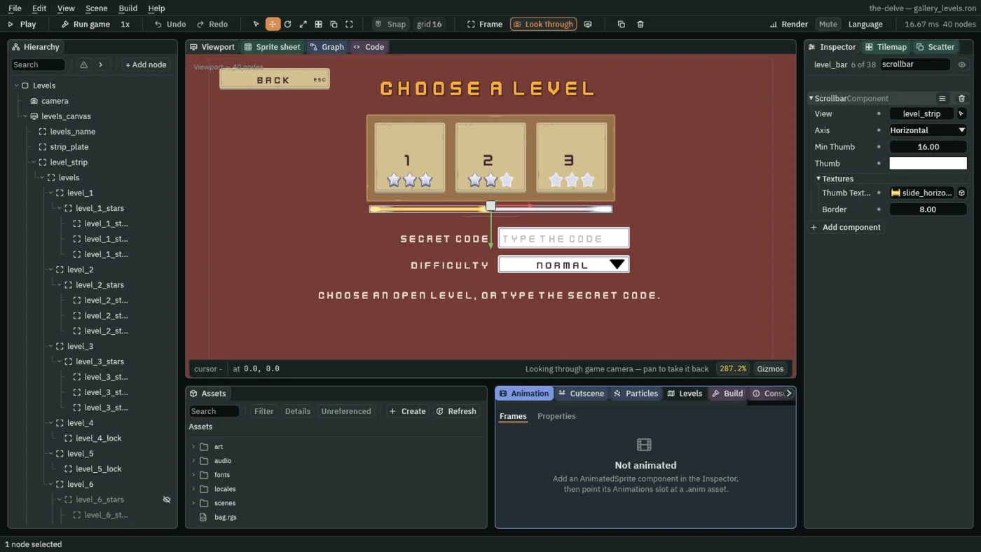
Vertical, as it comes, for a list such as the journal;Horizontalfor a strip. The level bar isHorizontal: its thumb runs across, as long as the share of the strip in view, half of it, and dragging it scrolls the strip sideways.
The code, the list and the line
- Select
levels_canvas, click + Add node and choose Text Entry. Rename itcode. In its Rect, set Anchor Min and Anchor Max both to0.5,0, Offset Min to16,384, Offset Max to316,433and Pivot to0,0. In its Panel, set Texture toinput_rectangle.pngand Border to8. - In its Text Entry, set Action to
code, Placeholder toType the code, Max Length to8, Mode to Password, Padding to12, Scale to0.75and Caret Width to3. Set its Focus’s Up tolevel_1. - Add a LocalizedTextComponent with Placeholder
levels.code_prompt. - Select
code, add a Localized Label and rename itcode_label. In its Rect, set Anchor Max to0,0, Offset Min to-316,0, Offset Max to-16,49and Pivot to0,0: hung to the field’s left. In its Text, set Text toSecret code, Scale to0.75and Align to Right, and its Key tolevels.code. - Create the script
secret_codeand replace everything in it with the script below. Givecodea SecretCode, its Codedelve, as the script gives it.
/// The level select's secret code: Enter in the field checks what was typed,
/// and the right code opens the secret level for as long as the game runs.
component SecretCode {
    /// The code that opens the secret level.
    code: String = "delve",

    fn loop() {
        // Enter in the field presses its action, code, and entered() reads
        // what it holds, which its Password mode shows as dots.
        if pressed("code") {
            if entered("code") == code {
                keep_number("secret_open", 1.0);
                // What the line under the strip says: 7 the level is open.
                keep_number("levels_said", 7.0);
            } else {
                // 8: that was not the code.
                keep_number("levels_said", 8.0);
            }
        }
    }
}
pressed("code") is true for one step after Enter is pressed in the field. entered("code") is what the field holds, as the step began: the letters typed, though the field draws each as a dot.
- Select
levels_canvas, click + Add node and choose Dropdown. Rename itdifficulty. In its Rect, set Anchor Min and Anchor Max both to0.5,0, Offset Min to16,449, Offset Max to316,489and Pivot to0,0. In its Panel, set Texture toinput_rectangle.pngand Border to8. In its Text, set Text toDifficulty, Scale to0.75and Align to Center. - In its Dropdown, set Action to
difficulty, add two Options,NormalandHard, set Item Height to40, and tick Disabled. - Give it a TooltipComponent: Text
Finish every level to choose Hard., Delay0.3, Placement Right. Add a LocalizedTextComponent with Keylevels.difficulty, Tooltiplevels.hard_tipand two Options,levels.normalandlevels.hard. - Select
difficulty, add a Panel and rename itdifficulty_arrow: Anchor Min and Anchor Max1,0.5, Offset Min-46,-11, Offset Max-12,11, Pivot1,0.5, Textureicon_arrow_down_dark.png, as the settings’ lists have. Add a Localized Label,difficulty_label: Anchor Max0,0, Offset Min-316,-4, Offset Max-16,44, Pivot0,0, TextDifficulty, Scale0.75, Align Right, Keylevels.difficulty.
- Disabled
- A Dropdown’s Disabled: whether the list is off. An off list does not open, by a click, a key or a pad, is drawn greyed, and the ring passes it by; its closed face still shows its choice,
Normal. A new Dropdown is on. The difficulty is off, as Hard is not the player’s yet, and its tooltip says what opens it. A script turns it on withset_flag("DropdownComponent", "disabled", false).
- Select
levels_canvas, add a Localized Label and rename itlevels_said. In its Rect, set Anchor Min and Anchor Max both to0.5,0, Offset Min to-500,517, Offset Max to500,557and Pivot to0.5,0. In its Text, set Text toChoose an open level, or type the secret code., Scale to0.75and Align to Center. Set its Key tolevels.choose, with one Substitution, Namen, Value1. - Create the script
level_saidand replace everything in it with the script below. Givelevels_saida LevelSaid. - Last, drag
backontolevels_canvas, select it, press Apply theme, and press Ctrl+S.
/// The line under the level select: what to do, which level was chosen, or
/// what the secret code did, whichever happened last.
component LevelSaid {
    fn loop() {
        // A level keeps levels_said as its number, 1 to 6, and the code's
        // field as 7 when it opens the secret level and 8 when it does not.
        let said = kept_number("levels_said", 0.0);
        let words = "levels.choose";
        if said >= 1.0 && said <= 6.0 {
            words = "levels.chosen";
        } else if said == 7.0 {
            words = "levels.open";
        } else if said == 8.0 {
            words = "levels.wrong";
        }
        // The Localized Text beside this script writes the key's words, its
        // substitution named n filled with the level's number.
        set_text("LocalizedTextComponent", "key", words);
        set_text("LocalizedTextComponent", "substitutions.0.value", text(said));
    }
}
The line reads levels_said, which the levels and the code keep, and fills {n} with the level’s number in the game’s language.
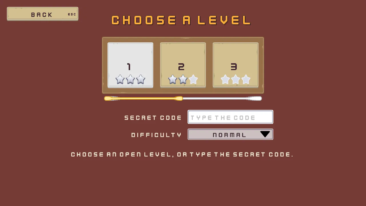
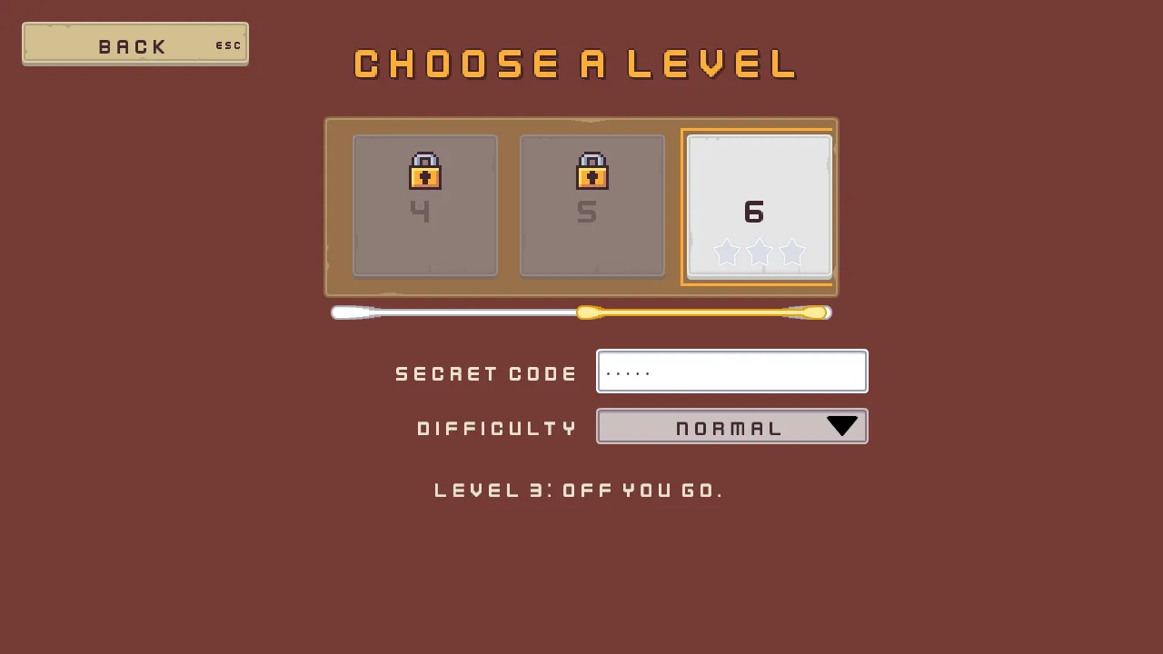
The level select, in one table
| Node | Values | Why this value |
|---|---|---|
Levels, camera, levels_name, back | Every screen’s, with Text Choose a level and Key levels.name | The gallery’s frame. |
levels_canvas | Every screen’s, with Focus Ring Width 3 and Outset 4 | A ring that reads round a big tile. |
strip_plate | Anchor Min and Anchor Max 0.5, 0, Offset Min -284, 128, Offset Max 284, 328, Pivot 0.5, 0; Texture panel_brown.png, Border 8 | The plate behind the strip. |
level_strip | A Scroll View: Anchor Min and Anchor Max 0.5, 0, Offset Min -276, 136, Offset Max 276, 320, Pivot 0.5, 0; Content 1104, 0, Wheel 184; Focus Mode None | Three levels in view of six; a level a notch. |
levels | A Grid: Columns 6, Cell 0, 160, Spacing 24, 24, Padding 12 | Six columns across the content’s 1104. |
level_1 to level_6 | A Menu Button each: Texture buttonLong_beige.png, Border 8; Text its number, Scale 1.25, Align Center; Action level_ and its number, the gallery buttons’ three textures; Shortcut Key Digit1 to Digit6, Show Label unticked; Focus Down code; LevelTile, Level its number; level_4 to level_6 Disabled, and the rest of each in the table above | A big number on a beige tile, chosen by its own key. |
level_1_stars, level_2_stars, level_3_stars, level_6_stars | A Stack: Anchor Min 0, 1, Offset Min 0, -48, Offset Max 0, -14, Pivot 0.5, 1; Axis Horizontal, Fit Fixed, Spacing 4, Item 32, Align Center; level_6_stars hidden, with ShownBySecret, Once Open ticked | Three stars in a row along the tile’s foot. |
level_1_star_1 to level_6_star_3 | A Panel each: Texture star.png for a star earned, star_outline.png for one not yet | Stars at half their size, 32 wide in the Stack. |
level_4_lock, level_5_lock, level_6_lock | Anchor Min and Anchor Max 0.5, 0, Offset Min -24, 16, Offset Max 24, 64, Pivot 0.5, 0; Texture lock.png; level_6_lock with ShownBySecret, Once Open unticked | The padlock, 16 pixels at three times, over the number. |
level_bar | A Scrollbar: Anchor Min and Anchor Max 0.5, 0, Offset Min -276, 336, Offset Max 276, 352, Pivot 0.5, 0; Texture slide_horizontal_grey.png, Border 8; View level_strip, Axis Horizontal, Min Thumb 16, Thumb 255, 255, 255, alpha 255, Thumb Texture slide_horizontal_color.png, Border 8; Focus Mode None | The slider’s art across, 16 high, under the strip. |
code | A Text Entry: Anchor Min and Anchor Max 0.5, 0, Offset Min 16, 384, Offset Max 316, 433, Pivot 0, 0; Texture input_rectangle.png, Border 8; Action code, Placeholder Type the code, Max Length 8, Mode Password, Padding 12, Scale 0.75, Caret Width 3; Focus Up level_1; Localized Placeholder levels.code_prompt; SecretCode, Code delve | Dots for what is typed, and up goes back to the first level. |
code_label | Anchor Max 0, 0, Offset Min -316, 0, Offset Max -16, 49, Pivot 0, 0; Text Secret code, Scale 0.75, Align Right; Key levels.code | The field’s word, at its left. |
difficulty | A Dropdown: Anchor Min and Anchor Max 0.5, 0, Offset Min 16, 449, Offset Max 316, 489, Pivot 0, 0; Texture input_rectangle.png, Border 8; Text Difficulty, Scale 0.75, Align Center; Action difficulty, Options Normal and Hard, Disabled ticked, Item Height 40; Tooltip Finish every level to choose Hard., Delay 0.3, Placement Right; Key levels.difficulty, Tooltip levels.hard_tip, Options levels.normal and levels.hard | A list that is not the player’s yet, and says why. |
difficulty_arrow | Anchor Min and Anchor Max 1, 0.5, Offset Min -46, -11, Offset Max -12, 11, Pivot 1, 0.5; Texture icon_arrow_down_dark.png | The settings’ list arrow. |
difficulty_label | Anchor Max 0, 0, Offset Min -316, -4, Offset Max -16, 44, Pivot 0, 0; Text Difficulty, Scale 0.75, Align Right; Key levels.difficulty | The list’s word, at its left. |
levels_said | Anchor Min and Anchor Max 0.5, 0, Offset Min -500, 517, Offset Max 500, 557, Pivot 0.5, 0; Text Choose an open level, or type the secret code., Scale 0.75, Align Center; Key levels.choose, Substitution n 1; LevelSaid | What happened last, across the foot. |
Every other colour came from Apply theme, the ring’s gold among them.
What it costs. 13 draws as it opens, and 14 in the picture of the secret level, ringed, with other tiles in view. The tiles, the stars, the padlocks, the bar’s two pictures, the field, the list and the words break a run wherever a neighbour wears another picture.
Rings and meters
What it is for. A value drawn as a ring or a pie: health round a portrait, a shot charged while a button is held, an ability waiting to be used again. Three of them side by side: a health ring that two buttons empty and fill, a charge meter of a dozen chunky segments that fills both ways while it is held, and a cooldown pie that fills each time the charge is let go and empties again before the meter will charge. It joins the Radial Progress fields chapter 7 left as they came, a Button held down, a list whose choice a script writes into a choice field by name, a field that takes a number with a point, and a signal from one node to another.
- Start the screen as every screen starts: the scene
gallery_rings.ron, the rootRings, the canvasrings_canvas, and the namerings_name, its TextRings and metersand its Keyrings.name.
The health ring
A ring is drawn twice: its track, full and dim, and the ring itself on it, filling with its value. Each is a plain node given a Rect and a Radial Progress, as the hotbar’s cooldown rings are.
- Select
rings_canvas, click + Add node and choose Node. Rename ithealth_ring_track. Click Add component and choose RectComponent: Anchor Min and Anchor Max both0.5,0, Offset Min-460,136, Offset Max-260,336, Pivot0.5,0, a square of200left of the middle. - Click Add component and choose RadialProgressComponent. Leave Value at
1, full. Set Start to90, Direction to CounterClockwise, Inner Radius to0.6and Color to63,38,49, alpha153: the plum the words are outlined in, at three fifths. - Select
health_ring_track, add a Node and rename ithealth_ring. Give it a RectComponent, as it comes, filling the track, and a RadialProgressComponent with the same Start, Direction and Inner Radius, and Color232,69,55, alpha255, the palette’s danger red. - Give
health_ringa TextComponent: Text10, Scale1.5, Align Center. It is drawn in the ring’s hole. - Select
rings_canvas, add a Localized Label and rename ithealth_label: Anchor Min and Anchor Max0.5,0, Offset Min-530,344, Offset Max-190,376, Pivot0.5,0; TextHealth, Scale0.625, Align Center; Keyrings.health. - Add two Button nodes under
rings_canvas,hurtandheal, each with the gallery buttons’ faces: Anchor Min and Anchor Max0.5,0, Pivot0.5,0;hurtat Offset Min-524,388and Offset Max-364,437, TextHurt, Actionhurt, Keyrings.hurt;healat-356,388and-196,437, TextHeal, Actionheal, Keyrings.heal. Each is160wide, for the French Blesser and Soigner. - Create the script
health_ringand replace everything in it with the script below. Givehealth_ringa HealthRing, Most10.
/// The health ring: Hurt takes a point and Heal gives one back, from none to
/// the most, and the ring drains anticlockwise as health goes, its number in
/// its hole.
component HealthRing {
    /// The most health there is: a full ring.
    most: f32 = 10.0,
    /// The health now.
    #[hidden]
    health: f32 = 10.0,

    fn loop() {
        // A click on Hurt or Heal, or Enter or a pad's South while it holds
        // the focus, presses hurt or heal on the game's next step.
        if pressed("hurt") && health > 0.0 {
            health = health - 1.0;
        }
        if pressed("heal") && health < most {
            health = health + 1.0;
        }
        set_number("RadialProgressComponent", "value", health / most);
        set_text("TextComponent", "text", text(health));
    }
}
pressed("hurt") and pressed("heal") are true for one step after Hurt or Heal is clicked, or after Enter or a pad’s South while it holds the focus. The script writes the ring’s Value as a share of Most, and the number in its hole.
The charge meter
- Select
rings_canvas, add a Node,charge_meter_track, with a RectComponent: Anchor Min and Anchor Max0.5,0, Offset Min-100,136, Offset Max100,336, Pivot0.5,0, in the middle. Give it a RadialProgressComponent: Value1, Start90, Direction Both, Inner Radius0.3, Segments12and Color63,38,49, alpha153. - Select
charge_meter_track, add a Node,charge_meter, with a RectComponent as it comes and a RadialProgressComponent: Value0, Start90, Direction Both, Inner Radius0.3, Segments12, Color254,174,52, alpha255, the accent gold.
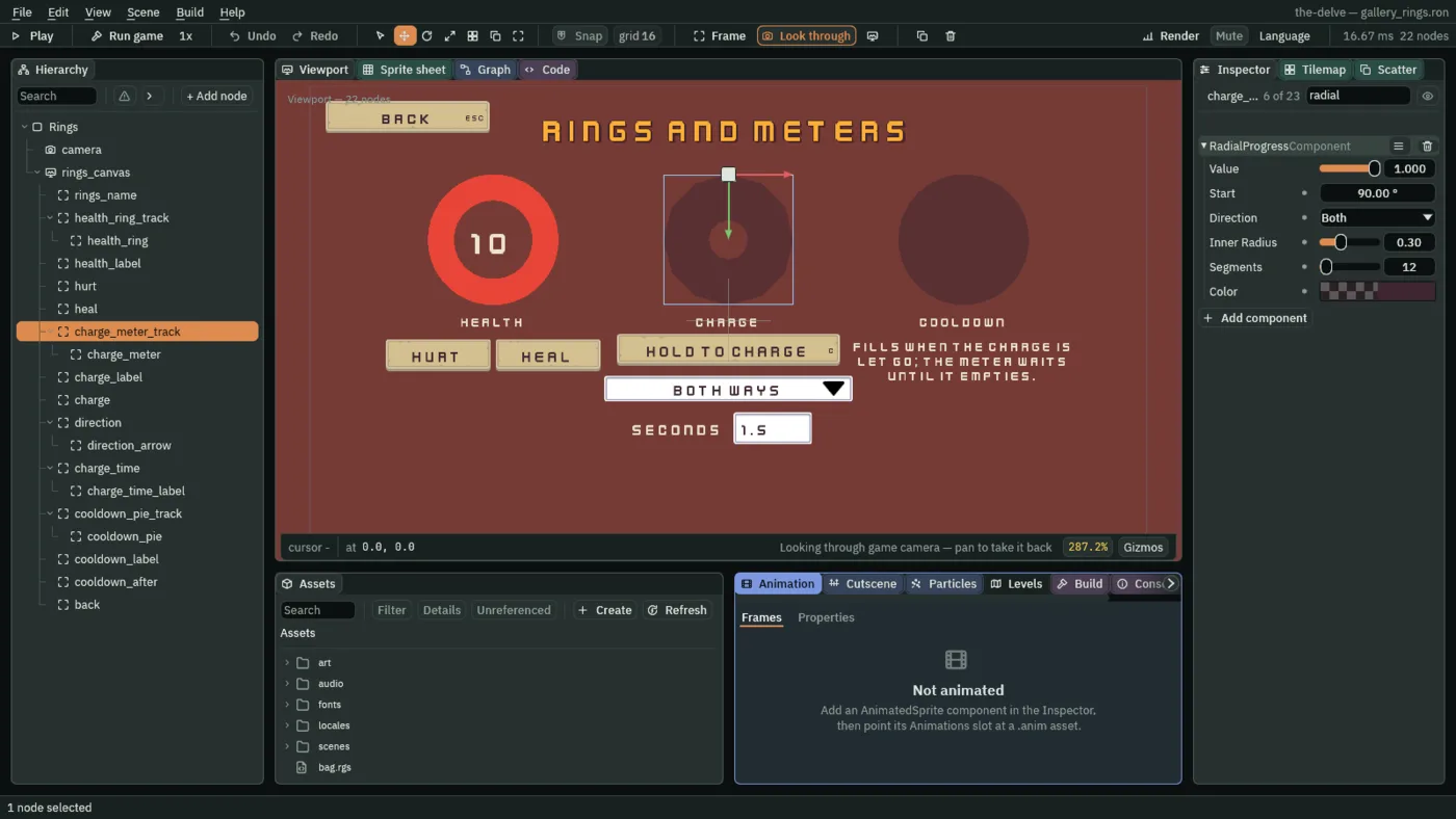
12 segments.- Start
- Where the fill begins, in degrees clockwise from three o’clock. A new ring’s is
-90, twelve o’clock, as the hotbar’s rings and the cooldown pie keep it. The health ring and the charge meter take90, six o’clock, so they fill from their foot. - Direction
- Which way the fill grows from Start.
Clockwise, as it comes;CounterClockwise, the other way;Both, half of it each way, so a ring half full covers the quarter on each side of Start. The health ring isCounterClockwise: from six o’clock it fills through three, twelve and nine, and as health goes its end falls back towards six. The meter isBoth, rising up both sides at once like a cup filling. - Segments
- How many straight edges a full turn is drawn with, from
3to512. A new ring’s64reads as round at any size The Delve draws. The meter’s12is chunky on purpose: a twelve-sided ring that fills a facet at a time, as a game’s charge gauge often does.
- Select
rings_canvas, add a Localized Label,charge_label: Anchor Min and Anchor Max0.5,0, Offset Min-170,344, Offset Max170,376, Pivot0.5,0; TextCharge, Scale0.625, Align Center; Keyrings.charge. - Add a Menu Button under
rings_canvas,charge, with the gallery buttons’ faces: Anchor Min and Anchor Max0.5,0, Offset Min-170,380, Offset Max170,429, Pivot0.5,0; TextHold to charge, Actioncharge; its Shortcut’s Actionchargetoo, so it draws C; Keyrings.hold. - Add a Dropdown under
rings_canvas,direction: Anchor Min and Anchor Max0.5,0, Offset Min-190,444, Offset Max190,484, Pivot0.5,0; Textureinput_rectangle.png, Border8; TextFills, Scale0.75, Align Center; Actiondirection, OptionsBoth ways,ClockwiseandAnticlockwise, Item Height40. Give it a LocalizedTextComponent with Keyrings.fillsand Optionsrings.both,rings.clockwiseandrings.anticlockwise, and an arrow,direction_arrow, as the level select’s list has. - Add a Text Entry under
rings_canvas,charge_time: Anchor Min and Anchor Max0.5,0, Offset Min8,500, Offset Max128,549, Pivot0,0; Textureinput_rectangle.png, Border8; Actioncharge_time, Text1.5, Placeholder empty, Max Length4, Mode Decimal, Padding12, Scale0.75, Caret Width3. Under it, a Localized Label,charge_time_label: Anchor Max0,0, Offset Min-176,0, Offset Max-16,49, Pivot0,0; TextSeconds, Scale0.75, Align Right; Keyrings.seconds.
The cooldown pie
- Select
rings_canvas, add a Node,cooldown_pie_track, with a RectComponent: Anchor Min and Anchor Max0.5,0, Offset Min260,136, Offset Max460,336, Pivot0.5,0, at the right. Give it a RadialProgressComponent with Color63,38,49, alpha153, everything else as it comes: a full disc with no hole. - Select
cooldown_pie_track, add a Node,cooldown_pie, with a RectComponent as it comes and a RadialProgressComponent: Value0, Color254,231,97, alpha255, the light gold. - Add two Localized Label nodes under
rings_canvas:cooldown_label, Anchor Min and Anchor Max0.5,0, Offset Min190,344, Offset Max530,376, Pivot0.5,0, TextCooldown, Scale0.625, Align Center, Keyrings.cooldown; andcooldown_after, the same but Offset Min190,380and Offset Max530,460, TextFills when the charge is let go; the meter waits until it empties., Wrap ticked, Keyrings.after: three lines in either language. - Create the scripts
cooldown_pieandcharge_meterand replace everything in each with its script below. Givecooldown_piea CooldownPie, Seconds2, andcharge_metera ChargeMeter, Seconds1.5and Cooldown2. - Select
charge_meter, click Add component and choose SignalComponent. Under Connections, add one: Signalreleased, Tocooldown_pie. - Last, drag
backontorings_canvas, select it, press Apply theme, and press Ctrl+S.
/// The charge meter: holding the Charge button down, by the mouse or a finger,
/// or C, or a pad's right trigger, fills it over the seconds typed beside it,
/// and letting go empties it and starts its cooldown, which the cooldown pie
/// shows. It fills nothing while it cools down. The Fills list chooses which
/// way it fills.
component ChargeMeter {
    /// How long a full charge takes, until the Seconds field holds a time.
    #[suffix("s")]
    seconds: f32 = 1.5,
    /// How long after a release it fills nothing: the cooldown pie's time.
    #[suffix("s")]
    cooldown: f32 = 2.0,
    /// How full it is, 0 to 1.
    #[hidden]
    charge: f32 = 0.0,
    /// Seconds until it fills again.
    #[hidden]
    cooling: f32 = 0.0,

    fn loop(dt: f32) {
        // Counted here rather than waited out, as a hotbar slot counts its
        // cooldown: a hook that waits hears nothing. dt is how long a step
        // is, in seconds.
        if cooling > 0.0 {
            cooling -= dt;
        }
        // A field in Decimal mode answers the number typed in it, 0 while it
        // is empty.
        let time = seconds;
        if amount("charge_time") > 0.0 {
            time = amount("charge_time");
        }
        // held() is true on every step the Charge button, its key or the
        // trigger is held down; while it cools down, holding fills nothing.
        if held("charge") && cooling <= 0.0 {
            charge = min(1.0, charge + dt / time);
        } else if charge > 0.0 {
            // Let go: it empties and cools down. Heard by the cooldown pie
            // its Signal component wires it to, on the next step.
            charge = 0.0;
            cooling = cooldown;
            emit("released");
        }
        set_number("RadialProgressComponent", "value", charge);
        // Choosing a row of the Fills list presses direction, and amount()
        // answers the row, from 0. A choice field takes one of its choices by
        // name.
        if pressed("direction") {
            if amount("direction") == 1.0 {
                set_text("RadialProgressComponent", "direction", "Clockwise");
            } else if amount("direction") == 2.0 {
                set_text("RadialProgressComponent", "direction", "CounterClockwise");
            } else {
                set_text("RadialProgressComponent", "direction", "Both");
            }
        }
    }
}
held("charge") is true on every step the Charge button is held down, by the mouse or a finger, or C or a pad’s right trigger is held: from the press until the release, or until the pointer is dragged off the button. amount("charge_time") is the number in the Seconds field, 1.5 as it opens and 0 while it is empty. pressed("direction") is true on the step a real choice is made in the Fills list, and amount("direction") is that row, from 0.
The meter’s Direction is a choice field, and set_text writes it by its choice’s name: Clockwise, CounterClockwise or Both. A name it does not have is refused, with the Console naming the three.
/// The cooldown pie: each time the charge is let go, it fills and then
/// empties over the meter's cooldown, as a hotbar slot's ring does after a
/// use, so the player sees how long it is until the meter fills again.
component CooldownPie {
    /// How long the pie takes to empty: the charge meter's cooldown.
    #[suffix("s")]
    seconds: f32 = 2.0,

    fn loop() {
        // The meter emits released when the charge is let go, and its Signal
        // component wires that to this pie, which hears it on the next step.
        if heard("released") {
            // Full first, so the anneal starts from there.
            set_number("RadialProgressComponent", "value", 1.0);
            anneal_number("RadialProgressComponent", "value", 0.0, seconds, .Linear);
        }
    }
}
The meter calls emit("released") as the charge is let go. Its Signal component wires released to the pie, which hears it with heard("released") on the next step, fills, and anneals back to empty over its Seconds, as a hotbar slot tells its ring in chapter 7. Neither script names the other node: the wire is the scene’s.
- held
- Whether the player is holding an action down, on every step until it is let go: a key, a pad’s control, or a Button held down by the mouse or a finger. A Button still fires its
pressedon the release, so a press dragged off it is no click; a Button that is off holds nothing.
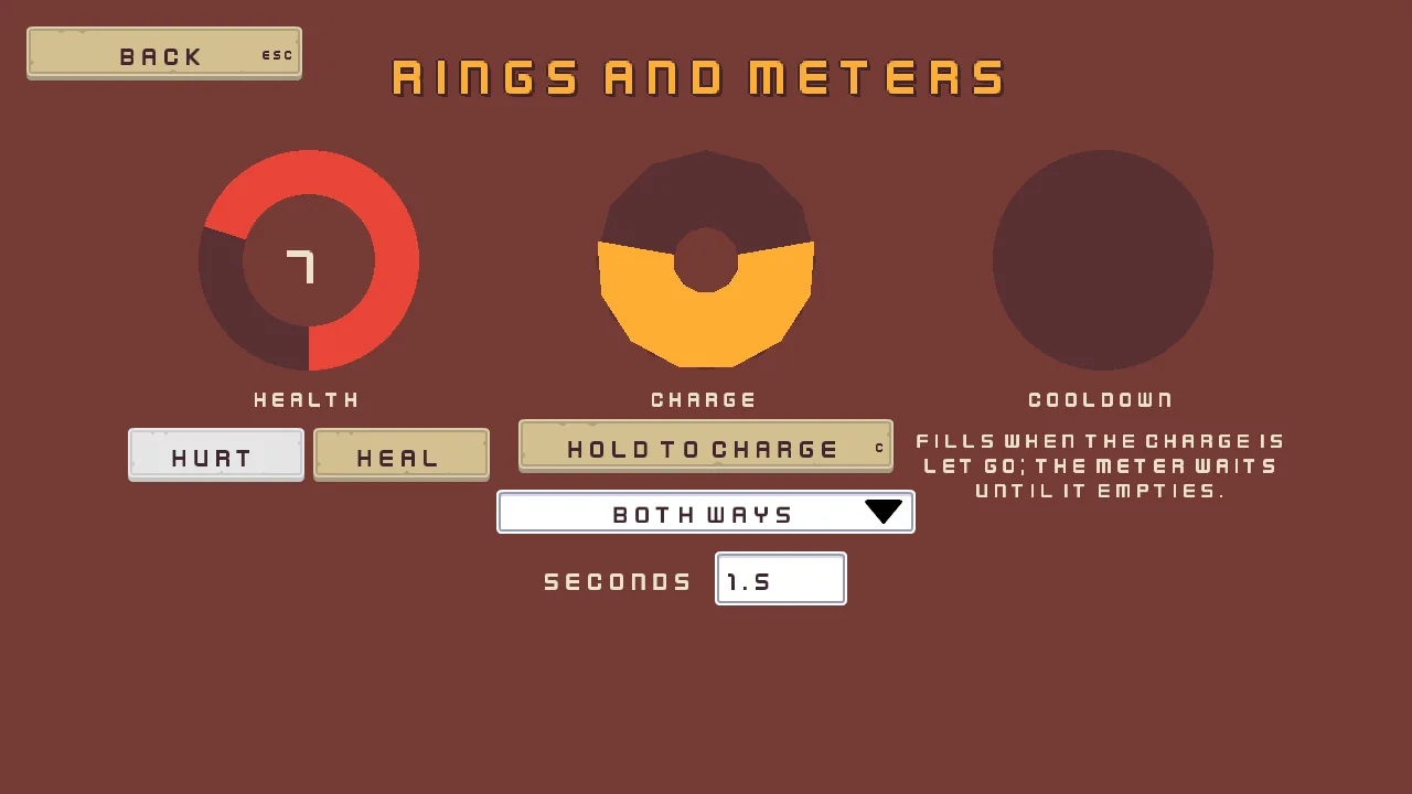
7 of 10. C held for most of a second: the meter fills both ways, a little over half of its 1.5 seconds.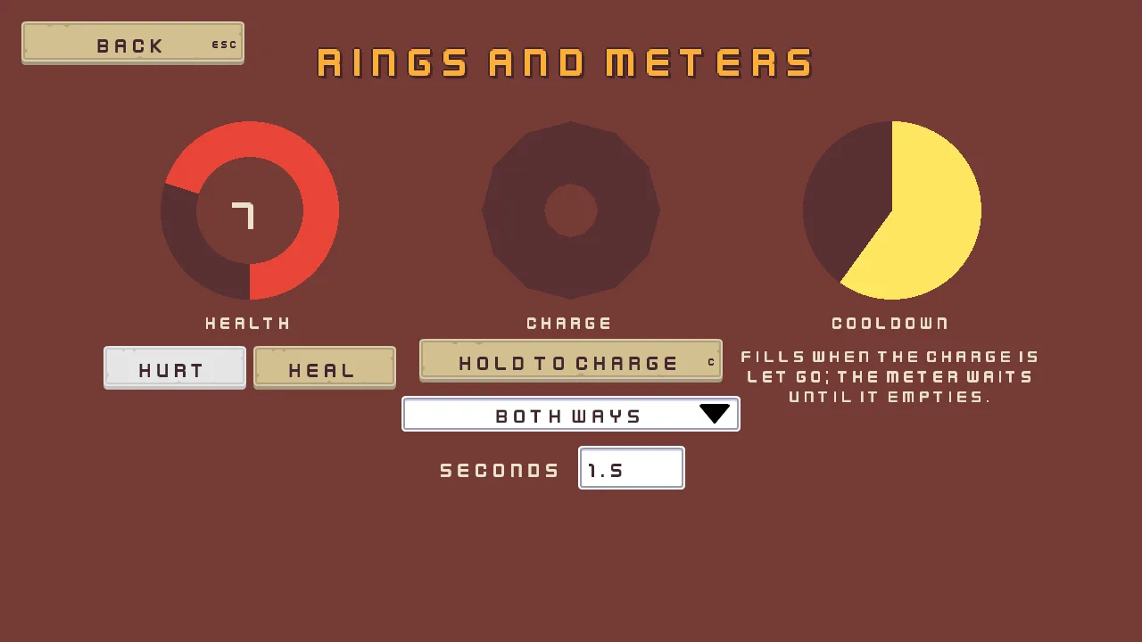
2 seconds, and while it runs the meter fills nothing.Rings and meters, in one table
| Node | Values | Why this value |
|---|---|---|
Rings, camera, rings_canvas, rings_name, back | Every screen’s, with Text Rings and meters and Key rings.name | The gallery’s frame. |
health_ring_track | A Node with a Rect, Anchor Min and Anchor Max 0.5, 0, Offset Min -460, 136, Offset Max -260, 336, Pivot 0.5, 0, and a Radial Progress, Start 90, Direction CounterClockwise, Inner Radius 0.6, Color 63, 38, 49, alpha 153 | The full ring, dim, behind the health. |
health_ring | A Rect as it comes; Radial Progress Start 90, Direction CounterClockwise, Inner Radius 0.6, Color 232, 69, 55, alpha 255; Text 10, Scale 1.5, Align Center; HealthRing, Most 10 | Red, from six o’clock, its number in a hole six tenths across. |
health_label | Anchor Min and Anchor Max 0.5, 0, Offset Min -530, 344, Offset Max -190, 376, Pivot 0.5, 0; Text Health, Scale 0.625, Align Center; Key rings.health | Under the ring. |
hurt, heal | A Button each, the gallery buttons’ faces: Anchor Min and Anchor Max 0.5, 0, Offset Min -524, 388 and -356, 388, Offset Max -364, 437 and -196, 437, Pivot 0.5, 0; Text Hurt and Heal, Action hurt and heal; Key rings.hurt and rings.heal | Side by side under the ring. |
charge_meter_track | A Node with a Rect, Anchor Min and Anchor Max 0.5, 0, Offset Min -100, 136, Offset Max 100, 336, Pivot 0.5, 0, and a Radial Progress, Start 90, Direction Both, Inner Radius 0.3, Segments 12, Color 63, 38, 49, alpha 153 | The meter’s track, twelve-sided. |
charge_meter | A Rect as it comes; Radial Progress Value 0, Start 90, Direction Both, Inner Radius 0.3, Segments 12, Color 254, 174, 52, alpha 255; Signal released to cooldown_pie; ChargeMeter, Seconds 1.5, Cooldown 2 | Empty until held; full in a second and a half. |
charge_label | Anchor Min and Anchor Max 0.5, 0, Offset Min -170, 344, Offset Max 170, 376, Pivot 0.5, 0; Text Charge, Scale 0.625, Align Center; Key rings.charge | Under the meter. |
charge | A Menu Button, the gallery buttons’ faces: Anchor Min and Anchor Max 0.5, 0, Offset Min -170, 380, Offset Max 170, 429, Pivot 0.5, 0; Text Hold to charge, Action charge; Shortcut Action charge; Key rings.hold | Held by the pointer, or by C through its Shortcut, which draws the key. |
direction | A Dropdown: Anchor Min and Anchor Max 0.5, 0, Offset Min -190, 444, Offset Max 190, 484, Pivot 0.5, 0; Texture input_rectangle.png, Border 8; Text Fills, Scale 0.75, Align Center; Action direction, Options Both ways, Clockwise, Anticlockwise, Item Height 40; Key rings.fills, Options rings.both, rings.clockwise, rings.anticlockwise | Wide enough for the French Des deux côtés. |
direction_arrow | Anchor Min and Anchor Max 1, 0.5, Offset Min -46, -11, Offset Max -12, 11, Pivot 1, 0.5; Texture icon_arrow_down_dark.png | The list’s arrow. |
charge_time | A Text Entry: Anchor Min and Anchor Max 0.5, 0, Offset Min 8, 500, Offset Max 128, 549, Pivot 0, 0; Texture input_rectangle.png, Border 8; Action charge_time, Text 1.5, Placeholder empty, Max Length 4, Mode Decimal, Padding 12, Scale 0.75, Caret Width 3 | A time with a point, four letters at most. |
charge_time_label | Anchor Max 0, 0, Offset Min -176, 0, Offset Max -16, 49, Pivot 0, 0; Text Seconds, Scale 0.75, Align Right; Key rings.seconds | The field’s word, at its left. |
cooldown_pie_track | A Node with a Rect, Anchor Min and Anchor Max 0.5, 0, Offset Min 260, 136, Offset Max 460, 336, Pivot 0.5, 0, and a Radial Progress, Color 63, 38, 49, alpha 153 | A full dim disc: no hole, from twelve o’clock. |
cooldown_pie | A Rect as it comes; Radial Progress Value 0, Color 254, 231, 97, alpha 255; CooldownPie, Seconds 2 | Empty until a release. |
cooldown_label, cooldown_after | Anchor Min and Anchor Max 0.5, 0, Offset Min 190, 344 and 190, 380, Offset Max 530, 376 and 530, 460, Pivot 0.5, 0; Text Cooldown and the sentence, Scale 0.625, Align Center, the sentence with Wrap; Key rings.cooldown and rings.after | The pie’s word, and what it does on three lines. |
The rings keep their own colours: Apply theme writes none of a Radial Progress’s. Every other colour came from it.
What it costs. 7 draws, as few as the gallery’s menu. A Radial Progress is plain colour, with no picture of its own, and Segments is how many triangles a full turn takes: 64 as it comes, 12 on the meter.
Key hints
What it is for. The controls shown in a corner of the screen, which the player may hide once they know them. Four hints, each a control whose Shortcut draws its key at its right edge, from the input map, in the game’s language: each lights while its key is held. Beside them, tick boxes hide them one by one, and the hints close up. It joins a Stack that gives each child its own Layout Element’s height, a Shortcut’s label, a Focus that keeps both the ring and the pointer out of a subtree, and tick boxes, one of them off.
- Start the screen as every screen starts: the scene
gallery_hints.ron, the rootHints, the canvashints_canvas, and the namehints_name, its TextKey hintsand its Keyhints.name. - Select
hints_canvas, add a Panel and rename ithint_panel. In its Rect, set Anchor Max to0,0, Offset Min to340,136, Offset Max to780,408and Pivot to0,0. In its Panel, set Texture topanel_brown.pngand Border to8. - Select
hint_panel, add a Stack and rename ithint_rows. Its Rect stays as it comes, filling the plate. In its Stack, set Fit to Elements, Spacing to12, Padding to20and Item to49, which Elements leaves unread. - Give
hint_rowsa FocusComponent: Mode None, Subtree Focus Deny and Subtree Pointer Deny.
- Subtree Pointer
- Whether the pointer may reach the controls under this node:
Inherit, as it comes, takes the answer from the nearest ancestor that says;Denymakes the subtree invisible to the pointer, so a click or a hover goes through it to whatever is behind;Allowlets it back in under aDeny.hint_rowstakesDeny, as its Subtree Focus isDeny: the hints say which keys do what, and are not the way to do it, so neither the ring nor a click lands on them.
- Select
hint_rows, click + Add node and choose Menu Button. Rename ithint_bag. Its Rect stays as it comes: the Stack places it. Give it the gallery buttons’ faces, TextOpen the bagand Actionbag, and set its Shortcut’s Action tobagtoo, the input map’s, on B. Its Show Label stays ticked. - Add a LocalizedTextComponent with Key
hints.bag, and a LayoutElement with Min49and Preferred49. Flexible stays0.
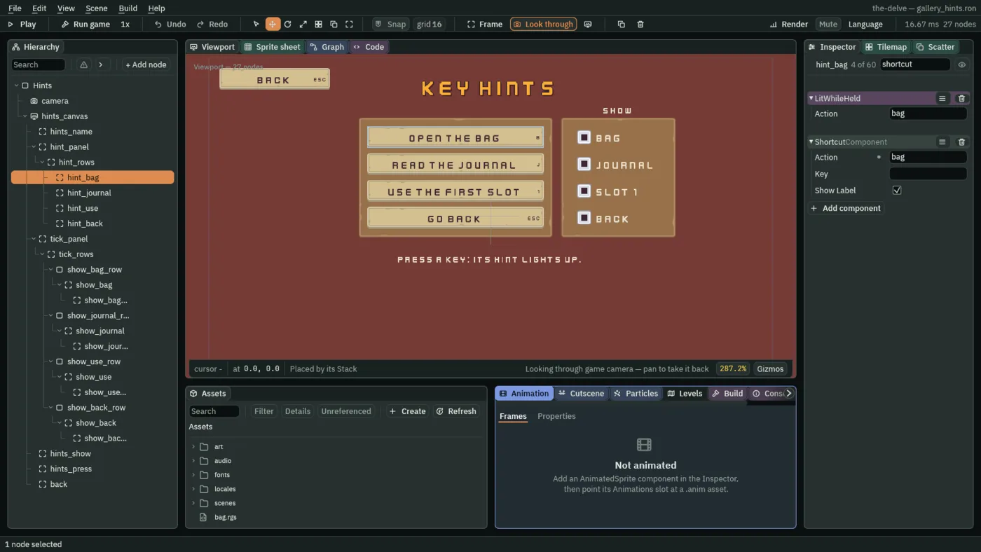
- Preferred
- A Layout Element’s Preferred: the length its node asks for along a Stack’s axis, in UI units, which a Stack with Fit Elements gives it when there is room. A new Layout Element’s is
48. The hints take49, a button’s height, with Min49too, so none is ever squeezed. A hidden child asks for nothing, so the Stack closes the gap it leaves. - Key
- A Shortcut’s Key: a key named by itself, such as
Ctrl+KeyS, which presses the control and is never rebound. Empty, as it comes, the Shortcut uses its Action’s keys instead, from the input map, and a rebind moves them. The hints leave it empty and name actions. The level select’s tiles nameDigit1toDigit6here: a level’s number key is not the player’s to rebind. - Show Label
- Whether the control draws its key inside its right edge, at half the size of its words: the input map’s first keyboard key for its Action, named as a
key.key of the string tables renames it, or its Key. Ticked, as it comes: the hints draw B, J, 1 and Esc, and Échap in French. The level tiles untick it, as their number is already their word.
A hint lights while its key is held. The script reads the action its Shortcut names, so a key rebound in the input map lights it too.
- Create the script
lit_while_heldand replace everything in it with the script below. Givehint_baga LitWhileHeld: its Actionbag, Lit and Plain, as the script gives them.
/// A key hint, lit while its key is held: the input map's action its Shortcut
/// names, so a rebound key lights it too.
component LitWhileHeld {
    /// The action its Shortcut names.
    action: String = "bag",
    /// The tint its face is drawn in while the key is down: the coin's light
    /// gold.
    #[color]
    lit: Vec4 = vec4(0.99, 0.8, 0.12, 1.0),
    /// The tint its face is drawn in otherwise: white, which leaves the face
    /// its own colours.
    #[color]
    plain: Vec4 = vec4(1.0, 1.0, 1.0, 1.0),

    fn loop() {
        // A button's face is drawn in its Normal tint, since no pointer
        // reaches a hint.
        if held(action) {
            set_colour("ButtonComponent", "normal", lit);
        } else {
            set_colour("ButtonComponent", "normal", plain);
        }
    }
}
held(action) is true on every step the action’s key is held down, B for the bag, and the hint’s face takes its Lit gold for as long. No pointer reaches the hints, so their faces are always drawn in their Normal tint, which the script sets.
- Create the script
shown_by_tickand replace everything in it with the script below. Givehint_baga ShownByTick, its Tickshow_bag, as the script gives it.
/// A key hint, shown while its tick box beside the hints is ticked. A hidden
/// hint takes no room in the hints' Stack, so the ones under it move up.
component ShownByTick {
    /// The tick box's action, which answers 1 while the box is ticked.
    tick: String = "show_bag",

    fn loop() {
        if amount(tick) == 1.0 {
            show();
        } else {
            hide();
        }
    }
}
amount(tick) is 1 while the box is ticked and 0 while it is not, from the step it flips by a click, or by Enter or a pad’s South while it holds the focus.
- Select
hint_bagand press Ctrl+D three times. Rename the copieshint_journal,hint_useandhint_back, and give each its Text, Action, Shortcut Action, Key, LitWhileHeld Action and ShownByTick Tick from the table below.
| Hint | Text | Its action, on Button, Shortcut and LitWhileHeld | Key | Tick |
|---|---|---|---|---|
hint_bag | Open the bag | bag | hints.bag | show_bag |
hint_journal | Read the journal | journal | hints.journal | show_journal |
hint_use | Use the first slot | use_1 | hints.use | show_use |
hint_back | Go back | ui_cancel | hints.back | show_back |
The tick boxes
- Select
hints_canvas, add a Panel and rename ittick_panel: Anchor Max0,0, Offset Min800,136, Offset Max1060,408, Pivot0,0; Texturepanel_brown.png, Border8. - Select
tick_panel, add a Stack and rename ittick_rows: Fit Fixed, Spacing12, Padding20, Item49, so each row lines up with its hint. - Select
tick_rows, click + Add node and choose Node. Rename itshow_bag_row: a plain node in the Stack, as the settings screen’s rows are. - Select
show_bag_row, add a Toggle and rename itshow_bag. Remove its Text with the bin at the right of its TextComponent header. In its Rect, set Anchor Min and Anchor Max both to0,0.5, Offset Min to16,-16, Offset Max to48,16and Pivot to0,0.5: the box,32square. Set its Panel’s Texture tocheck_square_grey.png. - In its Toggle, set Action to
show_bag, tick On, and set Check Inset to9. Leave On Texture empty: the mark is drawn inside the box. - Select
show_bag, add a Localized Label and rename itshow_bag_label: Anchor Max0,0, Offset Min44,-8, Offset Max232,40, Pivot0,0; TextBag, Scale0.75; Keyhints.show_bag. - Select
show_bag_rowand press Ctrl+D three times. Rename the copiesshow_journal_row,show_use_rowandshow_back_row, and their children to match:show_journalandshow_journal_label, and so on. Give each box its Action,show_journal,show_useandshow_back, and each label its Text,Journal,Slot 1andBack, and its Key,hints.show_journal,hints.show_useandhints.show_back. - Select
show_backand tick its Toggle’s Disabled: the way back is always shown. - Select
hints_canvas, add a Localized Label and rename ithints_show: Anchor Max0,0, Offset Min800,104, Offset Max1060,132, Pivot0,0; TextShow, Scale0.625, Align Center; Keyhints.show. It goes over the boxes’ plate. - Select
hints_canvas, add a Localized Label and rename ithints_press: Anchor Max0,0, Offset Min140,440, Offset Max1140,472, Pivot0,0; TextPress a key: its hint lights up., Scale0.625, Align Center; Keyhints.press. - Last, drag
backontohints_canvas, select it, press Apply theme, and press Ctrl+S.
- Disabled
- A Toggle’s Disabled: whether the box is off. An off box does not flip, by a click, a key or a pad, is drawn greyed, and the ring passes it by; it keeps its On. A new Toggle is on.
show_backis off and ticked: the Back hint can never be hidden, and the box says so. - Check Inset
- How far inside the box’s edge the mark of a Toggle with no On Texture is drawn, in UI units, in its Check colour. A new Toggle’s is
6. The boxes take9: the box is32square, so the mark is a square of14in its middle, as a lamp is lit.
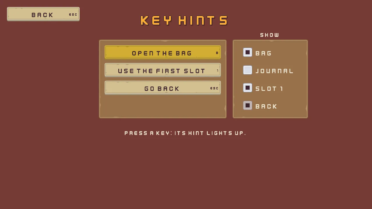
The key hints, in one table
| Node | Values | Why this value |
|---|---|---|
Hints, camera, hints_canvas, hints_name, back | Every screen’s, with Text Key hints and Key hints.name | The gallery’s frame. |
hint_panel | Anchor Max 0, 0, Offset Min 340, 136, Offset Max 780, 408, Pivot 0, 0; Texture panel_brown.png, Border 8 | Four hints of 49, three gaps of 12 and 20 above and below. |
hint_rows | A Stack: Fit Elements, Spacing 12, Padding 20, Item 49; Focus Mode None, Subtree Focus Deny, Subtree Pointer Deny | Each hint its own height; neither the ring nor a click reaches them. |
hint_bag, hint_journal, hint_use, hint_back | A Menu Button each, the gallery buttons’ faces; Text, Action and Shortcut Action in the table above; Key its own; Layout Element Min 49, Preferred 49; LitWhileHeld, Action its own; ShownByTick, Tick its own | A button only for the key it draws. |
hints_show | Anchor Max 0, 0, Offset Min 800, 104, Offset Max 1060, 132, Pivot 0, 0; Text Show, Scale 0.625, Align Center; Key hints.show | Over the boxes. |
tick_panel | Anchor Max 0, 0, Offset Min 800, 136, Offset Max 1060, 408, Pivot 0, 0; Texture panel_brown.png, Border 8 | Beside the hints, as tall, wide enough for Afficher and Journal. |
tick_rows | A Stack: Fit Fixed, Spacing 12, Padding 20, Item 49 | Rows level with the hints. |
show_bag_row, show_journal_row, show_use_row, show_back_row | A Node each, with nothing on it | A row the Stack places, holding its box. |
show_bag, show_journal, show_use, show_back | A Toggle without its Text: Anchor Min and Anchor Max 0, 0.5, Offset Min 16, -16, Offset Max 48, 16, Pivot 0, 0.5; Texture check_square_grey.png; Action its own name, On ticked, Check Inset 9; show_back Disabled | The grey box at its own size, its mark drawn inset. |
show_bag_label, show_journal_label, show_use_label, show_back_label | Anchor Max 0, 0, Offset Min 44, -8, Offset Max 232, 40, Pivot 0, 0; Text Bag, Journal, Slot 1 and Back, Scale 0.75; Key hints.show_ and its name | The box’s word, at its right. |
hints_press | Anchor Max 0, 0, Offset Min 140, 440, Offset Max 1140, 472, Pivot 0, 0; Text Press a key: its hint lights up., Scale 0.625, Align Center; Key hints.press | What to do, under it all. |
Every colour came from Apply theme, the boxes’ plum mark among them.
What it costs. 8 draws: the plates, the hints’ faces, the boxes and the words, with the keys drawn as words.
Quitting
What it is for. Asking before the game is left with work unsaved: a level editor, a character sheet, a page of notes. A notes page with a Game menu of Save and Quit, and over it the question its Quit asks, with three answers: Save, Don’t save and Cancel. While it is up the page behind it is dimmed and takes no input, and Save is off until the notes hold something unsaved. It joins a Canvas Group that makes a subtree inert, another that ignores the groups above it, a Modal whose first answer is off, a Pop-up Menu with a wider rule, and a field that starts with words in it.
- Start the screen as every screen starts: the scene
gallery_quit.ron, the rootQuit, the canvasquit_canvas, and the namequit_name, its TextQuittingand its Keyquit.name. - Select
quit_canvas, click + Add node and choose Fade Group. Rename itquit_page. Its Rect stays as it comes, filling the canvas. Dragquit_nameonto it: the page holds everything on the screen. - In its Canvas Group, set Alpha to
0.45and untick Interactable: the page opens dimmed and inert, on the question.
- Interactable
- A Canvas Group’s Interactable: whether the controls under it answer at all. Unticked, nothing in the subtree answers a click or takes the ring, and the subtree is drawn as it is, so Alpha dims it to show it. A new group’s is ticked.
quit_pageunticks it as the question opens, at Alpha0.45, and its script ticks it again, at1, when the question is answered with Cancel.
The notes page
- Select
quit_page, add a Panel and rename itnotes_plate. In its Rect, set Anchor Min and Anchor Max both to0.5,0.5, Offset Min to-320,-200and Offset Max to320,60. In its Panel, set Texture topanel_brown.pngand Border to8. - Select
notes_plate, add a Localized Label and rename itnotes_title, the bag’s title again: Anchor Max1,0, Offset Min16,0, Offset Max-16,36, Pivot0.5,0; TextNotes, Scale0.75, Outline63,38,49, alpha255, Outline Width1; role Accent; Keyquit.notes. - Select
notes_plate, add a Button and rename itgame_menu: Anchor Max0,0, Offset Min40,56, Offset Max200,105, Pivot0,0; the gallery buttons’ faces, TextGame, Actiongame_menu. Add a LocalizedTextComponent with Keyquit.gameand two Options,quit.saveandquit.quit: the menu’s rows. - Click Add component and choose PopupMenuComponent, as chapter 9’s slot menus. Under Items, add three rows: Label
Save, Actiongame_save, ShortcutKeyS; a row with Separator ticked and Enabled unticked; and LabelQuit, Actiongame_quit, ShortcutKeyQ. Enabled stays ticked on both. - Set Opens to
game_menu, so the Game button opens it, Width to240, Item Height to30, Separator Height to16, Shortcut Width to24and Scale to0.625. Set Texture topanel_beigeLight.png, Border to8and Padding to8,8. The colours come from Apply theme.
- Separator Height
- A Pop-up Menu’s Separator Height: how tall a separator row is, in UI units. A new menu’s is
9, as the bag’s menus keep it. The Game menu’s is16, a wider gap between Save and Quit, so Quit stands apart from the row a player means to press.
- Select
notes_plate, click + Add node and choose Text Entry. Rename itnotes: Anchor Max0,0, Offset Min40,132, Offset Max600,181, Pivot0,0; Textureinput_rectangle.png, Border8. - In its Text Entry, set Action to
notes, Text toThe shrine heals., Placeholder toWrite a note, Padding to12, Scale to0.625and Caret Width to3. Add a LocalizedTextComponent with Placeholderquit.notes_prompt. - Create the script
notesand replace everything in it with the script below. Givenotesa Notes.
- Text
- A Text Entry’s Text: the words in the field, which the field opens with, the player edits, and a script reads with
enteredor writes withset_text. Empty, as it comes, the field shows its Placeholder instead. The notes open onThe shrine heals.; the shop’s quantity on1; the rings’ Seconds on1.5.
/// The notes field: it opens on the notes last saved, even empty ones, and
/// saves what it holds when the Game menu's Save or the quit question's Save
/// is pressed. It keeps notes_changed as 1 while it holds words it has not
/// saved, which the quit question reads.
component Notes {
    /// The words last saved, or, until the notes are first saved, the words
    /// the field is made with.
    #[hidden]
    last_saved: String = "",
    /// Whether last_saved holds them yet.
    #[hidden]
    known: bool = false,

    fn on_create() {
        // gallery_notes_saved is 1 once the notes have been saved, so notes
        // saved empty open empty. Until then the field keeps the words it
        // was made with.
        if saved_number("gallery_notes_saved", 0.0) == 1.0 {
            last_saved = saved_text("gallery_notes", "");
            known = true;
            set_text("TextEntryComponent", "text", last_saved);
        }
    }

    fn loop() {
        // entered() reads the field's words as the step began.
        let words = entered("notes");
        if !known {
            last_saved = words;
            known = true;
        }
        // The Game menu's Save, by a click on its row or S while the menu is
        // open, presses game_save, and the quit question's Save presses
        // save_quit, on the game's next step.
        if pressed("game_save") || pressed("save_quit") {
            save_text("gallery_notes", words);
            save_number("gallery_notes_saved", 1.0);
            last_saved = words;
        }
        if words == last_saved {
            keep_number("notes_changed", 0.0);
        } else {
            keep_number("notes_changed", 1.0);
        }
    }
}
entered("notes") is the field’s words as the step began. pressed("game_save") is true for one step after the Game menu’s Save is chosen, by a click on its row or S while the menu is open; pressed("save_quit") after the question’s Save is clicked, or chosen by the arrows and Enter. Each saves the notes with save_text.
The question
- Select
quit_page, click + Add node and choose Modal. Rename itquit_question. In its Rect, set Anchor Min and Anchor Max both to0.5,0.5, Offset Min to-480,50and Offset Max to480,250: over the page’s foot. In its Panel, set Texture topanel_beige.pngand Border to8, the dialogs’ plate. - In its Modal, set Title to
Quit the game?and Body toYour notes have not changed.Under Buttons, make three: LabelSave, Actionsave_quit, Disabled ticked; LabelDon't save, Actionquit_unsaved; and LabelCancel, Actioncancel_quit. Set Cancel Action tocancel_quit, so Esc answers Cancel. - Under Colors, set Scrim to
63,38,49, alpha0: no scrim, as the page dims itself. Under Answers, set Button Texture tobuttonLong_beige.png, Button Hovered Texture tobuttonLong_grey.png, Button Pressed Texture tobuttonLong_beige_pressed.pngand Button Border to8. Under Layout, set Padding to20, Scale to0.625, Title Height to36, Button Height to49and Button Gap to16, as chapter 9’s questions. - Click Add component and choose CanvasGroupComponent, and tick its Ignore Parent Groups.
- Add a LocalizedTextComponent with Key
quit.title, Bodyquit.unchangedand three Options,quit.save,quit.dont_saveandquit.cancel: the title, the question and the answers. Add an AudioSourceComponent, Positional unticked, with the triggerbackonaudio/back_001.ogg. - Create the scripts
quit_questionandquit_pageand replace everything in each with its script below. Givequit_questiona QuitQuestion, andquit_pagea QuitPage, Dimmed0.45. - Last, drag
backontoquit_page, not the canvas: Back is on the page, and dims with it. Selectquit_canvas, press Apply theme, and press Ctrl+S.
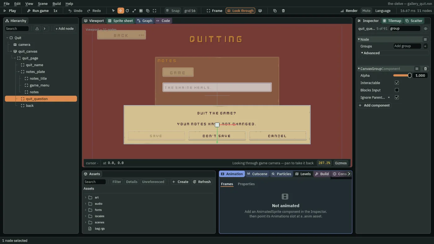
- Ignore Parent Groups
- Whether a Canvas Group ignores every group above it, their Alpha and their Interactable alike, and answers only to its own. A new group’s is unticked. The question ticks it: it is inside
quit_page, which is at0.45and inert, and it is drawn whole and answers all the same. - Disabled
- A Modal answer’s Disabled: whether that answer is off. An off answer is drawn with its word at half strength, and a click on it does nothing. Each answer has its own, under Buttons; the dialog has none of its own. Save starts off: nothing is changed as the screen opens.
/// The question asked before the game is left: Save keeps the notes and
/// leaves, Don't save leaves without them, and Cancel, or Escape, stays.
/// While the notes hold nothing that is not saved, Save is off and the
/// question says so. In the gallery, leaving goes back to the gallery.
component QuitQuestion {
    fn loop() {
        // The Game menu's Quit, by a click on its row or Q while the menu is
        // open, presses game_quit. The question is up as the screen opens,
        // with Save off, as the scene makes it: nothing is changed yet.
        if pressed("game_quit") {
            // The notes field keeps notes_changed as 1 while it holds words
            // it has not saved.
            let changed = kept_number("notes_changed", 0.0) == 1.0;
            // The answers count from 0, left to right: Save is the first.
            set_flag("ModalComponent", "buttons.0.disabled", !changed);
            // The Localized Text beside this script writes the question in
            // the game's language, from its body's key.
            if changed {
                set_text("LocalizedTextComponent", "body", "quit.body");
            } else {
                set_text("LocalizedTextComponent", "body", "quit.unchanged");
            }
            show();
        }
        // A click on an answer, or Enter on the one the arrows chose, presses
        // its action; Escape presses the Cancel Action, cancel_quit.
        if pressed("cancel_quit") {
            hide();
        }
        // The notes field saves the notes when save_quit is pressed.
        if pressed("save_quit") {
            play_sound("back");
            change_scene("gallery");
        }
        if pressed("quit_unsaved") {
            play_sound("back");
            change_scene("gallery");
        }
    }
}
pressed("game_quit") is true for one step after the Game menu’s Quit is chosen, by a click on its row or Q while the menu is open. pressed("cancel_quit") is true after Cancel is clicked or chosen, and after Esc or a pad’s East, through the Cancel Action; pressed("save_quit") and pressed("quit_unsaved") after Save and Don’t save.
/// The notes page behind the quit question: dimmed and inert while the
/// question is up, and lit and live again once Cancel answers it.
component QuitPage {
    /// How strongly the page is drawn while the question is up, 0 to 1.
    dimmed: f32 = 0.45,

    fn loop() {
        // Cancel, or Escape through the question's Cancel Action, presses
        // cancel_quit on the game's next step.
        if pressed("cancel_quit") {
            set_number("CanvasGroupComponent", "alpha", 1.0);
            set_flag("CanvasGroupComponent", "interactable", true);
        }
        // The Game menu's Quit, by a click on its row or Q while the menu is
        // open, presses game_quit.
        if pressed("game_quit") {
            set_number("CanvasGroupComponent", "alpha", dimmed);
            set_flag("CanvasGroupComponent", "interactable", false);
        }
    }
}
pressed("cancel_quit") and pressed("game_quit") are the question’s: the page lights up and comes alive when the question is cancelled, and dims and goes inert when the Game menu asks it again.
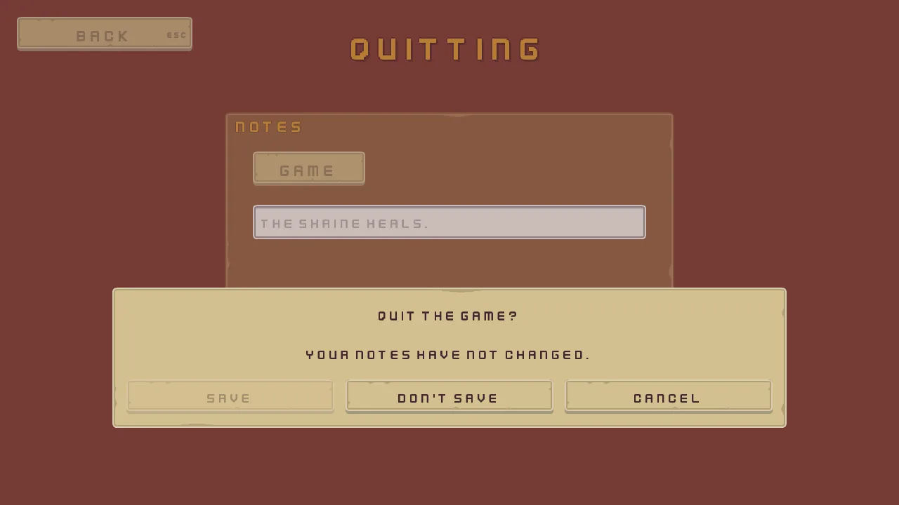
Press Cancel, or Esc: the page lights up and takes input again. Type into the notes, choose Game, then Quit, and the question comes back with Save live, saying Your notes are not saved yet.
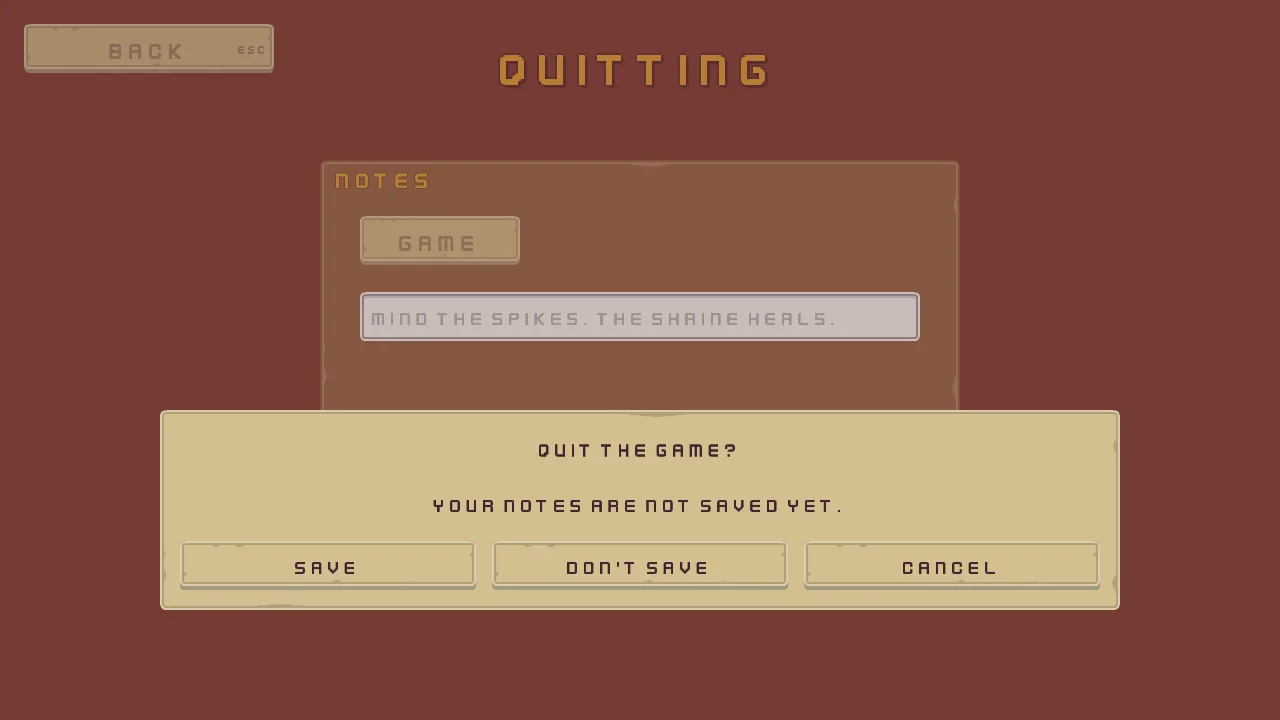
Save keeps the notes and goes back to the gallery, and the page opens on them the next time; Don’t save goes back keeping nothing.
Quitting, in one table
| Node | Values | Why this value |
|---|---|---|
Quit, camera, quit_canvas, quit_name, back | Every screen’s, with Text Quitting and Key quit.name; quit_name and back under quit_page | The gallery’s frame, on the page. |
quit_page | A Fade Group: Alpha 0.45, Interactable unticked; QuitPage, Dimmed 0.45 | Opens dimmed and inert, under the question. |
notes_plate | Anchor Min and Anchor Max 0.5, 0.5, Offset Min -320, -200, Offset Max 320, 60; Texture panel_brown.png, Border 8 | The page’s plate, above the middle. |
notes_title | Anchor Max 1, 0, Offset Min 16, 0, Offset Max -16, 36, Pivot 0.5, 0; Text Notes, Scale 0.75, Outline 63, 38, 49, alpha 255, Outline Width 1; role Accent; Key quit.notes | The bag’s title. |
game_menu | A Button: Anchor Max 0, 0, Offset Min 40, 56, Offset Max 200, 105, Pivot 0, 0; the gallery buttons’ faces, Text Game, Action game_menu; Key quit.game, Options quit.save, quit.quit; Pop-up Menu Items Save on game_save and KeyS, a separator, Quit on game_quit and KeyQ, Opens game_menu, Width 240, Item Height 30, Separator Height 16, Shortcut Width 24, Scale 0.625, Texture panel_beigeLight.png, Border 8, Padding 8, 8 | A menu the button opens, Quit set apart. |
notes | A Text Entry: Anchor Max 0, 0, Offset Min 40, 132, Offset Max 600, 181, Pivot 0, 0; Texture input_rectangle.png, Border 8; Action notes, Text The shrine heals., Placeholder Write a note, Padding 12, Scale 0.625, Caret Width 3; Localized Placeholder quit.notes_prompt; Notes | A field that opens with a note in it. |
quit_question | A Modal: Anchor Min and Anchor Max 0.5, 0.5, Offset Min -480, 50, Offset Max 480, 250; Texture panel_beige.png, Border 8; Title Quit the game?, Body Your notes have not changed., Buttons Save on save_quit and Disabled, Don’t save on quit_unsaved, Cancel on cancel_quit; Cancel Action cancel_quit; Scrim 63, 38, 49, alpha 0; the three answer textures, Button Border 8; Padding 20, Scale 0.625, Title Height 36, Button Height 49, Button Gap 16; Canvas Group Ignore Parent Groups; Key quit.title, Body quit.unchanged, Options quit.save, quit.dont_save, quit.cancel; Audio Source, trigger back; QuitQuestion | Shown as the screen opens, whole and live inside the dimmed page. |
Every other colour came from Apply theme, the answers’ tints and the question’s words among them.
What it costs. 11 draws. The page under a group at 0.45 is still drawn, every picture of it, and the question over it: a dimmed page costs what a lit one does.
What each costs
Each recipe counted its own screen. Here they are together, as the player counts them for each picture: the draws a frame of the screen takes.
| Screen | Draws | Why |
|---|---|---|
| The gallery’s menu | 7 | A plate, the buttons’ beige and grey faces, and the words. |
| A shop | 18 | Many pictures side by side, and the window display in the room; 19 with a tooltip up. |
| A dialogue | 9 | The room’s sprites, the bars, the box, the buttons, the slider and the words; the name’s distance-field run is not counted. |
| A level select | 13 | Tiles, stars and padlocks next to each other, the bar’s two pictures, the field and the list; 14 with the ring round the secret level. |
| Rings and meters | 7 | The rings are plain colour, with no picture. |
| Key hints | 8 | Two plates, the hints’ faces, the boxes and the words. |
| Quitting | 11 | The dimmed page is drawn whole, and the question over it. |
A draw is a run of interface pictures that share a texture, drawn at once. A screen that changes picture between neighbours, a plate, then a face, then a word, then a face again, draws more; one that keeps to a few pictures draws less, whatever the number of nodes. When a screen draws too much on a phone, look first at how many different pictures sit next to each other.