Tutorials · Interfaces · Chapter 6
Settings
By the end
scenes/settings.ron: music and effects sliders, Show hints and Item names tick boxes, a Text size list, Back- Every choice saved with
save_numberand applied the next time the game opens - A Focus Ring round the focused control
On this page
A settings screen
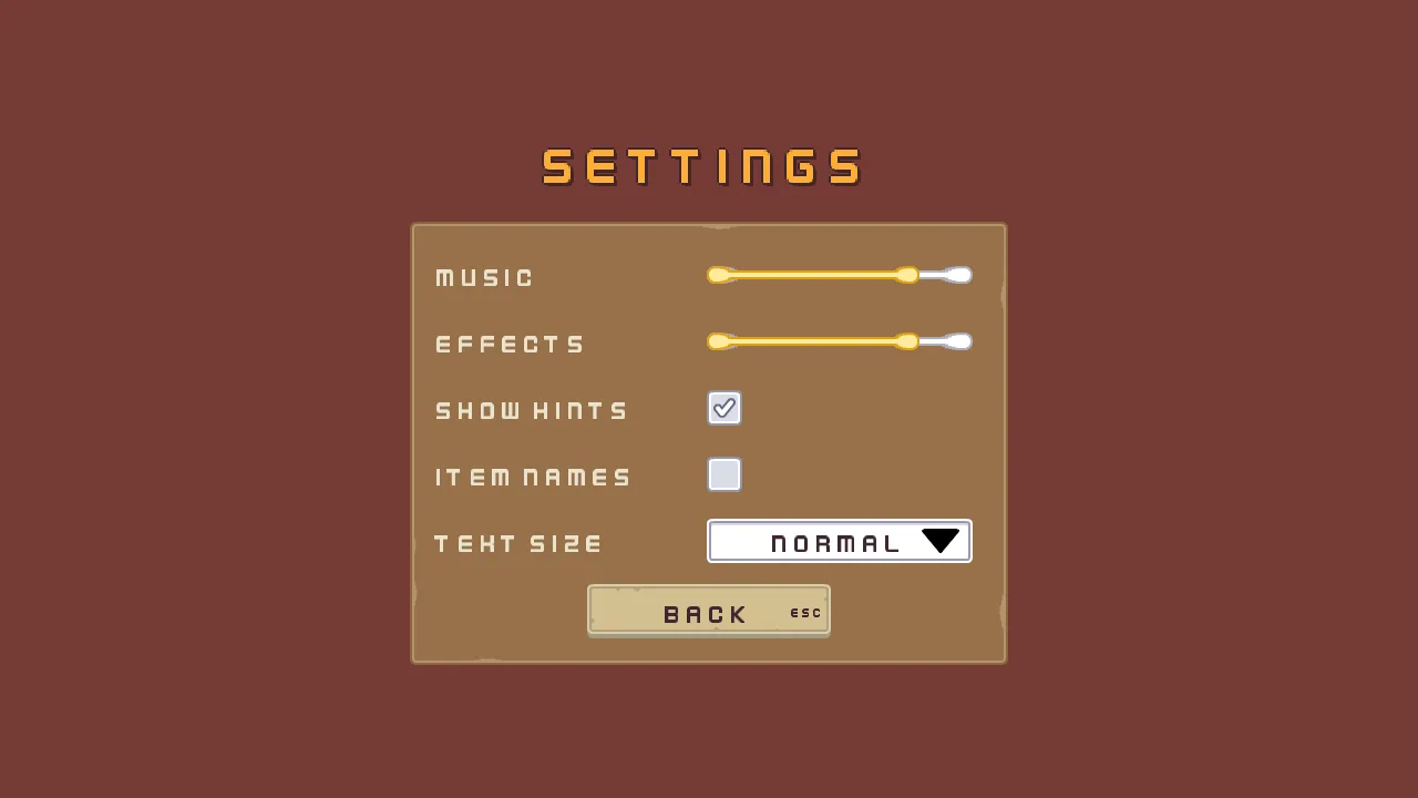
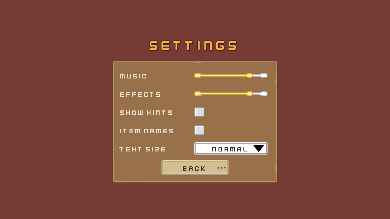
The settings screen is a scene of its own, which the title’s Settings button opens. It holds five rows, each a control with its name beside it, and a Back button. Here it is as it opens on a first launch, before the player has chosen anything: the defaults you are about to set.
- Copy the seven files below into your project, each to where the list says: the pictures into
art, and the music intoaudio. Then press Refresh in the Assets panel.
The screen starts as a copy of the title, which already has the camera, the palette and the name.
- Open
scenes/title.ronand choose File → Save as…. Save it asscenes/settings.ron. The editor now holds the copy. - In the Hierarchy, rename
TitletoSettings,title_canvastosettings_canvasandtitle_nametosettings_name. Selecttitle_fadeand press Delete: the menu stays on the title. - Select
settings_name. In its Rect, set Anchor Min and Anchor Max both to0.5,0.5, Offset Min to-360,-256, Offset Max to360,-176and Pivot to0.5,1. - In its Text, set Text to
Settings, Scale to1.5, Outline Width to2and Shadow Offset to3,3. Its Align stays Center, its outline and shadow colours as they are, and its role Accent. - Select
settings_canvas, click + Add node and choose Panel. Rename itsettings_frame. - In its Rect, set Anchor Min and Anchor Max both to
0.5,0.5, Offset Min to-270,-160and Offset Max to270,240. Pivot stays0.5,0.5. In its Panel, set Texture topanel_brown.pngand Border to8. - Select
settings_frame, click + Add node and choose Stack. Rename itsettings_rows. - In its Rect, set Anchor Max to
1,0, Offset Min to24,24, Offset Max to-24,312and Pivot to0.5,0. Anchor Min stays0,0. In its Stack, set Fit to Fixed and Spacing to12. Item stays48, which makes five rows of48and four gaps of12:288, the Stack’s height. - Select
settings_rows, click + Add node and choose Node. Rename itmusic_row. Add four more Nodes undersettings_rows, in this order:effects_row,hints_row,names_rowandsize_row. Each is a row492wide and48high, and each holds one control.
Two changes to the title make it open this screen, and give it its music.
- Open
scenes/title.ron. Selectsettingsand untick Disabled in its Button. - Select
Title, click Add component and choose AudioSourceComponent. Set Clip toabandoned_castle_music_-_starninjas_6.oggand Bus to Music. Tick Looping and Autoplay, and untick Positional.
Two sliders
The first two rows are sliders. A slider is chapter 2’s health bar with Interactive ticked, so the pointer and the keys can move it, and with an Action to say so.
- Open
scenes/settings.ron. Selectmusic_row, click + Add node and choose Slider. Rename itmusic. - In its Rect, set Anchor Min and Anchor Max both to
0,0.5, Offset Min to244,-8, Offset Max to484,8and Pivot to0,0.5. That is a bar240wide and16high,244in from the row’s left edge and centred up and down. - In its Slider, set Action to
music, Value to0.8and Step to0.1. Min stays0, Max1and Interactive ticked. Under Textures, set Fill Texture toslide_horizontal_color.png, Track Texture toslide_horizontal_grey.pngand Border to8. Fill and Track come from Apply theme. - Click Add component and choose FocusComponent. Its links come with the ring, below.
- Select
music, click + Add node and choose Label. Rename itmusic_label. - In its Rect, set Anchor Min and Anchor Max both to
0,0.5, Offset Min to-244,-24, Offset Max to-24,24and Pivot to0,0.5. It is a child of the slider and hangs to its left, the row’s label,220wide. In its Text, set Text toMusicand Scale to0.75. - Select
musicand press Ctrl+C. Right-clickeffects_rowand choose Paste as child. Rename the copyeffects, and its childeffects_label. Seteffects’s Action toeffectsandeffects_label’s Text toEffects.
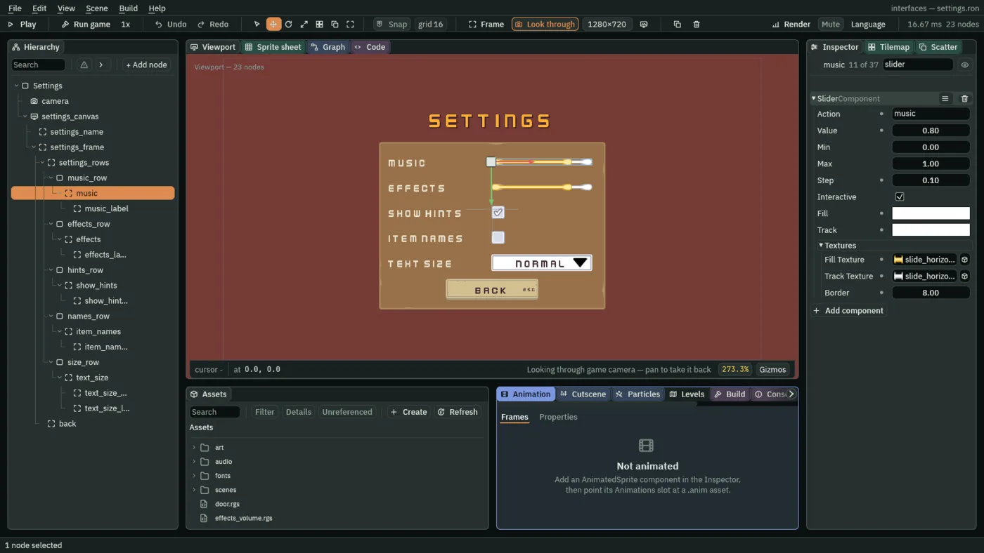
- Action
- A Slider’s Action: the action it fires as it moves. A script hears it with
pressed("music"), and reads where the slider stands withamount("music"), in the slider’s own range,0to1here. - Step
- The smallest amount a Slider’s value can change by, and how far one arrow press moves it.
0.1makes ten notches from one end to the other, and Left and Right move one.0allows any value, and the arrows then move it a twentieth of its range. A new Slider’s is0.
The Slider’s Value is where it opens, 0.8, which is also the volume a player who has never chosen one gets. Its other rows are chapter 2’s: Interactive ticked is what chapter 2 left unticked for the health bar.
The music volume
- In Assets, click Assets in the path bar over the tree, so the script is written at the project’s top, then press Create, choose New script, type
music_volume, and press Enter. - In the Code tab, replace everything in
music_volume.rgswith the script below, and press Ctrl+S.
/// The music slider, on the settings screen: it opens where the saved music
/// volume is, and each move the player makes sets the music's volume and
/// saves it.
component MusicVolume {
    fn on_create() {
        // Writing a slider moves it and presses nothing, so the screen opens
        // on the saved volume and saves nothing. 0.8 until the player has
        // chosen one.
        set_number("SliderComponent", "value", saved_number("music_volume", 0.8));
    }

    fn loop() {
        // A drag, a click on the bar, or Left and Right while it holds the
        // focus moves it, and presses music on that step; amount() answers
        // where it now is.
        if pressed("music") {
            let level = amount("music");
            set_music_volume(level);
            save_number("music_volume", level);
        }
    }
}
- Select
music, click Add component and choose MusicVolume.
pressed("music") is true on every step the slider’s value changes: a drag, a click on the bar, or Left and Right, or A and D, while it holds the focus. amount("music") is where it now stands, and it keeps that value between presses.
On create, the script sets the slider to the saved music volume, 0.8 until the player has chosen one. A script that writes a slider moves it and presses nothing, so opening the screen changes no volume and saves nothing. When the player moves it, the script sets the music bus to the new level and saves it for the next launch.
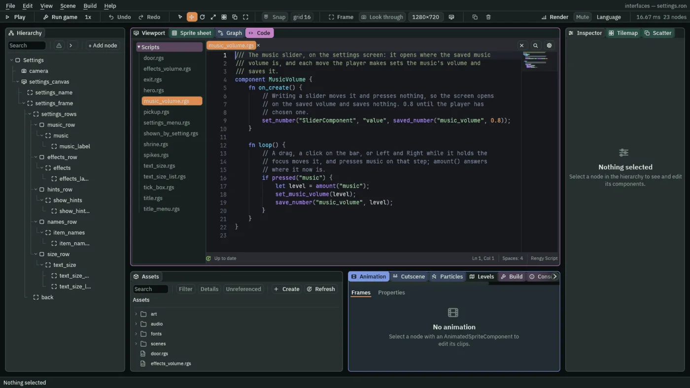
- set_number and saved_number
set_number("SliderComponent", "value", …)writes a number onto another component of this node, here the slider’s value.saved_number("music_volume", 0.8)reads a number saved on disk, or the second number if none was ever saved.- amount, set_music_volume and save_number
amount("music")is the slider’s value.set_music_volume(level)sets the music bus,0to1.save_number("music_volume", level)writes the number to disk, where it lasts from one launch to the next.
The effects volume
The effects slider does the same for the effects bus, and plays a click at the new volume, so the player hears how loud the game will be.
- In Assets, press Create, choose New script, type
effects_volume, and press Enter. - In the Code tab, replace everything in
effects_volume.rgswith the script below, and press Ctrl+S.
/// The effects slider, on the settings screen: it opens where the saved
/// effects volume is, and each move the player makes sets the effects' volume,
/// saves it, and plays a click at it, so the player hears how loud the game
/// will be. While it is dragged, the click plays no more than once every
/// sample_gap.
component EffectsVolume {
    /// The shortest time between two clicks while the slider moves.
    #[suffix("s")]
    sample_gap: f32 = 0.15,
    /// Seconds until the click may sound again.
    #[hidden]
    quiet: f32 = 0.0,

    fn on_create() {
        // Writing a slider moves it and presses nothing, so the screen opens
        // on the saved volume without a sound. 0.8 until the player has
        // chosen one.
        set_number("SliderComponent", "value", saved_number("effects_volume", 0.8));
    }

    fn loop(dt: f32) {
        // Counted here rather than waited out: a hook that waits hears
        // nothing, and the moves made meanwhile would go unset and unsaved.
        if quiet > 0.0 {
            quiet -= dt;
        }
        // A drag, a click on the bar, or Left and Right while it holds the
        // focus moves it, and presses effects on that step.
        if pressed("effects") {
            let level = amount("effects");
            set_sfx_volume(level);
            save_number("effects_volume", level);
            if quiet <= 0.0 {
                play_sound("click");
                quiet = sample_gap;
            }
        }
    }
}
- Select
effects, click Add component and choose EffectsVolume. Its Sample Gap starts at the script’s own0.15, and its Quiet is hidden at0: leave both. - Click Add component again and choose AudioSourceComponent. Untick Positional. In its Triggers, press the + beside it once, and set the entry’s Name to
clickand its Clip toclick_001.ogg.
pressed("effects") is true on every step the effects slider’s value changes, as the music’s is. A drag moves it on many steps a second, so the script counts a gap of 0.15 seconds between clicks and plays none in between, or the sound would be a buzz. play_sound and set_sfx_volume are the effects’ side of set_music_volume.
Tick boxes
A tick box is a Toggle: a box that flips between two states when it is pressed, and remembers which. Its box is a Panel, and its tick is the Panel’s other picture. There are two, Show hints and Item names, and each decides something in the delve.
- Select
hints_row, click + Add node and choose Toggle. Rename itshow_hints. - Remove its Text: press the bin at the right of its TextComponent header. The box has no word of its own; its name sits beside it.
- In its Rect, set Anchor Min and Anchor Max both to
0,0.5, Offset Min to244,-16, Offset Max to276,16and Pivot to0,0.5. That is a box32wide and32high. - In its Panel, set Texture to
check_square_grey.png. Border stays0. - In its Toggle, set Action to
show_hints, tick On, and set On Texture tocheck_square_grey_checkmark.png. The colours come from Apply theme. - Click Add component and choose FocusComponent.
- Select
show_hints, click + Add node and choose Label. Rename itshow_hints_label. Give its Rect and its Text the values ofmusic_label, with TextShow hints. - Select
show_hintsand press Ctrl+C. Right-clicknames_rowand choose Paste as child. Rename the copyitem_namesand its childitem_names_label. Setitem_names’s Action toitem_namesand untick its On, and setitem_names_label’s Text toItem names.
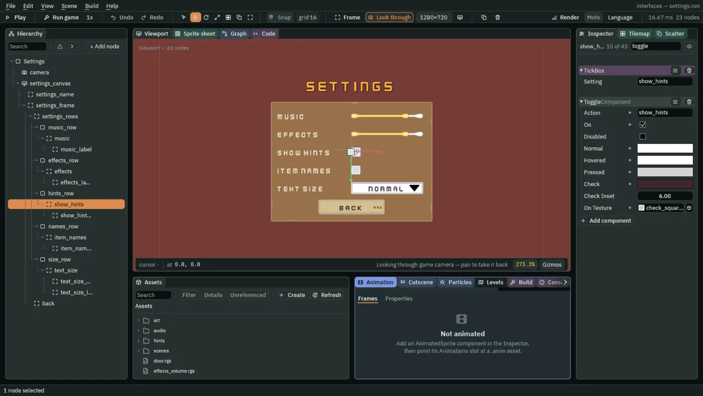
- Action
- A Toggle’s Action: the action it presses on the step it flips, here
show_hints. A script readsamount("show_hints"), which is1while it is ticked and0while it is not, from then on. - On
- Whether the box is ticked. It is saved with the scene, unlike a Button’s pressed look.
show_hintsopens ticked, anditem_namesnot, as a player who has chosen nothing finds them. - Normal, Hovered, Pressed
- A Toggle’s tints for its box, as a Button’s are: at rest, under the pointer or with the focus, and while held down. Apply theme writes them from the palette’s button colours:
255,255,255at rest and lit, and211,211,211held. - Check
- The colour of the mark drawn inside the box when it is on. Apply theme writes the palette’s Button Text, the plum
63,38,49. A Toggle that has an On Texture draws that and no mark, so here Check is set and not seen. - On Texture
- The picture drawn instead of the Panel’s, and instead of the mark, while the box is on: the same box with a tick in it,
check_square_grey_checkmark.png. Empty, the box draws the mark in Check, inset by Check Inset, which stays6.
A tick box that keeps its setting
- In Assets, press Create, choose New script, type
tick_box, and press Enter. - In the Code tab, replace everything in
tick_box.rgswith the script below, and press Ctrl+S.
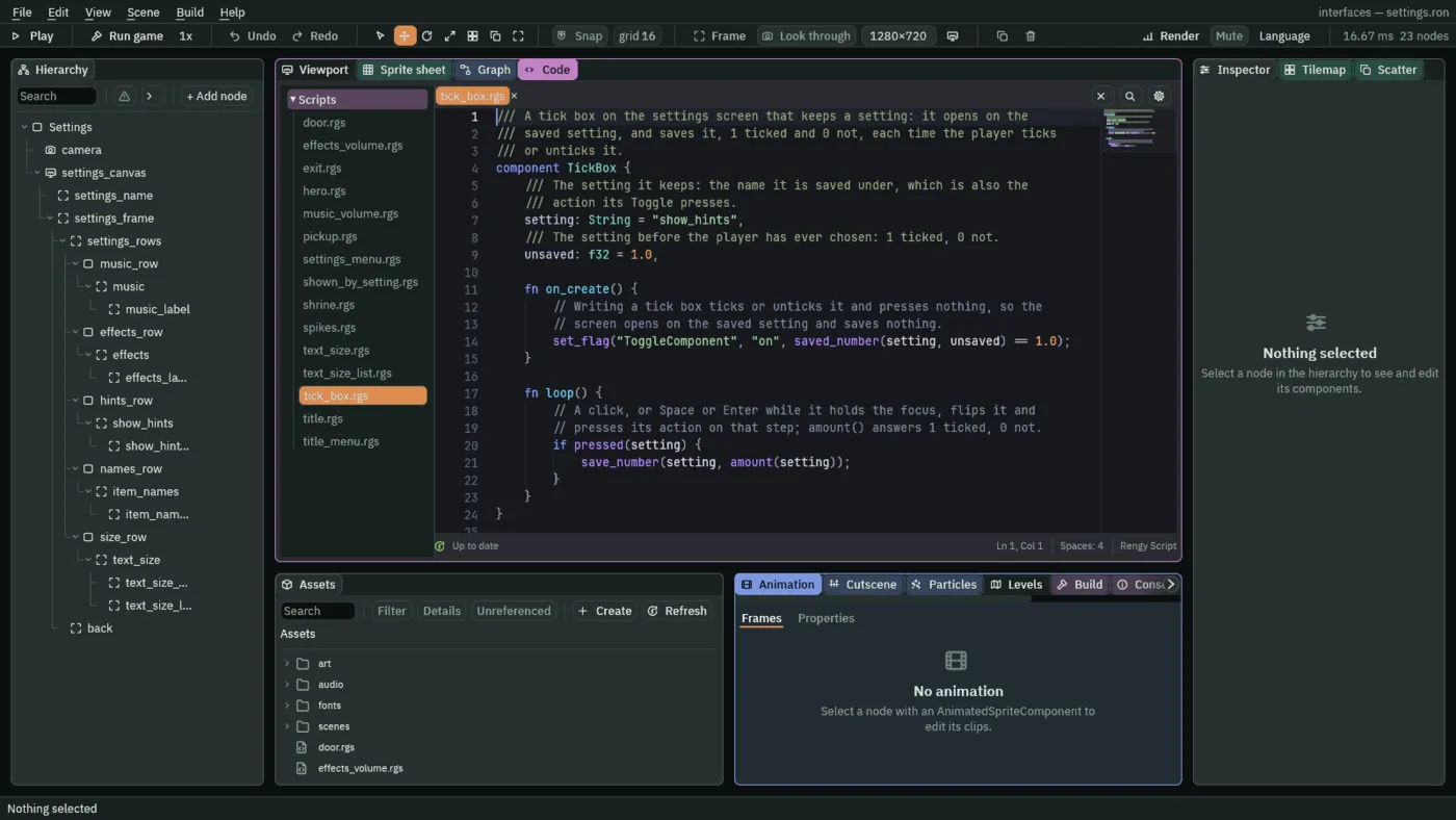
/// A tick box on the settings screen that keeps a setting: it opens on the
/// saved setting, and saves it, 1 ticked and 0 not, each time the player ticks
/// or unticks it.
component TickBox {
    /// The setting it keeps: the name it is saved under, which is also the
    /// action its Toggle presses.
    setting: String = "show_hints",
    /// The setting before the player has ever chosen: 1 ticked, 0 not.
    unsaved: f32 = 1.0,

    fn on_create() {
        // Writing a tick box ticks or unticks it and presses nothing, so the
        // screen opens on the saved setting and saves nothing.
        set_flag("ToggleComponent", "on", saved_number(setting, unsaved) == 1.0);
    }

    fn loop() {
        // A click, or Space or Enter while it holds the focus, flips it and
        // presses its action on that step; amount() answers 1 ticked, 0 not.
        if pressed(setting) {
            save_number(setting, amount(setting));
        }
    }
}
- Select
show_hints, click Add component and choose TickBox. Its Setting isshow_hintsand its Unsaved1, as the script starts: leave both. - Select
item_names, click Add component and choose TickBox. Set its Setting toitem_namesand its Unsaved to0.
pressed(setting) is true on the step the box flips: a click let go on it, or Enter or Space while it holds the focus. amount(setting) is 1 from then on while it is ticked, and 0 while it is not, and the script saves that number under the setting’s name. On create it ticks or unticks the box from the saved number, which, like a slider, presses nothing.
- set_flag
- Writes a true or false onto another component of this node: here the Toggle’s On, ticked if the saved number is
1. Unsaved is the number a player who has never chosen is given.
What the boxes decide
Show hints decides whether the delve draws its line of key hints at the foot of the screen, and Item names whether each pickup wears its name. Both are in the delve’s scene. One script serves both: it shows its node, or hides it, by a saved setting.
- In Assets, press Create, choose New script, type
shown_by_setting, and press Enter. - In the Code tab, replace everything in
shown_by_setting.rgswith the script below, and press Ctrl+S.
/// Shows this node only while a setting the player chose in Settings is on:
/// the key hints in the HUD, a pickup's name in the room.
component ShownBySetting {
    /// The setting that shows it: show_hints or item_names.
    setting: String = "show_hints",
    /// The setting before the player has ever chosen: 1 on, 0 off.
    unsaved: f32 = 1.0,

    fn on_create() {
        // Settings are saved as 1 for on and 0 for off.
        if saved_number(setting, unsaved) == 1.0 {
            show();
        } else {
            hide();
        }
    }
}
- Open
scenes/delve.ron. Selecthud, click + Add node and choose Label. Rename itkey_hints. - In its Rect, set Anchor Min and Anchor Max both to
0.5,1, Offset Min to-320,-44, Offset Max to320,-12and Pivot to0.5,1. That is a line640wide at the foot of the screen. - In its Text, set Text to
WASD or arrows walk, Scale to0.625and Align to Center. Set Outline to63,38,49, alpha255and Outline Width to2. - Click Add component and choose ShownBySetting. Its Setting is
show_hintsand its Unsaved1, as the script starts: leave both.
On create, shown_by_setting.rgs reads the saved number for its Setting, 1 for on and 0 for off, or Unsaved if the player has never chosen, and shows the node or hides it. show and hide make a node visible or invisible.
The pickups’ names are World Text, which draws words in the room, over a pickup, and not on the screen. There are twelve, one for each pickup. You make one and copy it.
- Select
potion_1, click + Add node and choose Node. Rename itpotion_1_name, and untick its Visible: the name starts hidden. - Click Add component and choose WorldTextComponent. Set Text to
Potion, Scale to0.1, Color to236,227,206, alpha255, Offset to0,-10and Sort Layer to4. Set Outline to63,38,49, alpha255and Outline Width to0.5. - Click Add component and choose ShownBySetting. Set its Setting to
item_namesand its Unsaved to0. - Press Ctrl+C. For each of the other eleven pickups, right-click it and choose Paste as child:
potion_2,elixir,key,gem_green,gem_red,gem_blueandcoin_1tocoin_5. - Rename each copy after its pickup,
potion_2_name,elixir_name,key_name,gem_green_name,gem_red_name,gem_blue_nameandcoin_1_nametocoin_5_name, and set its Text:Elixirfor the elixir,Keyfor the key,Gemfor each of the three gems, andCoinfor each of the five coins.
A World Text’s Scale is a share of the face’s size, as a Text’s is: 0.1 is small enough for a name over a sprite 16 units across. Offset is how far from its node it sits, in the room’s own units, here up 10; Sort Layer sorts it over the pickup’s sprite; Outline Width is in room units too, 0.5. The name is hidden on create unless the saved Item names is 1.
A list
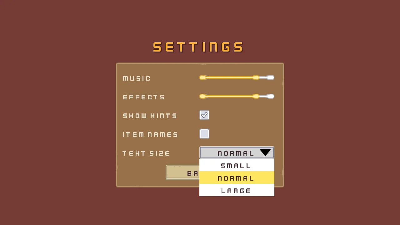
The last row is a Dropdown: a closed list that opens when it is pressed and shows its chosen option. This one picks the size of everything on the screen.
- Open
scenes/settings.ron. Selectsize_row, click + Add node and choose Dropdown. Rename ittext_size. - In its Rect, set Anchor Min and Anchor Max both to
0,0.5, Offset Min to244,-20, Offset Max to484,20and Pivot to0,0.5. That is a face240wide and40high. - In its Panel, set Texture to
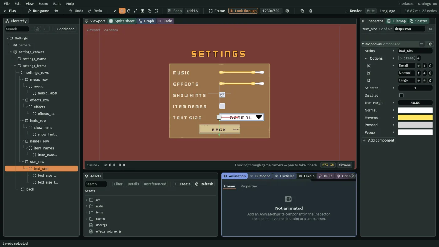
input_rectangle.pngand Border to8. In its Text, set Text toText size, Scale to0.75and Align to Center. - In its Dropdown, set Action to
text_size. Under Options, press the + until there are three, and set them toSmall,NormalandLarge. Set Selected to1and Item Height to40. - Click Add component and choose FocusComponent.
- Select
text_size, click + Add node and choose Panel. Rename ittext_size_arrow. In its Rect, set Anchor Min and Anchor Max both to1,0.5, Offset Min to-46,-11, Offset Max to-12,11and Pivot to1,0.5. In its Panel, set Texture toicon_arrow_down_dark.png. - Select
text_size, click + Add node and choose Label. Rename ittext_size_label. Give its Rect the values ofmusic_label, and set its Text toText sizeand its Scale to0.75.
- Action
- A Dropdown’s Action: the action it fires when the chosen row really changes. Choosing the row that is already chosen presses nothing. A script reads
amount("text_size"), the chosen row’s number counted from0. - Options
- The rows of the open list, in order:
Small,Normal,Large. - Selected
- Which row is chosen, counted from
0, so1isNormal. A number past the last row reads as nothing chosen. The closed face shows the chosen option’s words, over its own Text. - Item Height
- The height of one row of the open list, in UI units:
40, so the three rows are120high. - Normal, Hovered, Pressed
- A Dropdown’s tints for its closed face, as a Button’s are: at rest, under the pointer or with the focus, and held down or while the list is open. Apply theme writes them:
255,255,255at rest, the palette’s accent yellow254,231,97when lit, which is also the colour of the row the keys or the pointer are on, and211,211,211held. - Popup
- The background of the open list, white here,
255,255,255. It is drawn opaque, since the list opens over the rows below it.
A list that keeps its choice
- In Assets, press Create, choose New script, type
text_size_list, and press Enter. - In the Code tab, replace everything in
text_size_list.rgswith the script below, and press Ctrl+S.
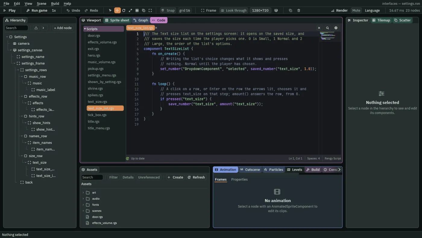
/// The Text size list on the settings screen: it opens on the saved size, and
/// saves the size each time the player picks one. 0 is Small, 1 Normal and 2
/// Large, the order of the list's options.
component TextSizeList {
    fn on_create() {
        // Writing the list's choice changes what it shows and presses
        // nothing. Normal until the player has chosen.
        set_number("DropdownComponent", "selected", saved_number("text_size", 1.0));
    }

    fn loop() {
        // A click on a row, or Enter on the row the arrows lit, chooses it and
        // presses text_size on that step; amount() answers the row, from 0.
        if pressed("text_size") {
            save_number("text_size", amount("text_size"));
        }
    }
}
- Select
text_size, click Add component and choose TextSizeList.
pressed("text_size") is true on the step a real choice is made: a click on a row, or Enter on the row the arrows have lit. amount("text_size") is that row’s number from 0: 0 is Small, 1 Normal and 2 Large.
A click opens the list, and a click on a row chooses it; a click anywhere else closes it. With the keys, Enter or Space opens it from the focus, Down and Up light a row, Enter chooses the lit row, and Esc closes the list without choosing.
Sizing every screen
A choice of size has to reach every screen, so one script sizes a canvas from the saved choice, and goes on every canvas: the delve’s HUD, the title and the settings.
- In Assets, press Create, choose New script, type
text_size, and press Enter. - In the Code tab, replace everything in
text_size.rgswith the script below, and press Ctrl+S.
/// Sizes everything on this canvas by the text size the player chose in
/// Settings. A canvas fits its reference into the window, so the smaller the
/// reference, the bigger everything on it is drawn.
component TextSize {
    /// The reference at Small.
    small: Vec2 = vec2(1536.0, 864.0),
    /// The reference at Normal: the window's own size, the art at 1x.
    normal: Vec2 = vec2(1280.0, 720.0),
    /// The reference at Large.
    large: Vec2 = vec2(1066.0, 600.0),

    fn loop() {
        // Read on every step, so the settings screen changes size as soon as
        // its list saves a new choice. Normal, 1, until the player has chosen.
        let size = saved_number("text_size", 1.0);
        if size == 0.0 {
            set_point("CanvasComponent", "reference_size", small);
        } else if size == 2.0 {
            set_point("CanvasComponent", "reference_size", large);
        } else {
            set_point("CanvasComponent", "reference_size", normal);
        }
    }
}
- Select
settings_canvas, click Add component and choose TextSize. Its Small, Normal and Large start at the script’s own1536by864,1280by720and1066by600: leave them. - Do the same for
title_canvasinscenes/title.ron, and forhudinscenes/delve.ron.
A canvas fits its Reference Size into the window, so a smaller reference draws everything on it bigger. Large is a reference of 1066 by 600, one fifth bigger than 1280 by 720, and Small is 1536 by 864, a sixth smaller. set_point writes a pair of numbers, and vec2 builds one; the script writes the canvas’s reference_size on every step, from the saved size, 1 (Normal) until the player has chosen.
A ring for the keys
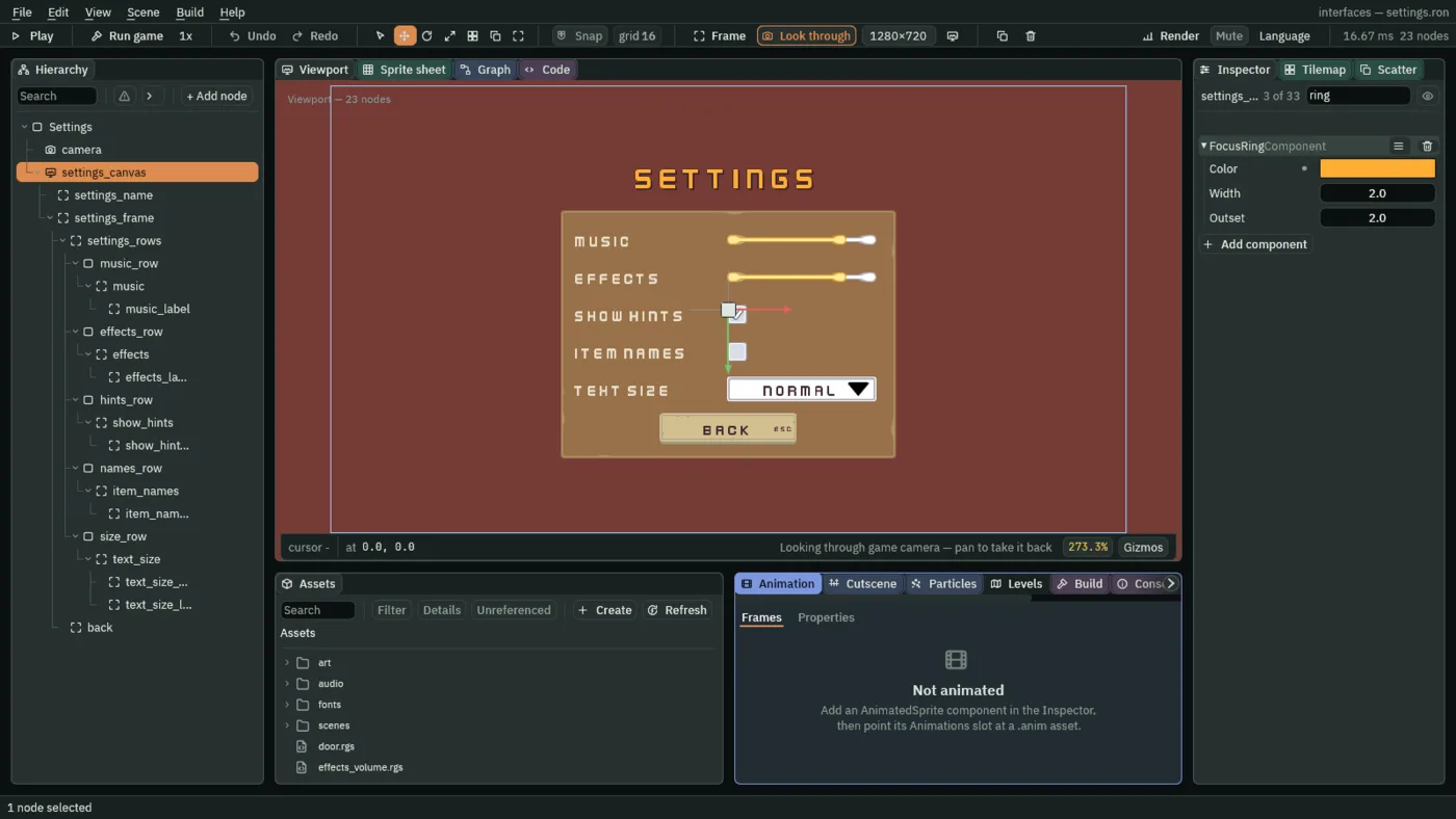
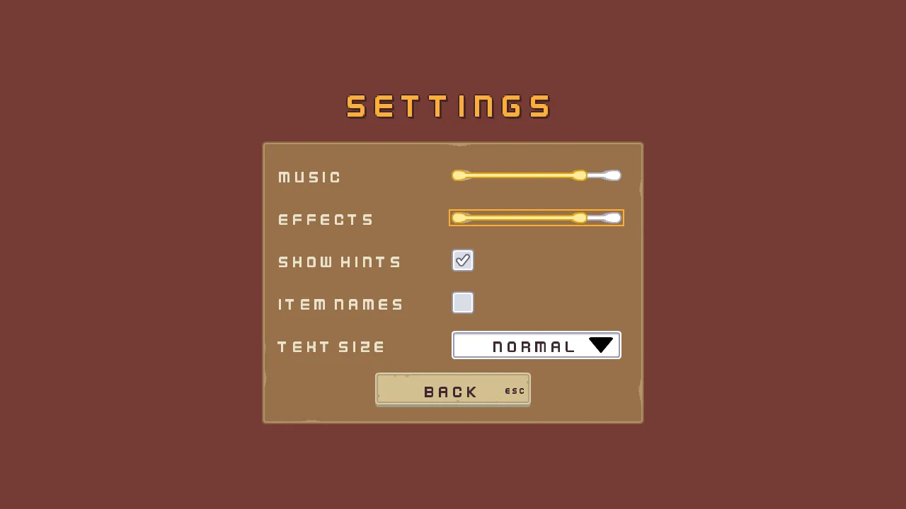
A player with the keys needs to see where they are. The lit tint of a button says it, and a slider brightens, but a tick box and a list need more. A Focus Ring draws a ring round whatever the keys have moved to. It is on the canvas, so it serves every control under it.
- Select
settings_canvas, click Add component and choose FocusRingComponent. - Open
scenes/title.ron, selecttitle_canvas, and add a FocusRingComponent the same way. The title’s menu then shows it too.
- Color
- A Focus Ring’s Color: the colour of the ring. Apply theme sets it to the palette’s accent words,
254,174,52, a gold that reads over pictures and plates alike. A new ring’s is white.
The ring’s Width and Outset stay as they come, 2 and 2, and chapter 16 defines them.
The ring is shown by a key, and hidden by the pointer. An arrow, Tab or Shift+Tab shows it round the control the focus has moved to; any press of the pointer hides it until the next key. So a player who uses the mouse does not see it, and one who uses the keys does.
Links, and a way back
Every control gets its focus links, as the title’s did, so that the arrows go round the screen in the order it reads. A control’s Up and Previous name the one above it, and its Down and Next the one below, round the loop: music, effects, show_hints, item_names, text_size and back.
- Open
scenes/title.ron, selectquitand press Ctrl+C. Openscenes/settings.ron, right-clicksettings_frameand choose Paste as child. The copy brings the button’s pictures, its Shortcut and its Focus. Rename itback. - In its Rect, set Anchor Min and Anchor Max both to
0.5,1, Offset Min to-110,-73, Offset Max to110,-24and Pivot to0.5,1. In its Text, set Text toBack. In its Button, set Action toback. Its Shortcut’s Action staysui_cancel. - In each control’s Focus, set the four links from the table below.
| Node | Up | Down | Next | Previous |
|---|---|---|---|---|
music | back | effects | effects | back |
effects | music | show_hints | show_hints | music |
show_hints | effects | item_names | item_names | effects |
item_names | show_hints | text_size | text_size | show_hints |
text_size | item_names | back | back | item_names |
back | text_size | music | music | text_size |
Back goes on the way out: it plays the back sound and returns to the title. Its script is on the frame, with the sound.
- In Assets, press Create, choose New script, type
settings_menu, and press Enter. - In the Code tab, replace everything in
settings_menu.rgswith the script below, and press Ctrl+S.
/// The settings screen's way back: Back goes to the title. Each control keeps
/// its own setting.
component SettingsMenu {
    fn loop() {
        // A click on Back, Enter while it holds the focus, or Escape through
        // its Shortcut presses back on the game's next step. Escape closes an
        // open list first, and goes back on the next press.
        if pressed("back") {
            // A sound asked for on the step that changes scene plays on after
            // it.
            play_sound("back");
            change_scene("title");
        }
    }
}
- Select
settings_frame, click Add component and choose SettingsMenu. - Click Add component again and choose AudioSourceComponent. Untick Positional. In its Triggers, press the + beside it once, and set the entry’s Name to
backand its Clip toback_001.ogg. - Select
settings_canvasand press Apply theme. It writes the colours of everything on the screen from the palette: the labels’ cream, the sliders’ and the list’s tints, the boxes’ marks, and the ring’s colour, the accent’s words,254,174,52, alpha255. - Do the same on
title_canvasinscenes/title.ron, where it gives the ring its colour, and onhudinscenes/delve.ron, where it gives the key line its cream.
pressed("back") is true on the step after Back is pressed: a click let go on it, Enter while it holds the focus, or Esc through its Shortcut. An Esc that closes an open list does that first and goes back on the next press, since the list takes it.
Saved and applied
Each control’s script reads its saved number on create and saves when it is pressed (save_number and saved_number). That is half of it. The other half is the title, which has to set both volumes as it opens, before the game’s first sound, and a Settings button that opens the screen. Both are small changes to the title’s two scripts.
- In the Code tab’s Scripts list, click
title.rgs, replace everything in it with the script below, and press Ctrl+S.
/// The title, as it opens: the volumes the player chose in Settings, set before
/// the game's first sound, and the menu faded in. The Canvas Group on this
/// node starts at alpha 0, where the menu is not drawn and takes no key; this
/// brings it to 1 over half a second.
component Title {
    fn on_create() {
        // 0.8 until the player has chosen a volume.
        set_music_volume(saved_number("music_volume", 0.8));
        set_sfx_volume(saved_number("effects_volume", 0.8));
        anneal_number("CanvasGroupComponent", "alpha", 1.0, 0.5, .OutQuad);
    }
}
- Click
title_menu.rgsin the list, replace everything in it with the script below, and press Ctrl+S.
/// The title's menu: New game starts a fresh run in the delve, Settings opens
/// the settings screen, and Quit closes the game.
component TitleMenu {
    /// The health a new game starts with.
    start_health: f32 = 10.0,

    fn loop() {
        // A button pressed by a click, by Enter while it holds the focus, or
        // by its Shortcut presses its action on the game's next step.
        if pressed("new_game") {
            // What a run keeps outlasts a change of scene, so a new game puts
            // it back as a run starts: full health, and nothing picked up.
            keep_number("health", start_health);
            keep_number("potions", 0.0);
            keep_number("elixirs", 0.0);
            keep_number("keys", 0.0);
            keep_number("gems", 0.0);
            keep_number("coins", 0.0);
            // A sound asked for on the step that changes scene plays on after
            // it.
            play_sound("click");
            change_scene("delve");
        }
        if pressed("settings") {
            play_sound("click");
            change_scene("settings");
        }
        if pressed("quit") {
            play_sound("back");
            // The game closes at the end of the step that asks, which would
            // cut the sound off, so it waits a tenth of a second first.
            await wait(0.1);
            quit();
        }
    }
}
The first script now sets the music and effects buses from the saved volumes, 0.8 until a player has chosen. The second adds Settings, which plays the click and opens settings. pressed("settings") is true for one step after Settings is pressed, by a click let go on it or by Enter while it holds the focus, now that it is not disabled.
In the editor’s Play, the saved values are kept in a file of their own, play-saved.ron in your project folder, so trying the game never touches a real player’s. They are still there the next time you Play. With Play stopped, Scene → Clear saved values empties it and every setting goes back to its default.
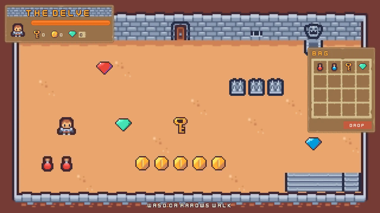
The two pictures here and below are of the same delve. In the first, Show hints is on, as it is for a player who has never opened Settings, so the line shows. In the second the player has first ticked Item names and chosen Large, then started a new game: the names show over the pickups and the HUD is drawn bigger.
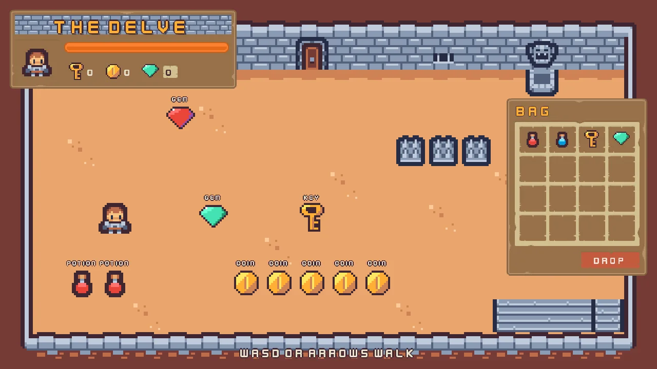
The settings screen, its controls and the changes to the title and the delve
The settings screen
| Node | Component | Field | Value |
|---|---|---|---|
camera | Camera | Scaling | Letterbox |
| Extent | 180 | ||
| Width | 320 | ||
| Background | 118, 59, 54, alpha 255 | ||
settings_canvas | Canvas | Scale Mode | ShrinkToFit |
| Theme | Panel | 255, 255, 255, alpha 255 | |
| Panel Accent | 254, 231, 97, alpha 255 | ||
| Panel Danger | 232, 69, 55, alpha 255 | ||
| Text | 236, 227, 206, alpha 255 | ||
| Text Accent | 254, 174, 52, alpha 255 | ||
| Text Danger | 255, 228, 220, alpha 255 | ||
| Button | 255, 255, 255, alpha 255 | ||
| Button Text | 63, 38, 49, alpha 255 | ||
| Hover Lift | 0.15 | ||
| Press Sink | 0.35 | ||
settings_name | Rect | Anchor Min | 0.5, 0.5 |
| Anchor Max | 0.5, 0.5 | ||
| Offset Min | -360, -256 | ||
| Offset Max | 360, -176 | ||
| Pivot | 0.5, 1 | ||
| Text | Text | Settings | |
| Scale | 1.5 | ||
| Color | 254, 174, 52, alpha 255, written by Apply theme | ||
| Align | Center | ||
| Outline | 63, 38, 49, alpha 255 | ||
| Outline Width | 2 | ||
| Shadow | 0, 0, 0, alpha 153 | ||
| Shadow Offset | 3, 3 | ||
| Shadow Softness | 0 | ||
| Theme Role | Role | Accent | |
settings_frame | Rect | Anchor Min | 0.5, 0.5 |
| Anchor Max | 0.5, 0.5 | ||
| Offset Min | -270, -160 | ||
| Offset Max | 270, 240 | ||
| Panel | Color | 255, 255, 255, alpha 255, written by Apply theme | |
| Texture | panel_brown.png | ||
| Border | 8 | ||
settings_rows | Rect | Anchor Max | 1, 0 |
| Offset Min | 24, 24 | ||
| Offset Max | -24, 312 | ||
| Pivot | 0.5, 0 | ||
| Stack | Fit | Fixed | |
| Spacing | 12 |
The sliders
| Node | Component | Field | Value |
|---|---|---|---|
music, effects | Rect | Anchor Min | 0, 0.5 |
| Anchor Max | 0, 0.5 | ||
| Offset Min | 244, -8 | ||
| Offset Max | 484, 8 | ||
| Pivot | 0, 0.5 | ||
| Slider | Value | 0.8 | |
| Step | 0.1 | ||
| Fill | 255, 255, 255, alpha 255, written by Apply theme | ||
| Track | 255, 255, 255, alpha 255, written by Apply theme | ||
| Fill Texture | slide_horizontal_color.png | ||
| Track Texture | slide_horizontal_grey.png | ||
| Border | 8 | ||
music | Slider | Action | music |
effects | Slider | Action | effects |
effects | Audio Source | Positional | unticked |
| Triggers | click with click_001.ogg; Mode Shuffle, Pitch and Volume 1 to 1 | ||
| EffectsVolume | Sample Gap | 0.15 | |
| Quiet | 0 | ||
music_label, effects_label | Rect | Anchor Min | 0, 0.5 |
| Anchor Max | 0, 0.5 | ||
| Offset Min | -244, -24 | ||
| Offset Max | -24, 24 | ||
| Pivot | 0, 0.5 | ||
| Text | Scale | 0.75 | |
| Color | 236, 227, 206, alpha 255, written by Apply theme | ||
music_label | Text | Text | Music |
effects_label | Text | Text | Effects |
The tick boxes
| Node | Component | Field | Value |
|---|---|---|---|
show_hints, item_names | Rect | Anchor Min | 0, 0.5 |
| Anchor Max | 0, 0.5 | ||
| Offset Min | 244, -16 | ||
| Offset Max | 276, 16 | ||
| Pivot | 0, 0.5 | ||
| Panel | Color | 255, 255, 255, alpha 255, written by Apply theme | |
| Texture | check_square_grey.png | ||
| Toggle | Normal | 255, 255, 255, alpha 255, written by Apply theme | |
| Hovered | 255, 255, 255, alpha 255, written by Apply theme | ||
| Pressed | 211, 211, 211, alpha 255, written by Apply theme | ||
| Check | 63, 38, 49, alpha 255, written by Apply theme | ||
| On Texture | check_square_grey_checkmark.png | ||
show_hints | Toggle | Action | show_hints |
| On | ticked | ||
| TickBox | Setting | show_hints | |
| Unsaved | 1 | ||
item_names | Toggle | Action | item_names |
| TickBox | Setting | item_names | |
| Unsaved | 0 | ||
show_hints_label, item_names_label | Rect | Anchor Min | 0, 0.5 |
| Anchor Max | 0, 0.5 | ||
| Offset Min | -244, -24 | ||
| Offset Max | -24, 24 | ||
| Pivot | 0, 0.5 | ||
| Text | Scale | 0.75 | |
| Color | 236, 227, 206, alpha 255, written by Apply theme | ||
show_hints_label | Text | Text | Show hints |
item_names_label | Text | Text | Item names |
The text size list
| Node | Component | Field | Value |
|---|---|---|---|
text_size | Rect | Anchor Min | 0, 0.5 |
| Anchor Max | 0, 0.5 | ||
| Offset Min | 244, -20 | ||
| Offset Max | 484, 20 | ||
| Pivot | 0, 0.5 | ||
| Panel | Color | 255, 255, 255, alpha 255, written by Apply theme | |
| Texture | input_rectangle.png | ||
| Border | 8 | ||
| Text | Text | Text size | |
| Scale | 0.75 | ||
| Color | 63, 38, 49, alpha 255, written by Apply theme | ||
| Align | Center | ||
| Dropdown | Action | text_size | |
| Options | Small, Normal, Large | ||
| Selected | 1 | ||
| Item Height | 40 | ||
| Normal | 255, 255, 255, alpha 255, written by Apply theme | ||
| Hovered | 254, 231, 97, alpha 255, written by Apply theme | ||
| Pressed | 211, 211, 211, alpha 255, written by Apply theme | ||
| Popup | 255, 255, 255, alpha 255, written by Apply theme | ||
text_size_arrow | Rect | Anchor Min | 1, 0.5 |
| Anchor Max | 1, 0.5 | ||
| Offset Min | -46, -11 | ||
| Offset Max | -12, 11 | ||
| Pivot | 1, 0.5 | ||
| Panel | Color | 255, 255, 255, alpha 255, written by Apply theme | |
| Texture | icon_arrow_down_dark.png | ||
text_size_label | Rect | Anchor Min | 0, 0.5 |
| Anchor Max | 0, 0.5 | ||
| Offset Min | -244, -24 | ||
| Offset Max | -24, 24 | ||
| Pivot | 0, 0.5 | ||
| Text | Text | Text size | |
| Scale | 0.75 | ||
| Color | 236, 227, 206, alpha 255, written by Apply theme | ||
settings_canvas | TextSize | Small | 1536, 864 |
| Normal | 1280, 720 | ||
| Large | 1066, 600 |
The ring and the way back
| Node | Component | Field | Value |
|---|---|---|---|
settings_canvas | Focus Ring | Color | 254, 174, 52, alpha 255, written by Apply theme |
back | Rect | Anchor Min | 0.5, 1 |
| Anchor Max | 0.5, 1 | ||
| Offset Min | -110, -73 | ||
| Offset Max | 110, -24 | ||
| Pivot | 0.5, 1 | ||
| Panel | Color | 255, 255, 255, alpha 255, written by Apply theme | |
| Texture | buttonLong_beige.png | ||
| Border | 8 | ||
| Text | Text | Back | |
| Scale | 0.75 | ||
| Color | 63, 38, 49, alpha 255, written by Apply theme | ||
| Align | Center | ||
| Button | Action | back | |
| Normal | 255, 255, 255, alpha 255, written by Apply theme | ||
| Hovered | 255, 255, 255, alpha 255, written by Apply theme | ||
| Pressed | 211, 211, 211, alpha 255, written by Apply theme | ||
| Hovered Texture | buttonLong_grey.png | ||
| Pressed Texture | buttonLong_beige_pressed.png | ||
| Disabled Texture | buttonLong_blue.png | ||
| Shortcut | Action | ui_cancel | |
settings_frame | Audio Source | Positional | unticked |
| Triggers | back with back_001.ogg; Mode Shuffle, Pitch and Volume 1 to 1 |
The title’s changes
| Node | Component | Field | Value |
|---|---|---|---|
Title | Audio Source | Clip | abandoned_castle_music_-_starninjas_6.ogg |
| Bus | Music | ||
| Looping | ticked | ||
| Autoplay | ticked | ||
| Positional | unticked | ||
title_canvas | Focus Ring | Color | 254, 174, 52, alpha 255, written by Apply theme |
| TextSize | Small | 1536, 864 | |
| Normal | 1280, 720 | ||
| Large | 1066, 600 | ||
settings | Button | Disabled | unticked |
The delve’s key line and its sizing
| Node | Component | Field | Value |
|---|---|---|---|
hud | TextSize | Small | 1536, 864 |
| Normal | 1280, 720 | ||
| Large | 1066, 600 | ||
key_hints | Rect | Anchor Min | 0.5, 1 |
| Anchor Max | 0.5, 1 | ||
| Offset Min | -320, -44 | ||
| Offset Max | 320, -12 | ||
| Pivot | 0.5, 1 | ||
| Text | Text | WASD or arrows walk | |
| Scale | 0.625 | ||
| Color | 236, 227, 206, alpha 255, written by Apply theme | ||
| Align | Center | ||
| Outline | 63, 38, 49, alpha 255 | ||
| Outline Width | 2 | ||
| ShownBySetting | Setting | show_hints | |
| Unsaved | 1 |
The pickups’ names
| Node | Component | Field | Value |
|---|---|---|---|
potion_1_name, potion_2_name, elixir_name, key_name, gem_green_name, gem_red_name, gem_blue_name, coin_1_name to coin_5_name | Node | Visible | unticked |
| World Text | Scale | 0.1 | |
| Color | 236, 227, 206, alpha 255 | ||
| Offset | 0, -10 | ||
| Sort Layer | 4 | ||
| Outline | 63, 38, 49, alpha 255 | ||
| Outline Width | 0.5 | ||
| ShownBySetting | Setting | item_names | |
| Unsaved | 0 | ||
potion_1_name, potion_2_name | World Text | Text | Potion |
elixir_name | World Text | Text | Elixir |
key_name | World Text | Text | Key |
gem_green_name | World Text | Text | Gem |
gem_red_name | World Text | Text | Gem |
gem_blue_name | World Text | Text | Gem |
coin_1_name to coin_5_name | World Text | Text | Coin |
The settings scene’s root, Settings, and the five row nodes are empty nodes. Every other field of every node is as it comes.