Tutorials · Interfaces · Chapter 5
The title screen
By the end
scenes/title.ron, the scene the game opens on: New game, Settings (greyed until chapter 6) and Quit, each with a picture for each state- A menu the arrows, Tab and Enter walk, and Escape to quit
title.rgsandtitle_menu.rgs: the menu fades in, New game opens the delve and Quit quits
On this page
A scene for the title
Until now the game has been one scene, the delve. A title is a scene of its own, and the game will open on it. It has no room to look at, only a camera, a canvas and a menu on the canvas, so it is quick to make.
- Press Ctrl+S to save the delve, then choose File → New scene. An empty scene takes its place.
- Click + Add node and choose Node. Rename it
Title. It is the scene’s root. - Select
Title, click + Add node and choose Camera. Rename itcamera. - In its Camera, set Scaling to Letterbox, Extent to
180, Width to320and Background to118,59,54, alpha255. If the colour picker reads F at its top left, press it back to U8, as in chapter 1. - Select
Title, click + Add node and choose Canvas. Rename ittitle_canvas. Set its Scale Mode to ShrinkToFit.
The camera is the delve’s own: it shows a world 320 units wide and 180 high, with bars at the sides or the top if the window is another shape. The title has no world to show, but the camera’s Background is the dark red behind the menu, the same as the delve’s, so the two screens match.
The canvas needs a palette, which is chapter 4’s with one change.
- In
title_canvas’s Theme, set Panel to255,255,255, alpha255, Panel Accent to254,231,97, alpha255and Panel Danger to232,69,55, alpha255. - Set Text to
236,227,206, alpha255, Text Accent to254,174,52, alpha255and Text Danger to255,228,220, alpha255. - Set Button to
255,255,255, alpha255and Button Text to63,38,49, alpha255, a dark plum. - Set Hover Lift to
0.15and Press Sink to0.35. - Press Ctrl+S and save the scene in the
scenesfolder astitle.ron. - Choose File → Project settings…, open its General tab and set Startup scene to
scenes/title.ron. Close the window.
From now on the game opens on the title. The delve is still a scene you can open and play on its own: the editor’s Play plays the scene that is open, so open scenes/title.ron before F5 to play the whole game, and Build → Run / Stop game starts on the startup scene, as an exported game does.
Three buttons
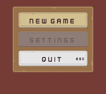
The menu is a frame holding a column of three buttons: New game, Settings and Quit. Each button is a Panel with a Text and a Button on one node, and each wears a different picture for each thing that can happen to it: resting, lit, held down and disabled. The pictures come from the pack you downloaded in chapter 1.
- Copy the four files below into your project’s
artfolder, each from where the list says it is in the unzipped download. Then press Refresh in the Assets panel.
The name, the fade and the frame
- Select
title_canvas, click + Add node and choose Label. Rename ittitle_name. - In its Rect, set Anchor Min and Anchor Max both to
0.5,0, Offset Min to-360,176, Offset Max to360,272and Pivot to0.5,0. That is a box720wide and96high, centred across the top of the screen. - In its Text, set Text to
The Delveand Align to Center. Scale stays2, twice the size of chapter 1’s title. - Set Outline to
63,38,49, alpha255and Outline Width to3. Under Effects, set Shadow to0,0,0, alpha153, Shadow Offset to4,4and Shadow Softness to0. - Click Add component and choose ThemeRoleComponent. Set Role to Accent. The title’s colour comes from the palette, in a moment.
- Select
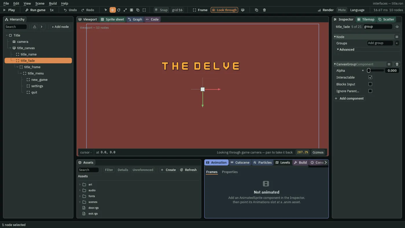
title_canvas, click + Add node and choose Fade Group. Rename ittitle_fade. Its Rect stays as it comes, so it fills the canvas. - In its Canvas Group, set Alpha to
0. The menu will start out invisible, and a script below fades it in. - Select
title_fade, click + Add node and choose Panel. Rename ittitle_frame. - In its Rect, set Anchor Min and Anchor Max both to
0.5,0, Offset Min to-130,320, Offset Max to130,531and Pivot to0.5,0. - In its Panel, set Texture to
panel_brown.pngand Border to8. Its Color comes from the palette too.
A stack for the buttons
The frame is 260 wide and 211 high. Three buttons would be a chore to place one by one, and a Stack places them for you, as chapter 2’s did for the counters.
- Select
title_frame, click + Add node and choose Stack. Rename ittitle_menu. Its Rect stays as it comes, so it fills the frame. - In its Stack, set Fit to Fixed, Spacing to
12, Padding to20, Item to49and Align to Center. Axis stays Vertical.
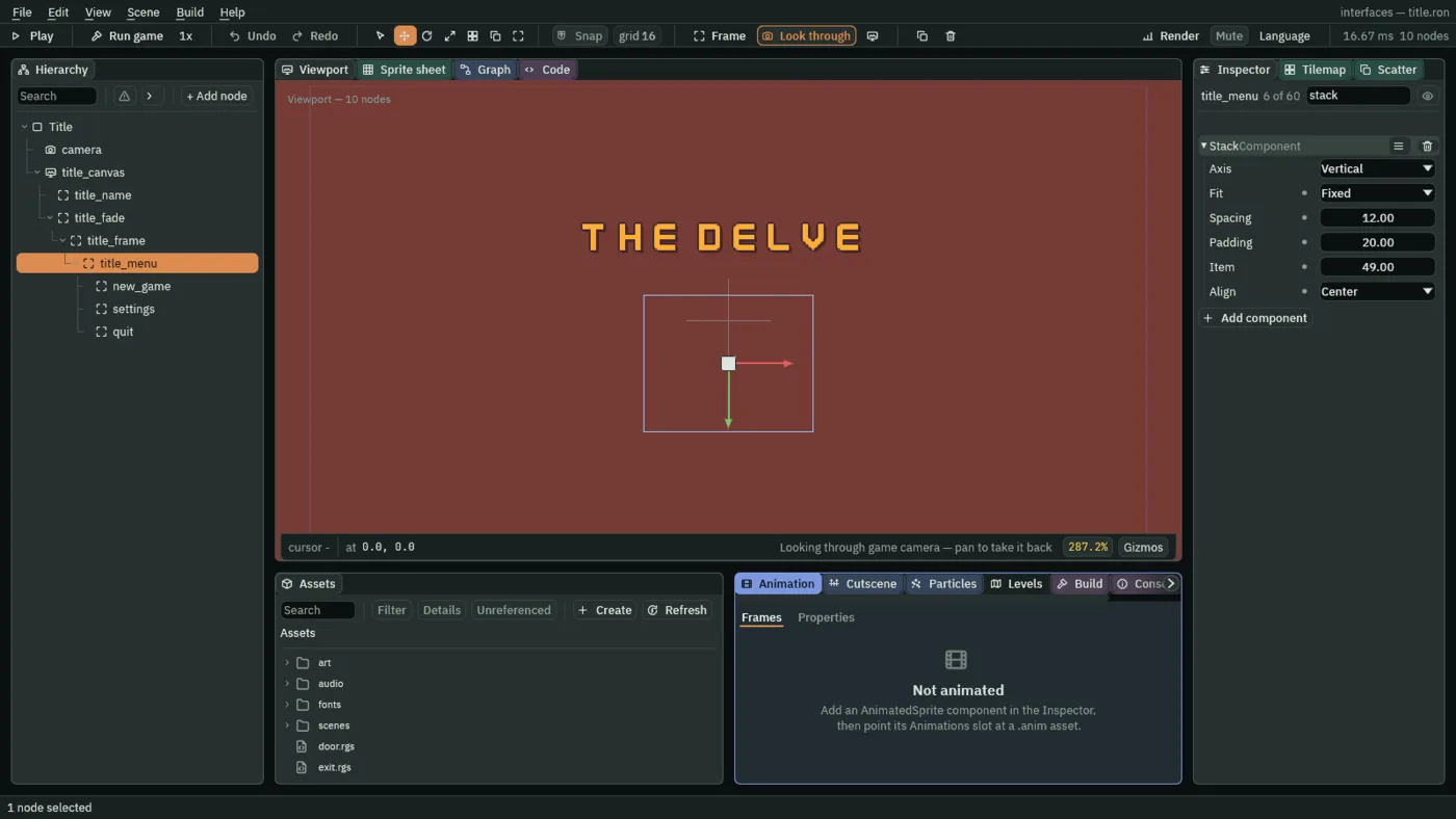
- Item
- A Stack’s Item: how long each child is along the Stack’s axis, in UI units, when Fit is Fixed. Here each button is
49high. Even ignores it, and Elements takes each child’s length from its own Layout Element instead. A new Stack’s is48. - Align
- Where a run of children shorter than the Stack sits in the room that is left over, along the axis: Start against the top, or the left, Center in the middle, End against the bottom, or the right. A Fixed run of three buttons and two gaps is
3 × 49 + 2 × 12 = 171long, and the frame’s room is211 − 2 × 20 = 171: nothing is left over, so no choice shows yet. Center keeps the menu in the middle of its frame whichever way the frame is made bigger. A new Stack’s is Start.
The Stack chooses how long each button is, and the button chooses how wide: a button whose Rect fills its slot, as these do, is as wide as the Stack’s room, 220, which is the frame’s 260 less the padding on both sides.
The buttons
- Select
title_menu, click + Add node and choose Button. Rename itnew_game. Its Rect stays as it comes: the Stack places it. - In its Panel, set Texture to
buttonLong_beige.pngand Border to8. - In its Text, set Text to
New game, Scale to0.75and Align to Center. - In its Button, set Action to
new_game, Hovered Texture tobuttonLong_grey.png, Pressed Texture tobuttonLong_beige_pressed.pngand Disabled Texture tobuttonLong_blue.png. - With
new_gameselected, press Ctrl+D. Rename the copysettings, and set its Text toSettingsand its Action tosettings. - Press Ctrl+D again. Rename the new copy
quit, and set its Text toQuitand its Action toquit. - Select
settingsand tick Disabled in its Button. Chapter 6 makes the screen it opens, and unticks it. - Select
title_canvasand press Apply theme, at the foot of its Theme. It writes the gold into the title, the plain panel colour into the frame and the buttons’ faces, and the plum Button Text into their words.
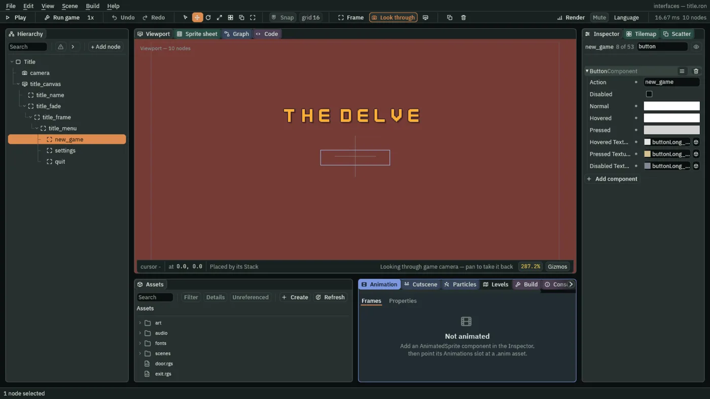
- Disabled
- A Button’s Disabled: when it is ticked, the button takes no press and no focus, shows its Disabled Texture, and its face and the word on it dim. A disabled button fires no action. Settings is the one disabled button here, until chapter 6.
- Hovered Texture, Pressed Texture, Disabled Texture
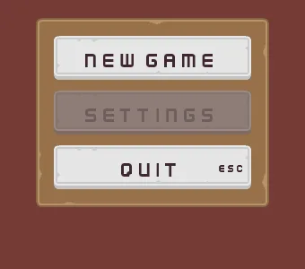
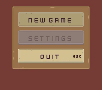
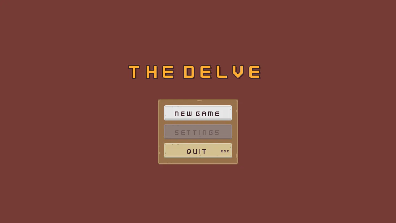
- The pictures the button’s face swaps to, in place of its Panel’s own, while the pointer or the focus is on it, while it is held down, and while it is disabled. Empty, the face keeps the Panel’s picture and only the tints change. Here the face lights to the grey
buttonLong_grey.png, sinks to the flatbuttonLong_beige_pressed.pngwhen held, and turns the bluebuttonLong_blue.pngwhen disabled, which, dimmed, shows as a dull grey-violet over the frame.
The three tints under Action, Normal, Hovered and Pressed, are chapter 4’s: Apply theme wrote them, from the palette’s white Button, lifted and sunk: 255, 255, 255 at rest and lit, and 211, 211, 211 held down.
The arrows and Tab
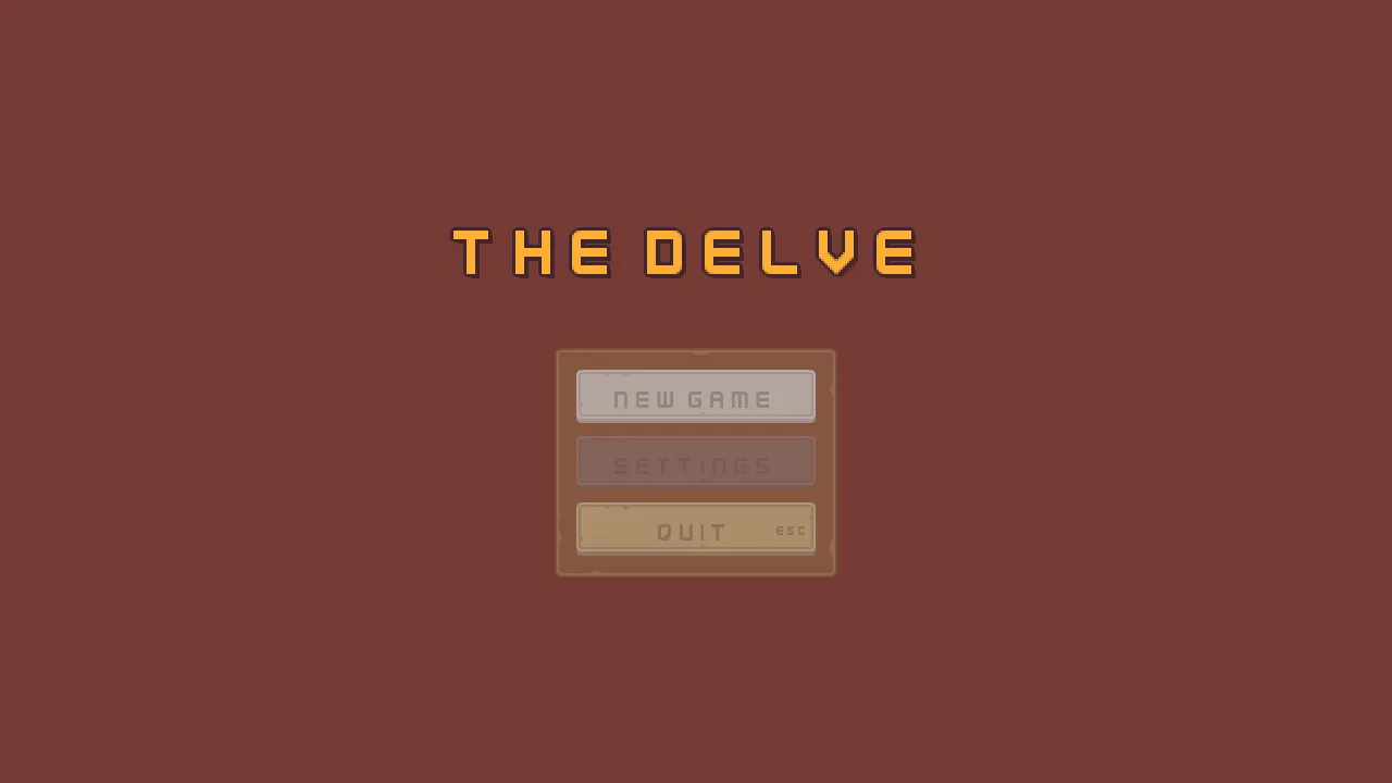
A menu is for keys as well as the pointer. The control that holds the focus is the lit one, and it is the one Enter or Space presses. The arrow keys move it, and Tab and Shift+Tab step it on and back. A screen opens with its first control focused, which is why New game was lit in the pictures above.
- Select
new_game, click Add component and choose FocusComponent. Do the same forsettingsand forquit. The list that a Focus link opens offers only nodes that have a Focus component of their own, so all three get theirs first. - In
new_game’s Focus, set Up toquit, Down tosettings, Next tosettingsand Previous toquit. Each is a box: click it and pick the node. - In
settings’s Focus, set Up tonew_game, Down toquit, Next toquitand Previous tonew_game. - In
quit’s Focus, set Up tosettings, Down tonew_game, Next tonew_gameand Previous tosettings.
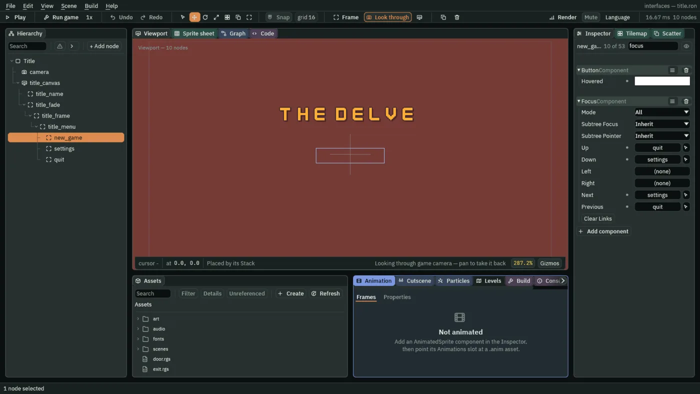
- Up, Down
- The node the focus moves to when Up or Down is pressed on this one, by name. Empty, the engine picks the nearest control in that direction by position. Here the three buttons loop: Up on New game goes to Quit, and Down on Quit goes round to New game.
- Next, Previous
- The node Tab and Shift+Tab step to. Empty, the Tab order is reading order, the Hierarchy’s order. Here Tab goes down the menu and round, as the arrows do.
The Focus’s other five rows, Mode, Subtree Focus, Subtree Pointer, Left and Right, stay as they come, and the Clear Links button forgets every link. Chapter 7 sets Mode, and chapter 14 and chapter 16 the rest.
Settings is disabled, so it cannot take the focus, and the links through it have to go somewhere else. A link to a control that is hidden or disabled falls back to the nearest control the keys can reach.
Escape to quit
A Shortcut presses its control from a key, with no focus needed. Quit takes Esc, the key a player reaches for to leave a menu.
- Select
quit, click Add component and choose ShortcutComponent. Set its Action toui_cancel.
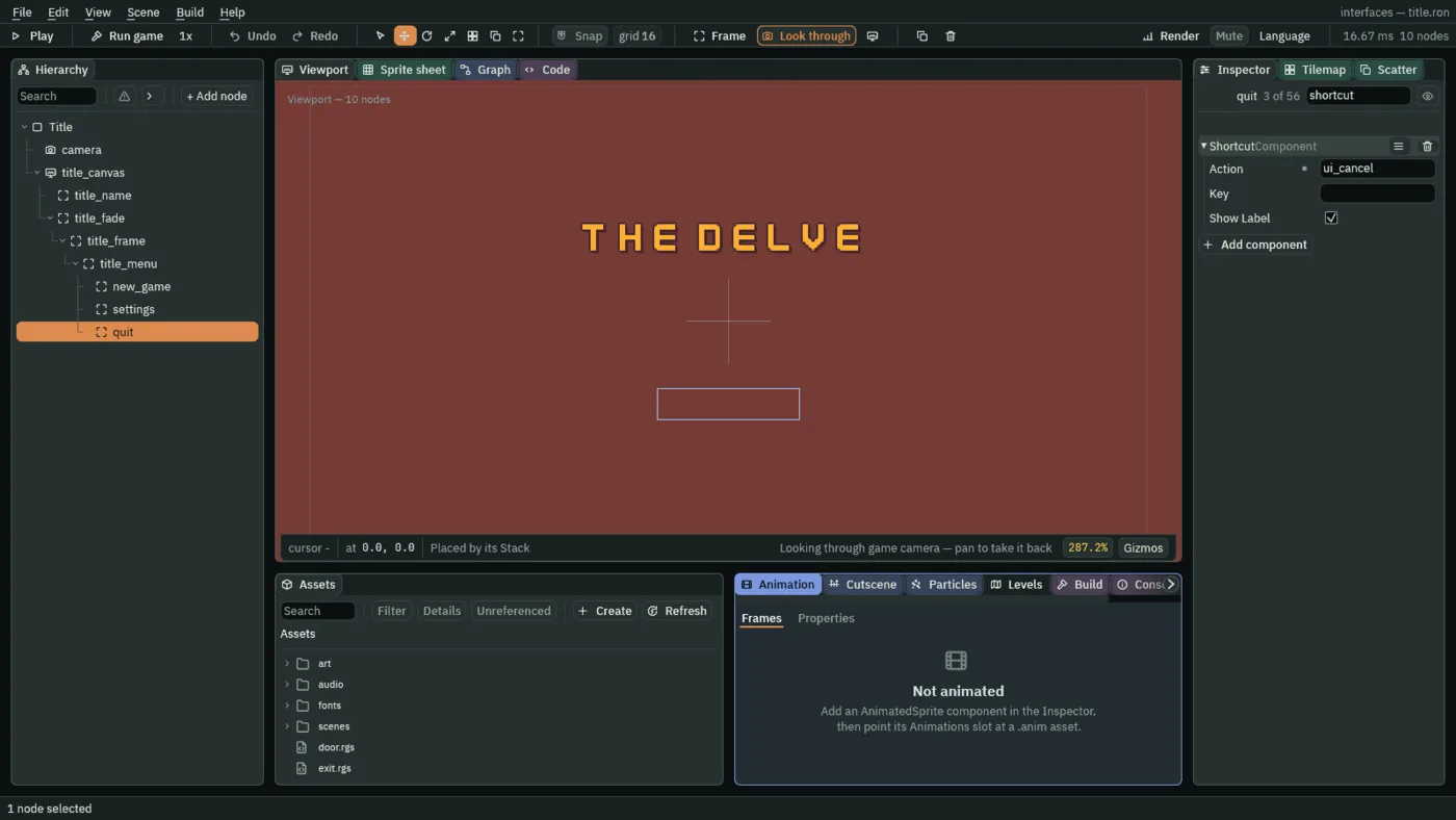
- Action
- A Shortcut’s Action: the input action whose key presses this control, as if it were clicked.
ui_cancelis on Esc in the starter’s input map, and the key’s name is drawn inside the button’s right edge, at half the size of its words: the ESC on Quit.
The Shortcut’s Key and Show Label stay as they come, and chapter 16 defines them. The key on the button comes from the input map, so if the project’s ui_cancel is moved to another key, the button shows that key.
Your first scripts
Everything so far was clicks. A menu has to do something when a button is pressed, and that is written in Rengy Script, a small language the editor runs as it is, with nothing to install. A script is a text file in your project. You add it to a node as a component, and it works on that node’s own components. Three scripts finish the title: one fades the menu in, one answers its buttons, and one changes a script the project already has.
- Copy the two sounds below into a new folder
audioin your project, besideart, each from where the list says. Then press Refresh in the Assets panel.
The fade
- In Assets, click Assets in the path bar over the tree, so the script is written at the project’s top, then press Create, choose New script, type
title, and press Enter. - In the Code tab, replace everything in
title.rgswith the script below, and press Ctrl+S.
/// The title's menu, faded in as the title opens. The Canvas Group on this
/// node starts at alpha 0, where the menu is not drawn and takes no key; this
/// brings it to 1 over half a second.
component Title {
    fn on_create() {
        anneal_number("CanvasGroupComponent", "alpha", 1.0, 0.5, .OutQuad);
    }
}
- Select
title_fade, click Add component and choose Title.
component Title declares a script component, named as its file. on_create is a hook: the engine calls it once, as the node enters the scene. anneal_number moves a number on another component of this node from where it is to a target, over some seconds, with an easing: here the Canvas Group’s alpha goes to 1.0 in 0.5 seconds, .OutQuad, quick at first and slowing to the end. The menu starts at 0, which is what Alpha is for.
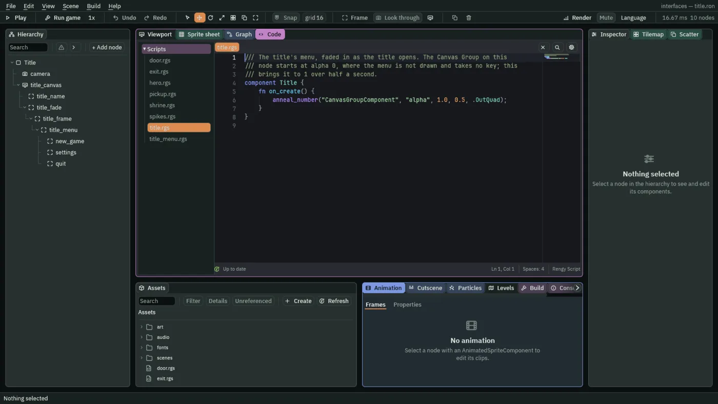
- Alpha
- A Canvas Group’s Alpha: a number from
0to1that multiplies every colour the group’s subtree draws, all at once.0draws nothing and takes no click or key.1draws everything as it is. The title anneals it from0to1over half a second, so the frame, the buttons and their words fade in together. Put the Alpha on the group and not on each node: one number does the fade. The name stays at full strength, because it is on the canvas, outside the group.
The buttons
- In Assets, press Create, choose New script, type
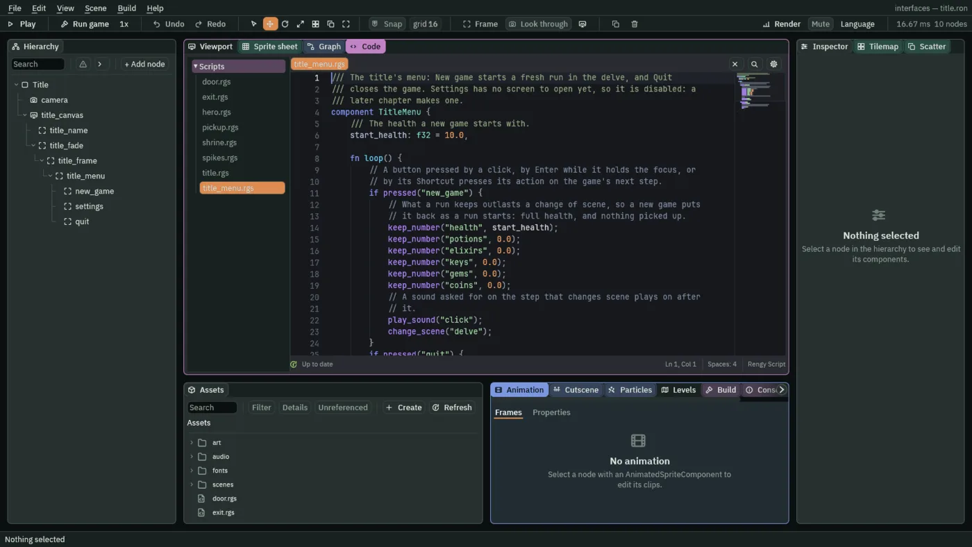
title_menu, and press Enter. - In the Code tab, replace everything in
title_menu.rgswith the script below, and press Ctrl+S.
/// The title's menu: New game starts a fresh run in the delve, and Quit
/// closes the game. Settings has no screen to open yet, so it is disabled: a
/// later chapter makes one.
component TitleMenu {
    /// The health a new game starts with.
    start_health: f32 = 10.0,

    fn loop() {
        // A button pressed by a click, by Enter while it holds the focus, or
        // by its Shortcut presses its action on the game's next step.
        if pressed("new_game") {
            // What a run keeps outlasts a change of scene, so a new game puts
            // it back as a run starts: full health, and nothing picked up.
            keep_number("health", start_health);
            keep_number("potions", 0.0);
            keep_number("elixirs", 0.0);
            keep_number("keys", 0.0);
            keep_number("gems", 0.0);
            keep_number("coins", 0.0);
            // A sound asked for on the step that changes scene plays on after
            // it.
            play_sound("click");
            change_scene("delve");
        }
        if pressed("quit") {
            play_sound("back");
            // The game closes at the end of the step that asks, which would
            // cut the sound off, so it waits a tenth of a second first.
            await wait(0.1);
            quit();
        }
    }
}
- Select
title_menu, click Add component and choose TitleMenu. Its Start Health starts at the script’s own10: leave it. - Click Add component again and choose AudioSourceComponent. Untick Positional, and leave Bus as Sfx.
- In its Triggers, press the + beside it twice. Set the first entry’s Name to
clickand its Clip toclick_001.ogg, and the second’s Name tobackand its Clip toback_001.ogg. Each Mode stays Shuffle, and each Pitch and Volume as it comes,1to1.
pressed("new_game") is true for one step: the first after New game is pressed, by a click let go on it, or by Enter or Space while it holds the focus. pressed("quit") is true the same way, and also on the step after Esc, because Quit’s Shortcut presses its action.
- pressed
- True on the step an action goes down. A Button fires its Action, a Shortcut the action it names, and a script hears either with
pressed. - keep_number
- Keeps a number under a name until the game closes, so it outlasts a change of scene. A new game puts the run’s numbers back as it starts: health to Start Health, and the potions, elixirs, keys, gems and coins to
0. - play_sound
- Plays the trigger of this node’s Audio Source that has that name:
clickorback. A sound asked for on the step that changes scene plays on after it. - change_scene
- Moves the game to a fresh copy of the scene with that name, its file’s name without
.ron, at the end of the step. Kept values carry over. - quit and wait
quit()closes the game at the end of the step, and in the editor stops Play. A closing game would cut the sound off, soawait wait(0.1)pauses the loop for a tenth of a second first.
The way out
The stairs in the delve were only stairs. Now the hero who walks onto them goes back to the title. You already have exit.rgs; this version replaces it.
- In the Code tab’s Scripts list, click
exit.rgs, replace everything in it with the script below, and press Ctrl+S.
/// The way out, down the stairs. The hero who steps onto them leaves the delve
/// for the title.
component Exit : Area {
    fn on_enter(other: NodeId) {
        if in_group(other, "hero") {
            change_scene("title");
        }
    }
}
The stairs are an Area, a region that tells its script who walks into it: on_enter runs when something does, and other is that node. in_group is true if it is in the group, here "hero", so a coin or a spike never sends the game to the title. Nothing in it reads a control, so there is no action to hear.
The title scene
The camera
| Component | Field | Value |
|---|---|---|
| Camera | Scaling | Letterbox |
| Extent | 180 | |
| Width | 320 | |
| Background | 118, 59, 54, alpha 255 |
The canvas and its palette
| Component | Field | Value |
|---|---|---|
| Canvas | Scale Mode | ShrinkToFit |
| Theme | Panel | 255, 255, 255, alpha 255 |
| Panel Accent | 254, 231, 97, alpha 255 | |
| Panel Danger | 232, 69, 55, alpha 255 | |
| Text | 236, 227, 206, alpha 255 | |
| Text Accent | 254, 174, 52, alpha 255 | |
| Text Danger | 255, 228, 220, alpha 255 | |
| Button | 255, 255, 255, alpha 255 | |
| Button Text | 63, 38, 49, alpha 255 | |
| Hover Lift | 0.15 | |
| Press Sink | 0.35 |
The name
| Component | Field | Value |
|---|---|---|
| Rect | Anchor Min | 0.5, 0 |
| Anchor Max | 0.5, 0 | |
| Offset Min | -360, 176 | |
| Offset Max | 360, 272 | |
| Pivot | 0.5, 0 | |
| Text | Text | The Delve |
| Color | 254, 174, 52, alpha 255, written by Apply theme | |
| Align | Center | |
| Outline | 63, 38, 49, alpha 255 | |
| Outline Width | 3 | |
| Shadow | 0, 0, 0, alpha 153 | |
| Shadow Offset | 4, 4 | |
| Shadow Softness | 0 | |
| Theme Role | Role | Accent |
The fade, the frame and the menu
| Node | Component | Field | Value |
|---|---|---|---|
title_fade | Canvas Group | Alpha | 0 |
title_frame | Rect | Anchor Min | 0.5, 0 |
| Anchor Max | 0.5, 0 | ||
| Offset Min | -130, 320 | ||
| Offset Max | 130, 531 | ||
| Pivot | 0.5, 0 | ||
| Panel | Color | 255, 255, 255, alpha 255, written by Apply theme | |
| Texture | panel_brown.png | ||
| Border | 8 | ||
title_menu | Stack | Fit | Fixed |
| Spacing | 12 | ||
| Padding | 20 | ||
| Item | 49 | ||
| Align | Center | ||
| Audio Source | Positional | unticked | |
| Triggers | click with click_001.ogg; back with back_001.ogg; each Mode Shuffle, Pitch and Volume 1 to 1 | ||
| TitleMenu | Start Health | 10 |
The buttons
| Node | Component | Field | Value |
|---|---|---|---|
new_game, settings, quit | Panel | Color | 255, 255, 255, alpha 255, written by Apply theme |
| Texture | buttonLong_beige.png | ||
| Border | 8 | ||
| Text | Scale | 0.75 | |
| Color | 63, 38, 49, alpha 255, written by Apply theme | ||
| Align | Center | ||
| Button | Normal | 255, 255, 255, alpha 255, written by Apply theme | |
| Hovered | 255, 255, 255, alpha 255, written by Apply theme | ||
| Pressed | 211, 211, 211, alpha 255, written by Apply theme | ||
| Hovered Texture | buttonLong_grey.png | ||
| Pressed Texture | buttonLong_beige_pressed.png | ||
| Disabled Texture | buttonLong_blue.png | ||
new_game | Text | Text | New game |
| Button | Action | new_game | |
| Focus | Up | quit | |
| Down | settings | ||
| Next | settings | ||
| Previous | quit | ||
settings | Text | Text | Settings |
| Button | Action | settings | |
| Disabled | ticked | ||
| Focus | Up | new_game | |
| Down | quit | ||
| Next | quit | ||
| Previous | new_game | ||
quit | Text | Text | Quit |
| Button | Action | quit | |
| Shortcut | Action | ui_cancel | |
| Focus | Up | settings | |
| Down | new_game | ||
| Next | new_game | ||
| Previous | settings |
The scene’s root, Title, is an empty node. The script components Title and TitleMenu add the rest. Every other field of every node is as it comes.