Tutorials · Interfaces · Chapter 2
The HUD
By the end
- A portrait that stays square,
portrait - Three counters in a row,
counters, the gem counter’s plate growing with its digits - A health bar,
health_bar, that shows and cannot be dragged
On this page
A portrait that stays square
The plate’s lower left holds a portrait of the hero in a frame. The frame has to stay square whatever box the layout hands it, and an Aspect Ratio Fitter holds that. The frame’s picture is one more file from UI Pack: RPG Expansion.
- Copy the file below into
art, then press Refresh in the bar of the Assets panel.
- Select
hud_plate, click + Add node and choose Aspect Rect. Rename the nodeportrait. - In its Rect, set Anchor Max to
0,1, Offset Min to8,48, Offset Max to80,-8and Pivot to0,0. Anchor Min stays0,0. - In its Aspect Ratio Fitter, set Ratio to
1, Mode to FromWidth and Anchor to0,0. - Click Add component and choose PanelComponent. Set Color to
255,255,255, alpha255, Texture topanelInset_brown.pngand Border to6. - Select
portrait, click + Add node and choose Image. Rename the nodeportrait_hero. - In its Rect, set Anchor Min and Anchor Max both to
0.5,0.5, Offset Min to-24,-24and Offset Max to24,24. - In its Panel, set Color to
255,255,255, alpha255and Texture totilemap_packed.png. Set UV Rect to0.166667,0.727273,0.25and0.818182.
An Image is a Panel with a Layout Element beside it. Only a Stack reads a Layout Element, and this picture’s parent is not one, so leave it as it comes.
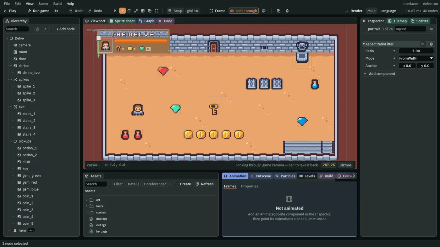
- UV Rect
- The part of the picture a Panel draws, as four numbers: the left and top edges, then the right and bottom, each a fraction of the picture,
0to1. The sheet is 192 by 176 pixels and the hero is tile 98, the 16 by 16 pixels from32,128to48,144. Divide by the sheet’s size,192across and176down, and the fractions are0.166667,0.727273,0.25and0.818182. A new Panel draws the whole picture,0,0,1,1. Chapter 3 names a part of a picture instead. - Ratio
- The Aspect Ratio Fitter’s shape: width divided by height.
1is a square; a new fitter’s is1.7778, 16 by 9. - Mode
- Which side the fitter keeps.
FromWidthkeeps the width the layout gave it and works the height out from it,FromHeightthe other way round.Fitmakes the largest box of the ratio that fits inside the rect, with space left over, andCoverthe smallest box that covers it, cropped. A new fitter’s isFit; the portrait takesFromWidth. - Anchor
- The Aspect Ratio Fitter’s Anchor: the point of the box that stays put as the fitter reshapes it, from
0,0its top left to1,1its bottom right. The portrait keeps its top left corner:0,0.
Here the anchors already give the portrait a box 72 across and 72 down, so the fitter has nothing to correct. Make the plate taller and the portrait would stay 72 square, because its height now follows its width.
Counters in a row
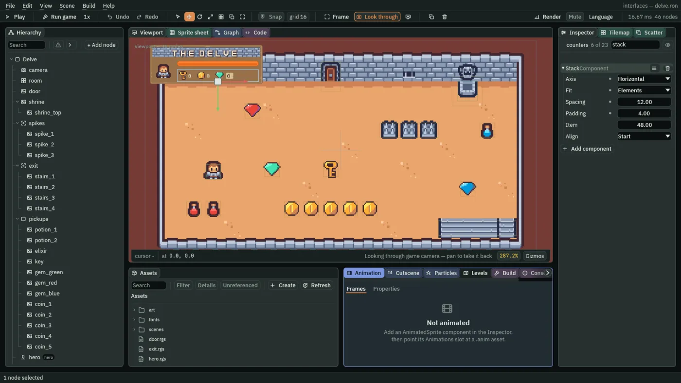
Three counters sit in a row under the bar: a key, a coin and a gem, each an icon and a number. A Stack lays them out, so you place the row once and not each counter.
- Select
hud_plate, click + Add node and choose Stack. Rename the nodecounters. - In its Rect, set Anchor Min to
0,1, Offset Min to88,-48, Offset Max to-12,-8and Pivot to0.5,1. Anchor Max stays1,1. - In its Stack, set Axis to Horizontal, Fit to Elements, Spacing to
12and Padding to4. - Select
counters, click + Add node and choose Node. Rename itkey_counter. Add two more nodes undercountersthe same way,coin_counterandgem_counter. They start empty: each only groups an icon and a number. - Select
key_counter, click + Add node and choose Image. Rename the nodekey_icon. In its Rect, set Anchor Min and Anchor Max both to0,0.5, Offset Min to0,-16, Offset Max to32,16and Pivot to0,0.5. In its Panel, set Color to255,255,255, alpha255and Texture tokey.png, which came with the starter. - Select
key_counter, click + Add node and choose Label. Rename the nodekey_count. In its Rect, set Offset Min to34,0. In its Text, set Text to0, Scale to0.5and Color to236,227,206, alpha255. - Do the same under
coin_counter:coin_icon, with Texturecoin.png, andcoin_count. - Under
gem_counter, addgem_iconthe same way, with Texturegem_green.png. Its count comes in the next section.
- Axis
VerticalorHorizontal: which way the Stack lays its children out. A new Stack isVertical; the counters runHorizontal.- Fit
- How the Stack shares out its length.
Evengives every child an equal share.Fixedgives each child the same Item length.Elementsgives each child the size its own Layout Element asks for, and a child with none asks for48. A new Stack isEven; the counters takeElements, so the gem counter can be wider than the others. - Spacing
- The gap between two neighbours, in UI units:
12. A new Stack’s is8. - Padding
- A Stack’s Padding: the margin kept inside its own edge on every side, in UI units:
4. A new Stack’s is0.
The Stack’s other two rows, Item and Align, stay as they come. Chapter 5 sets them.
Even: three equal shares of the row.A counter that grows
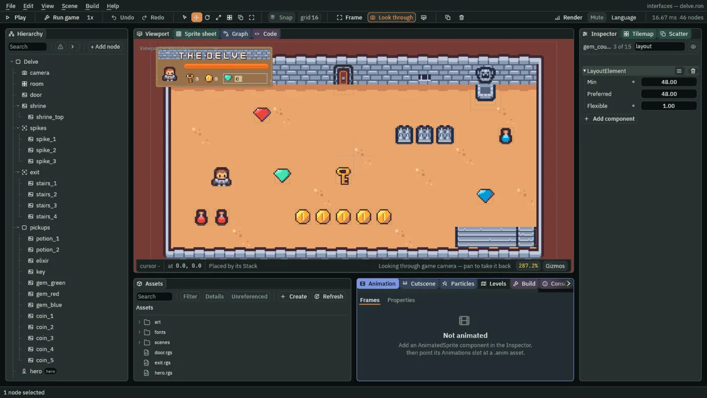
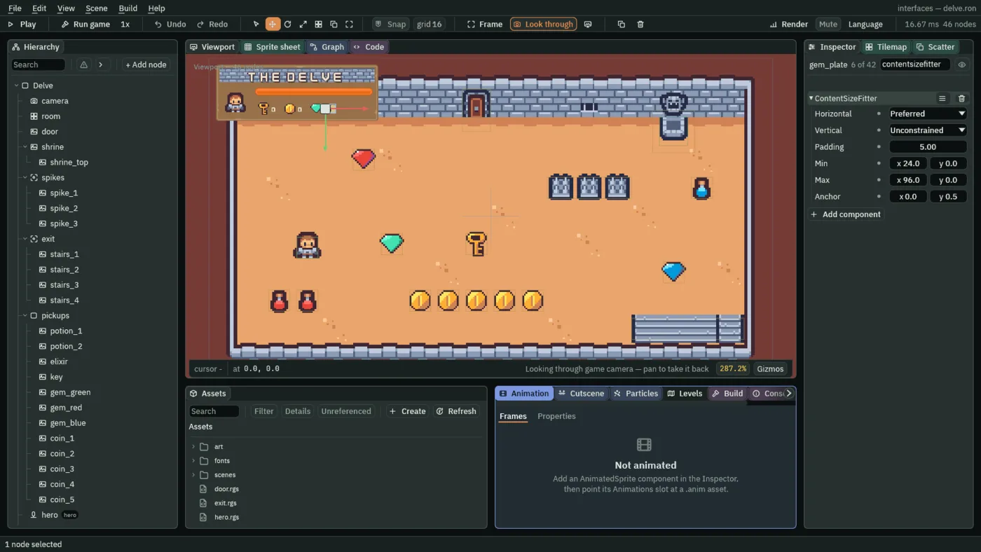
A gem counter can read 10, or 100000, and its number sits on a small beige plate. The plate should be as wide as its digits and no wider, so the plate measures its words and sizes itself to them: a Content Size Fitter. The counter that holds it asks the Stack for room to grow with a Layout Element.
- Select
gem_counter, click Add component and choose LayoutElement. Set Min to48and Flexible to1. Preferred stays48. - Select
gem_counter, click + Add node and choose Panel. Rename the nodegem_plate. - In its Rect, set Anchor Min and Anchor Max both to
0,0.5, Offset Min to36,-11, Offset Max to60,11and Pivot to0,0.5. - In its Panel, set Color to
255,255,255, alpha255, Texture topanelInset_beige.pngand Border to6. - Click Add component and choose TextComponent. Set Text to
0, Scale to0.5, Color to63,38,49, alpha255, a dark plum, and Align to Center. - Click Add component and choose ContentSizeFitter. Set Horizontal to Preferred and Vertical to Unconstrained, Padding to
5, Min to24and0, Max to96and0, and Anchor to0,0.5.
- Min
- A Layout Element’s Min: the least room a Stack gives the counter, in UI units, even if the row overflows.
48. A new Layout Element’s is0. - Flexible
- A Layout Element’s Flexible: its share of the room left in the row once every child has the size it asks for, relative to its siblings’ shares.
0, as a new one has it, never grows. The gem counter is the only child with a share, so it takes all that is left:1. - Horizontal, Vertical
- A Content Size Fitter’s two sides.
Preferredsizes that side to the Text plus the padding;Unconstrainedleaves it to the Rect. The plate’s width follows its digits and its height stays what its Rect says:Preferredacross,Unconstraineddown. - Padding
- A Content Size Fitter’s Padding: the room kept round the words on every side, in UI units, with the Text laid out inside it:
5. A new fitter’s is8. - Min
- A Content Size Fitter’s Min: the smallest the plate may get, across and then down, in UI units:
24,0. A0means no least on that side. - Max
- A Content Size Fitter’s Max: the largest the plate may get, across and then down:
96,0. A0means no limit on that side, so only the width is held, and the plate cannot outgrow its counter. - Anchor
- A Content Size Fitter’s Anchor: the point of the plate that stays put as it grows, from
0,0its top left to1,1its bottom right.0,0.5is the middle of its left edge, so the plate grows to the right.
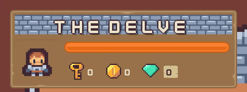
The row works out like this. Inside its padding the row is 260 units wide. The two gaps take 24, and the key and the coin counters ask for 48 each. The gem counter asks for 48 too, and its Flexible 1 gives it everything left: 140. The plate starts 36 in and may be 96 wide, so it ends inside its counter.
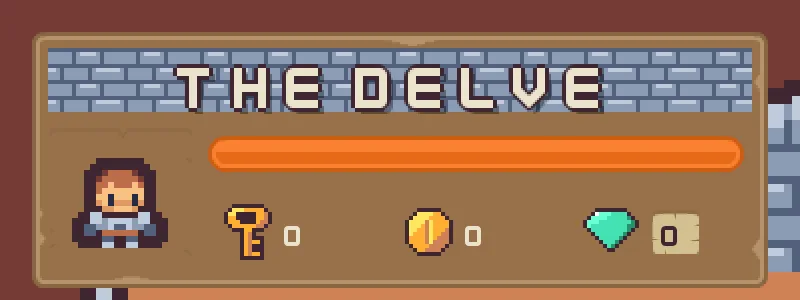
The pictures below show the plate reading 0, which is as you built it, and then 10 and 100000, typed into a copy of the project so you can see it grow. Nothing counts into it until chapter 7.
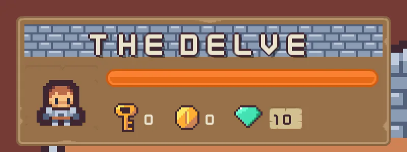
10: the plate wider.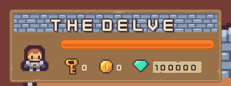
100000: wider again, inside its Max of 96.A bar that only shows
The health bar is a Slider that cannot be moved. A slider and a bar are the same picture drawn from a number; Interactive is the difference. Its two pictures, bar_back.png and bar_fill.png, came with the starter.
- Select
hud_plate, click + Add node and choose Slider. Rename the nodehealth_bar. - In its Rect, set Anchor Min to
0,0, Anchor Max to1,0, Offset Min to88,52, Offset Max to-12,70and Pivot to0,0.5. - In its Slider, set Max to
10, then Value to10. Untick Interactive. Set Fill and Track both to255,255,255, alpha255. - Under Textures, set Fill Texture to
bar_fill.png, Track Texture tobar_back.pngand Border to9.
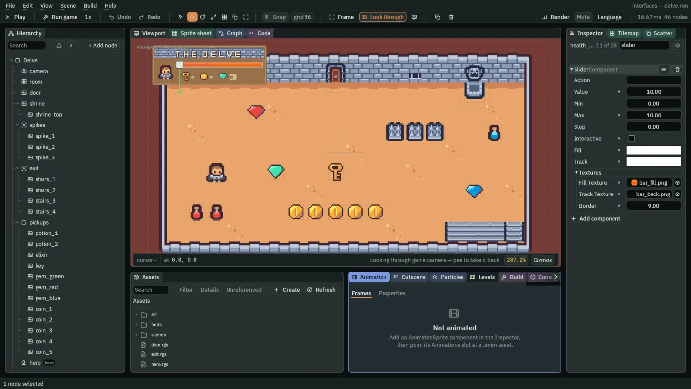
- Value, Max
- A Slider’s Value is where the bar stands, and its Max is where it is full: the bar is filled Value out of Max. A new Slider’s Max is
1. Health is counted out of10, so both are10. Set Max first, so that Value is never past it. - Interactive
- Whether the pointer and the keys can move the bar. Unticked, it is a gauge: a picture of a number that nothing can drag. An interactive Slider with no Action shows a line in Problems; a gauge does not, since nothing is meant to hear it.
- Fill, Track
- Tints for the filled part and for the empty track. A tint multiplies its picture, so white draws each picture as it is. A new Slider’s are grey and dark.
- Fill Texture, Track Texture
- The pictures drawn over the filled part and over the whole track. Empty, the bar is a flat colour.
- Border
- A Slider’s Border: the nine-slice border both its pictures share, in the pictures’ own pixels. The bar art is
36by18with round ends9pixels wide, so9keeps the ends round while the middle stretches to any length.
The Slider’s other rows stay as they come: Action and Step are set in chapter 6, and Min in chapter 16.
The portrait, the counters and the health bar
The portrait
| Node | Component | Field | Value |
|---|---|---|---|
portrait | Rect | Anchor Min | 0, 0 |
| Anchor Max | 0, 1 | ||
| Offset Min | 8, 48 | ||
| Offset Max | 80, -8 | ||
| Pivot | 0, 0 | ||
| Panel | Color | 255, 255, 255, alpha 255 | |
| Texture | panelInset_brown.png | ||
| Border | 6 | ||
| Aspect Ratio Fitter | Ratio | 1 | |
| Mode | FromWidth | ||
| Anchor | 0, 0 | ||
portrait_hero | Rect | Anchor Min | 0.5, 0.5 |
| Anchor Max | 0.5, 0.5 | ||
| Offset Min | -24, -24 | ||
| Offset Max | 24, 24 | ||
| Panel | Color | 255, 255, 255, alpha 255 | |
| Texture | tilemap_packed.png | ||
| UV Rect | 0.166667, 0.727273, 0.25, 0.818182 |
The counters
| Node | Component | Field | Value |
|---|---|---|---|
counters | Rect | Anchor Min | 0, 1 |
| Offset Min | 88, -48 | ||
| Offset Max | -12, -8 | ||
| Pivot | 0.5, 1 | ||
| Stack | Axis | Horizontal | |
| Fit | Elements | ||
| Spacing | 12 | ||
| Padding | 4 | ||
key_counter, coin_counter, gem_counter | empty nodes | ||
key_icon, coin_icon, gem_icon | Rect | Anchor Min | 0, 0.5 |
| Anchor Max | 0, 0.5 | ||
| Offset Min | 0, -16 | ||
| Offset Max | 32, 16 | ||
| Pivot | 0, 0.5 | ||
| Panel | Color | 255, 255, 255, alpha 255 | |
| Texture | key.png, coin.png, gem_green.png | ||
key_count, coin_count | Rect | Offset Min | 34, 0 |
| Text | Text | 0 | |
| Scale | 0.5 | ||
| Color | 236, 227, 206, alpha 255 |
The gem counter
| Node | Component | Field | Value |
|---|---|---|---|
gem_counter | Layout Element | Min | 48 |
| Flexible | 1 | ||
gem_plate | Rect | Anchor Min | 0, 0.5 |
| Anchor Max | 0, 0.5 | ||
| Offset Min | 36, -11 | ||
| Offset Max | 60, 11 | ||
| Pivot | 0, 0.5 | ||
| Panel | Color | 255, 255, 255, alpha 255 | |
| Texture | panelInset_beige.png | ||
| Border | 6 | ||
| Text | Text | 0 | |
| Scale | 0.5 | ||
| Color | 63, 38, 49, alpha 255 | ||
| Align | Center | ||
| Content Size Fitter | Horizontal | Preferred | |
| Vertical | Unconstrained | ||
| Padding | 5 | ||
| Min | 24, 0 | ||
| Max | 96, 0 | ||
| Anchor | 0, 0.5 |
The health bar
| Component | Field | Value |
|---|---|---|
| Rect | Anchor Min | 0, 0 |
| Anchor Max | 1, 0 | |
| Offset Min | 88, 52 | |
| Offset Max | -12, 70 | |
| Pivot | 0, 0.5 | |
| Slider | Value | 10 |
| Max | 10 | |
| Interactive | unticked | |
| Fill | 255, 255, 255, alpha 255 | |
| Track | 255, 255, 255, alpha 255 | |
| Fill Texture | bar_fill.png | |
| Track Texture | bar_back.png | |
| Border | 9 |
Every other field of every node is as it comes.