Tutorials · Interfaces · Chapter 3
The bag
By the end
- The bag’s window,
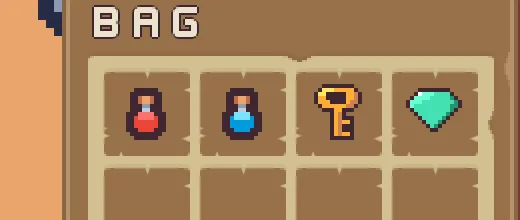
bag, with a grid of sixteen slots in four columns - The first four slots showing the items, cut from the sheet by name
- A clip that keeps what overflows inside the window
On this page
The bag’s window
The bag is a window at the right of the screen: a brown frame with a title, and inside it a paler panel that holds the slots. The panel carries a Clip, so that nothing in the bag can be drawn outside it.
- Select
hud, click + Add node and choose Panel. Rename the nodebag. - In its Rect, set Anchor Min and Anchor Max both to
1,0, Offset Min to-244,160, Offset Max to-16,412and Pivot to1,0. That is a window228wide and252high,16in from the right edge of the screen and160down. - In its Panel, set Color to
255,255,255, alpha255, Texture topanel_brown.pngand Border to8. - Select
bag, click + Add node and choose Label. Rename the nodebag_title. In its Rect, set Anchor Max to1,0, Offset Min to16,0, Offset Max to-16,36and Pivot to0.5,0. In its Text, set Text toBag, Scale to0.75, Color to236,227,206, alpha255, Outline to63,38,49, alpha255and Outline Width to1. - Select
bag, click + Add node and choose Panel. Rename the nodebag_content. In its Rect, set Anchor Max to1,0, Offset Min to12,36, Offset Max to-12,240and Pivot to0.5,0. In its Panel, set Color to255,255,255, alpha255, Texture topanelInset_beige.pngand Border to6. - Select
bag_content, click Add component and choose ClipComponent. Leave its fields as they come.
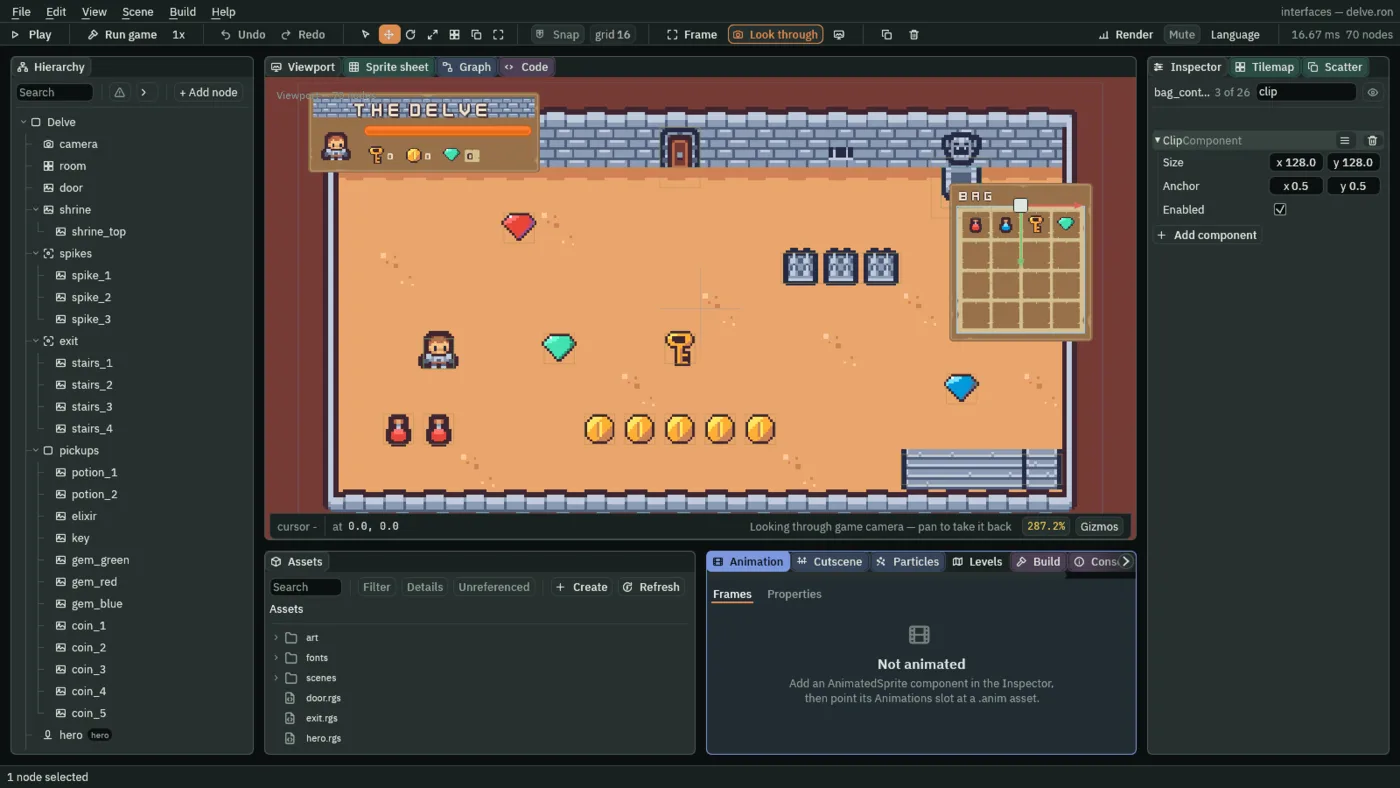
- Enabled
- A Clip’s Enabled: whether it cuts right now. Ticked, everything under
bag_contentis cut at its rect, so a slot that reaches past the edge is drawn only inside it. Unticked, the children draw past the edge, as the last picture of the next section shows. A new Clip is ticked, and the bag leaves it so.
The Clip’s other two rows, Size and Anchor, are for a Clip on a node in the room. On an interface node the Clip cuts at the node’s own rect, so they stay as they come. Chapter 16 uses them.
Sixteen slots
The slots are sixteen small panels in a Grid, which places them in rows and columns so that you do not place each one.
- Select
bag_content, click + Add node and choose Grid. Rename the nodebag_grid. Its Rect stays as it comes, so it fills the content. - In its Grid, set Cell to
44,44, Spacing to4,4and Padding to8. Fit stays Columns and Columns stays4. - Select
bag_grid, click + Add node and choose Panel. Rename the nodebag_1. In its Panel, set Color to255,255,255, alpha255, Texture topanelInset_brown.pngand Border to6. Its Rect stays as it comes: the Grid places it. - With
bag_1selected, press Ctrl+D. The copy comes selected, namedbag_1 copy. Rename itbag_2. Press Ctrl+D again, rename the new copybag_3, and go on until you havebag_16: fifteen copies in all.
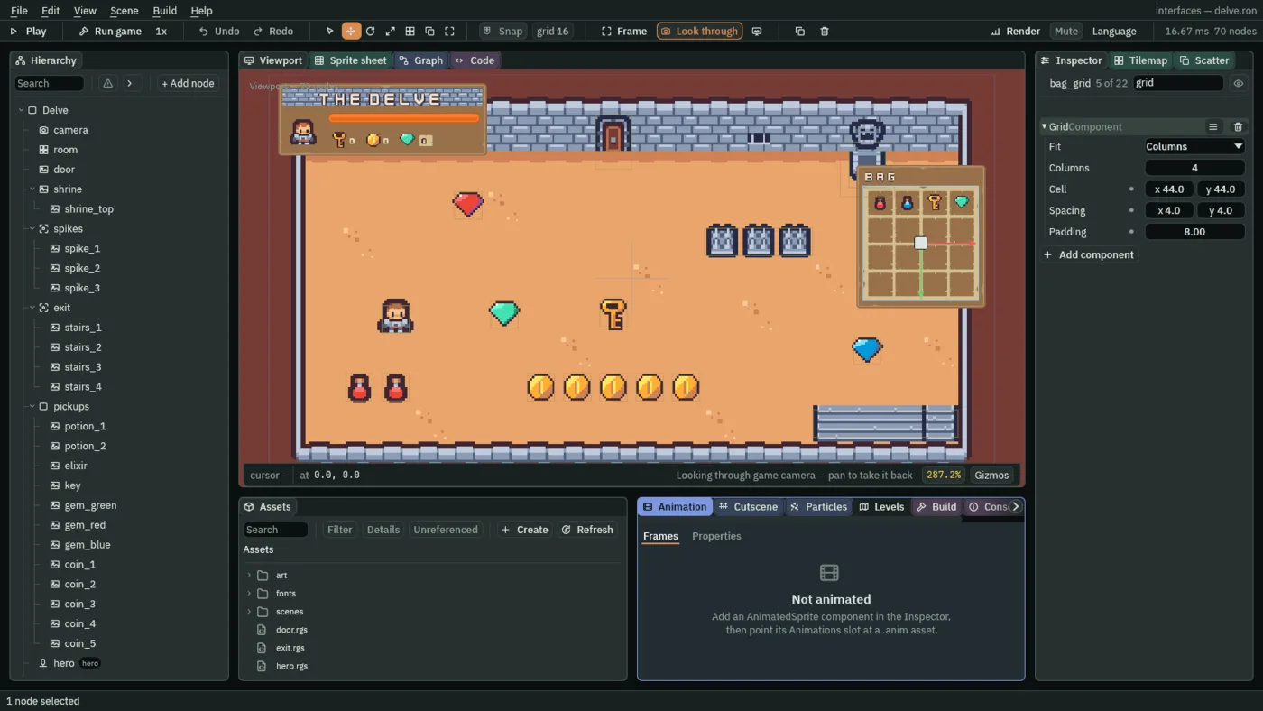
- Cell
- Each slot’s size, in UI units. A Grid with Fit Columns, as this one has, works each slot’s width out from its own width and the number of columns, so only the second number, the slot’s height, is read. Here the content is
204wide. The padding takes16of it, the three gaps12, and four slots share the176left:44each, which is what the first number says too. A new Grid’s Cell is64,64. - Spacing
- The gap between slots, across and then down, in UI units:
4,4, the pale lines between the slots. A new Grid’s is8,8. - Padding
- A Grid’s Padding: the margin kept inside its own edge on every side, in UI units:
8. A new Grid’s is0.
The Grid’s other two rows, Fit and Columns, stay as they come: four columns, shared out of the grid’s width. Chapter 16 defines them.
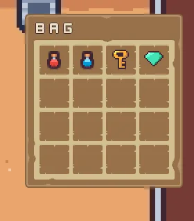
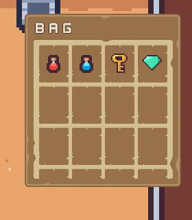
56: the slots grow taller, not wider, and the grid runs past the content, where the Clip cuts it.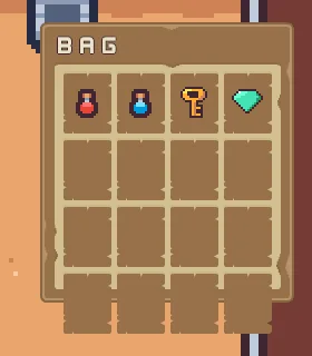
Pictures cut by name
The first four slots hold what the hero can carry: a red flask, a blue flask, a key and a green gem. Each is an Image inside its slot. The two flasks are on Tiny Dungeon’s sheet, and you cut them out by their names, not by numbers.
- Select
bag_1, click + Add node and choose Image. Rename the nodeitem_potion. - In its Rect, set Anchor Min and Anchor Max both to
0.5,0.5, Offset Min to-16,-16and Offset Max to16,16. - In its Panel, set Color to
255,255,255, alpha255, Texture totilemap_packed.pngand Atlas Region topotion. - Do the same in
bag_2foritem_elixir, with Atlas Regionelixir. Inbag_3additem_key, with Texturekey.pngand no region, and inbag_4additem_gem, with Texturegem_green.pngand no region.
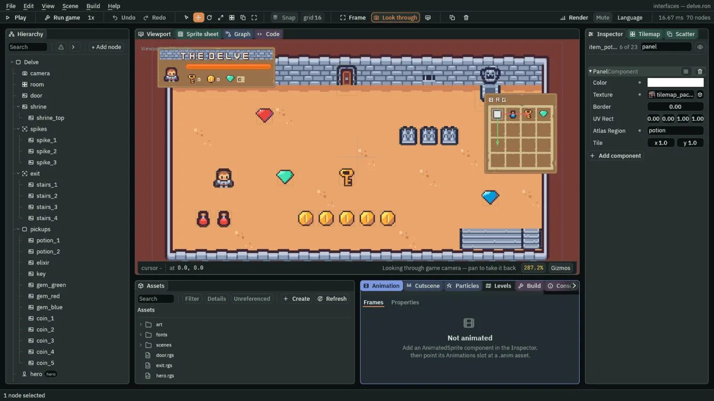
- Atlas Region
- The name of a piece of the picture, from the picture’s
.metafile, drawn instead of the whole picture or the UV Rect. The name is looked up again every frame.potionandelixirare two of the eleven pieces Tiny Dungeon’s sheet names, below. A name the.metadoes not have draws the whole picture, and the Console says so once. Empty, as a new Panel has it, draws the UV Rect.
Chapter 2’s portrait named the hero’s tile by four fractions. A region is the same job done by a name, which says what the piece is and not only where it is. The sheet’s .meta came with the starter, and holds these eleven:
| Region | Shows | Tile |
|---|---|---|
hero | the hero | 98 |
door_closed | the door, closed | 45 |
door_open | the door, open | 21 |
shrine_top | the shrine’s gargoyle | 19 |
shrine_base | the shrine’s basin | 31 |
spikes | a spike trap | 41 |
stairs_left | the stairs, left end | 36 |
stairs_mid | the stairs, middle | 37 |
stairs_right | the stairs, right end | 39 |
potion | the red flask | 115 |
elixir | the blue flask | 116 |
The bag, its grid and its pictures
The bag’s window
| Node | Component | Field | Value |
|---|---|---|---|
bag | Rect | Anchor Min | 1, 0 |
| Anchor Max | 1, 0 | ||
| Offset Min | -244, 160 | ||
| Offset Max | -16, 412 | ||
| Pivot | 1, 0 | ||
| Panel | Color | 255, 255, 255, alpha 255 | |
| Texture | panel_brown.png | ||
| Border | 8 | ||
bag_title | Rect | Anchor Max | 1, 0 |
| Offset Min | 16, 0 | ||
| Offset Max | -16, 36 | ||
| Pivot | 0.5, 0 | ||
| Text | Text | Bag | |
| Scale | 0.75 | ||
| Color | 236, 227, 206, alpha 255 | ||
| Outline | 63, 38, 49, alpha 255 | ||
| Outline Width | 1 | ||
bag_content | Rect | Anchor Max | 1, 0 |
| Offset Min | 12, 36 | ||
| Offset Max | -12, 240 | ||
| Pivot | 0.5, 0 | ||
| Panel | Color | 255, 255, 255, alpha 255 | |
| Texture | panelInset_beige.png | ||
| Border | 6 | ||
| Clip | every field | as it comes |
The grid
| Node | Component | Field | Value |
|---|---|---|---|
bag_grid | Grid | Cell | 44, 44 |
| Spacing | 4, 4 | ||
| Padding | 8 | ||
bag_1 to bag_16 | Panel | Color | 255, 255, 255, alpha 255 |
| Texture | panelInset_brown.png | ||
| Border | 6 |
The item pictures
| Node | Component | Field | Value |
|---|---|---|---|
item_potion, item_elixir, item_key, item_gem | Rect | Anchor Min | 0.5, 0.5 |
| Anchor Max | 0.5, 0.5 | ||
| Offset Min | -16, -16 | ||
| Offset Max | 16, 16 | ||
| Panel | Color | 255, 255, 255, alpha 255 | |
item_potion | Texture, Atlas Region | tilemap_packed.png, potion | |
item_elixir | Texture, Atlas Region | tilemap_packed.png, elixir | |
item_key | Texture | key.png | |
item_gem | Texture | gem_green.png |
Every other field of every node is as it comes.