Tutorials · Interfaces · Chapter 4
One palette
By the end
- The HUD canvas’s Theme set to the pack’s palette, and applied
- Gold titles by the Accent role; a red Drop button by the Danger role
On this page
One palette
So far every colour was typed onto the node that wears it. A Theme holds a screen’s colours in one place, as a palette, and Apply theme writes them into the controls under the canvas, each by the role it takes. Change a colour in one place and apply it again, and the whole screen follows.
- Select
hud. Its Inspector holds two components: the Canvas from chapter 1, and a ThemeComponent, which a new Canvas comes with. - In its Theme, set Panel to
255,255,255, alpha255, Panel Accent to254,231,97, alpha255and Panel Danger to232,69,55, alpha255. If the picker reads F at its top left, press it back to U8, as in chapter 1. - Set Text to
236,227,206, alpha255, Text Accent to254,174,52, alpha255and Text Danger to255,228,220, alpha255. - Set Button to
255,255,255, alpha255and Button Text to236,227,206, alpha255. - Set Hover Lift to
0.15and Press Sink to0.35. - Select
bagand set its Rect’s Offset Max to-16,448. The window grows from252to288high, to leave room at its foot for a button.
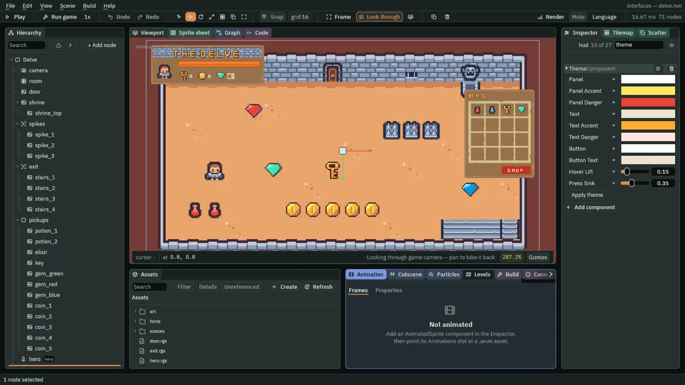
- Panel, Panel Accent, Panel Danger
- The fills of panels, by role: the plain one, an accent for emphasis, and a danger one for what deletes or discards. The Delve’s panels draw pictures, and a white fill draws a picture as it is, so the plain one is white. The accent is a warm yellow,
254,231,97, and the danger a red,232,69,55. - Text, Text Accent, Text Danger
- The colours of words, by the same three roles. The plain words are the cream of chapter 1’s title,
236,227,206. The accent is gold,254,174,52, and the danger words a pale pink,255,228,220, picked to read on the red. - Button, Button Text
- A plain button’s face when it is idle, and the words on it. White again, for the same reason, and the cream words. An accent or a danger button takes its role’s fill and its role’s words instead, so these two matter first to the plain buttons that start in chapter 5.
- Hover Lift, Press Sink
- How far a button’s face changes under the pointer and while it is held, each a fraction from
0to1of the way to white or to black. Hover Lift lightens the face toward white:0.15. Press Sink darkens it toward black:0.35. A new Theme’s are both0.2.
Roles
A node’s Theme Role says which of the Theme’s looks its controls take. A node with no Theme Role takes the plain one, so most of the HUD needs none.
- Select
hud_title, click Add component and choose ThemeRoleComponent. Set Role to Accent. - Do the same for
bag_title. - Select
gem_plate, click Add component and choose ThemeRoleComponent, and set Role to Custom.
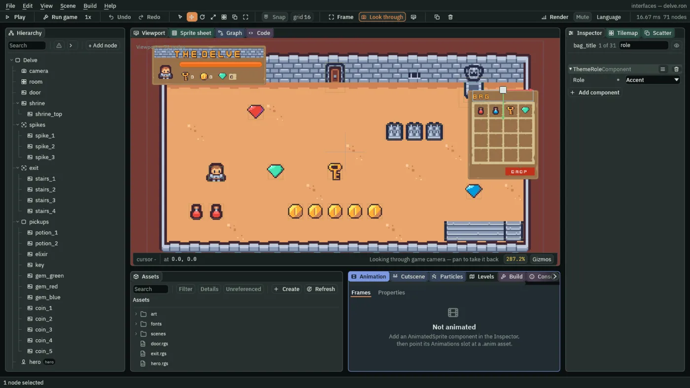
- Role
- Which of the Theme’s looks the node’s controls take.
Normalis the plain look, and a node with no Theme Role has it.Accentis for emphasis: the two titles.Dangeris for a button that deletes or discards: Drop.Customkeeps the node’s own colours through every Apply theme: the gem plate.
A danger button
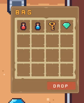
The bag gets a Drop button at its foot. Chapter 9 makes it ask whether to empty the bag. It takes the Danger role, so it comes out red.
- Select
bag, click + Add node and choose Button. Rename the nodedrop_button. - In its Rect, set Anchor Min to
1,1, Offset Min to-108,-40, Offset Max to-12,-12and Pivot to1,1. Anchor Max stays1,1. The button is96wide and28high,12in from the bag’s right and bottom edges. - In its Panel, set Texture to
panelInset_beige.pngand Border to6. - In its Text, set Text to
Drop, Scale to0.5and Align to Center. - Click Add component and choose ThemeRoleComponent. Set Role to Danger.
- In its Button, set Action to
drop.
The Panel’s Color, the Text’s Color and the Button’s three tints are not typed. Apply theme writes them, in the next section, from the Danger role.
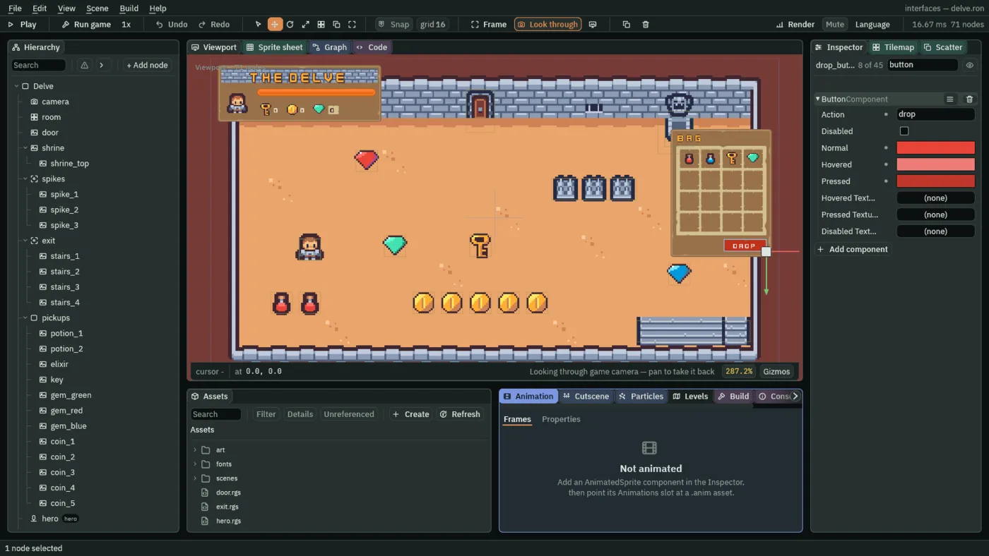
- Action
- A Button’s Action: the name of the action its press fires, here
drop. A Button fires it when a click on it is let go, or when Enter or Space is pressed while it has the focus. A script reads it withpressed("drop"), which is true for one step, the first after that. Nothing listens fordropyet: chapter 9’s question for the bag does. - Normal, Hovered, Pressed
- The face’s tint at rest, under the pointer or with the focus, and while a click holds it down. Apply theme writes them from the role: Normal is the role’s fill,
232,69,55, Hovered is that lifted toward white by Hover Lift,236,124,118, and Pressed that sunk toward black by Press Sink,192,55,44.
The Button’s other four rows, Disabled and the three pictures, stay as they come. Chapter 5 sets them.
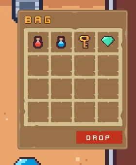
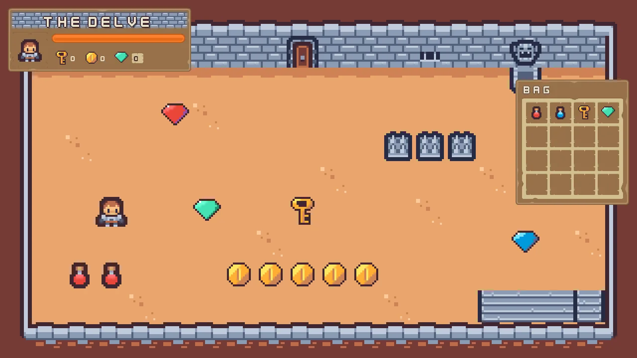
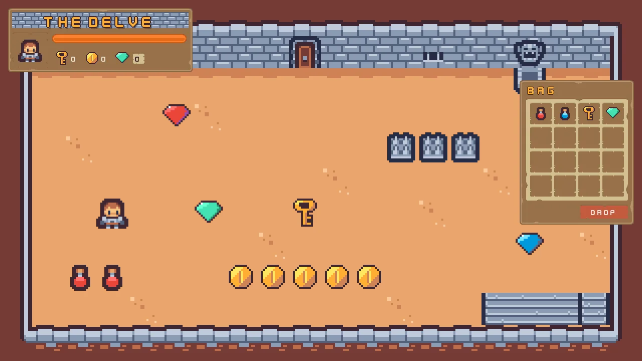
The two pictures below show the finished button. The first is taken before the game has taken a step, and the second a moment later, with the pointer on it.
Apply theme
- Select
hudand press Apply theme, at the foot of its Theme. The two titles turn gold and Drop turns red. - Press Ctrl+Z. The whole restyle was one step, so it goes back at once: the titles cream again, and Drop as it was before. Press Apply theme again.
Apply theme walks every node under the canvas and writes the Theme’s colours into its controls by its role: a Panel’s colour, a Text’s colour, a Button’s three tints, a Slider’s fill and track. A node already at its role’s colour stays as it was, which is why only the two titles and Drop changed here, and a Custom node is skipped. Pressing it twice is the same as pressing it once.
The colours are then the controls’ own. They are saved with the scene and drawn by an exported game, which never runs the Theme itself. So changing the Theme later changes nothing until you apply it again.
The theme, the roles and the Drop button
The theme
| Node | Component | Field | Value |
|---|---|---|---|
hud | Theme | Panel | 255, 255, 255, alpha 255 |
| Panel Accent | 254, 231, 97, alpha 255 | ||
| Panel Danger | 232, 69, 55, alpha 255 | ||
| Text | 236, 227, 206, alpha 255 | ||
| Text Accent | 254, 174, 52, alpha 255 | ||
| Text Danger | 255, 228, 220, alpha 255 | ||
| Button | 255, 255, 255, alpha 255 | ||
| Button Text | 236, 227, 206, alpha 255 | ||
| Hover Lift | 0.15 | ||
| Press Sink | 0.35 | ||
bag | Rect | Offset Max | -16, 448 |
The roles
| Node | Component | Field | Value |
|---|---|---|---|
hud_title, bag_title | Theme Role | Role | Accent |
| Text | Color | 254, 174, 52, alpha 255, written by Apply theme | |
gem_plate | Theme Role | Role | Custom |
The Drop button
| Component | Field | Value |
|---|---|---|
| Rect | Anchor Min | 1, 1 |
| Anchor Max | 1, 1 | |
| Offset Min | -108, -40 | |
| Offset Max | -12, -12 | |
| Pivot | 1, 1 | |
| Panel | Color | 232, 69, 55, alpha 255, written by Apply theme |
| Texture | panelInset_beige.png | |
| Border | 6 | |
| Text | Text | Drop |
| Scale | 0.5 | |
| Color | 255, 228, 220, alpha 255, written by Apply theme | |
| Align | Center | |
| Button | Action | drop |
| Normal | 232, 69, 55, alpha 255, written by Apply theme | |
| Hovered | 236, 124, 118, alpha 255, written by Apply theme | |
| Pressed | 192, 55, 44, alpha 255, written by Apply theme | |
| Theme Role | Role | Danger |
Every other field of every node is as it comes.
Check it works
Part 1 ends here: a HUD and a bag that look finished and do nothing yet. The title screen begins making them work.