Tutorials · Interfaces · Chapter 8
Tooltips
By the end
- A tooltip on every slot naming its item, on each counter, and on the health bar
- Each after its delay, beside what it describes, on the HUD’s own plate
On this page
A tooltip
A Tooltip is a few words that open beside a node once the pointer has rested on it for a moment, and close when the pointer moves away. It is the place for what a thing is, or what it asks for, which would crowd the screen if it were always there. This chapter gives one to each counter, to the health bar and to every slot of the hotbar and the bag.
- Select
key_counter, click Add component and choose TooltipComponent. Set Text toOpens the locked door, by walking into it., Delay to0.8and Placement to Right. - Do the same for
coin_counter, with Text set toCoins you have found., and forgem_counter, with Text set toGems you have found.. Both take Delay0.8and Placement Right. - Select
health_bar, add a TooltipComponent, and set Text toHealth: spikes take it, potions give it back.and Delay to0.8. Its Placement stays Below, as it comes.
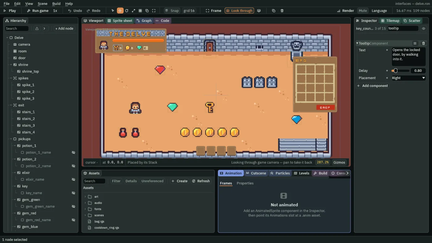
- Text
- A Tooltip’s Text: what it says. Empty, it opens nothing at all, however long the pointer rests, which the slots below depend on. Its words stay on one line, as a tooltip’s do unless its canvas’s style gives it a Max Width, which chapter 16 does.
- Delay
- How long the pointer must hold still on the node before the tooltip opens, in seconds, from
0to5. A short wait suits something the player reaches for, a slot,0.3. A longer one suits words that only explain, a counter or the bar,0.8: a pointer passing over them opens nothing. - Placement
- Which side of the node the tooltip opens on, centred on it and a few units off: Above, Below, Left or Right. Below is the default. A side with no room is no problem: the tooltip opens on the opposite side instead, and one that is still too wide slides along the window’s edge to stay inside it. The counters take Right, the hotbar’s slots Above, since they sit at the bottom of the window, and the bag’s slots Left, since the bag sits at its right.
A slot is different. What it says depends on what it holds, and that changes as the game is played, so a slot’s Tooltip has no words of its own and a script writes them.
- In the Hierarchy, select
hotbar_1, then Ctrl-clickhotbar_2,hotbar_3andhotbar_4. Click Add component and choose TooltipComponent. Clear Text, which starts asTooltip, set Delay to0.3and Placement to Above. What you set now is set on all four. - Select
bag_1, then Ctrl-clickbag_2tobag_16, add a TooltipComponent, clear its Text, and set Delay to0.3and Placement to Left. - In Assets, press Create, choose New script, type
slot_tooltip, and press Enter. - In the Code tab, replace everything in
slot_tooltip.rgswith the script below, and press Ctrl+S.
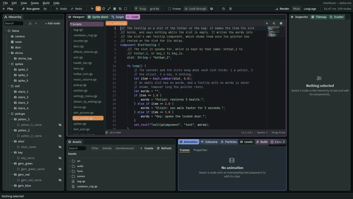
/// The tooltip on a slot of the hotbar or the bag: it names the item the slot
/// holds, and says nothing while the slot is empty. It writes the words into
/// the slot's own Tooltip component, which shows them once the pointer has
/// rested on the slot for its delay.
component SlotTooltip {
    /// The slot it speaks for, which is kept by that name: hotbar_1 to
    /// hotbar_4, or bag_1 to bag_16.
    slot: String = "hotbar_1",

    fn loop() {
        // The satchel and the slots keep what each slot holds: 1 a potion, 2
        // the elixir, 3 a key, 0 nothing.
        let item = kept_number(slot, 0.0);
        // An empty slot has no words, and a Tooltip with no words is never
        // shown, however long the pointer rests.
        let words = "";
        if item == 1.0 {
            words = "Potion: restores 3 health.";
        } else if item == 2.0 {
            words = "Elixir: you walk faster for 5 seconds.";
        } else if item == 3.0 {
            words = "Key: opens the locked door.";
        }
        set_text("TooltipComponent", "text", words);
    }
}
- Select the four hotbar slots again, click Add component and choose SlotTooltip. Then select the sixteen bag slots and add it to them too.
- The script’s Slot starts as
hotbar_1. Select each slot in turn and set it to the slot’s own name:hotbar_2,hotbar_3andhotbar_4on the rest of the hotbar, andbag_1tobag_16on the bag.
component SlotTooltip declares the script’s component, with one field, slot, the name of the slot it speaks for. The satchel of chapter 7 keeps every slot as a number under its own name: 1 a potion, 2 the elixir, 3 a key and 0 nothing. kept_number reads it, and set_text writes the words into the slot’s own Tooltip, on every step. A slot that fills says its item at once, and one that empties falls silent.
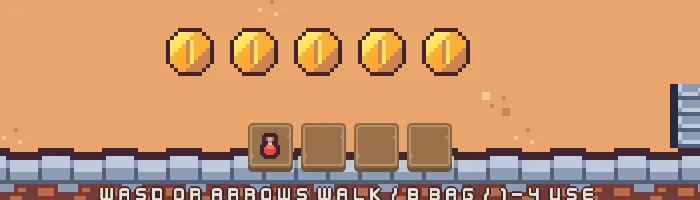
In the first two pictures the pointer comes to rest on the potion in the hotbar’s first slot. A sixth of a second later the Delay of 0.3 has not run out, and nothing has opened. A moment after that it has. The last three rest the pointer on a counter, on the bar and on a slot of the bag.
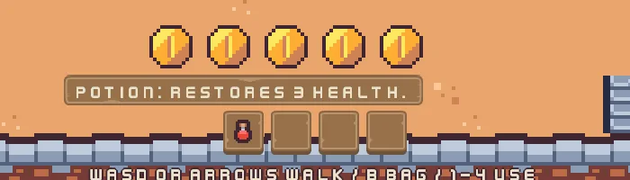
0.3 seconds: the tooltip, above the slot.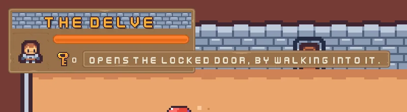
0.8 seconds.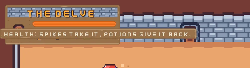
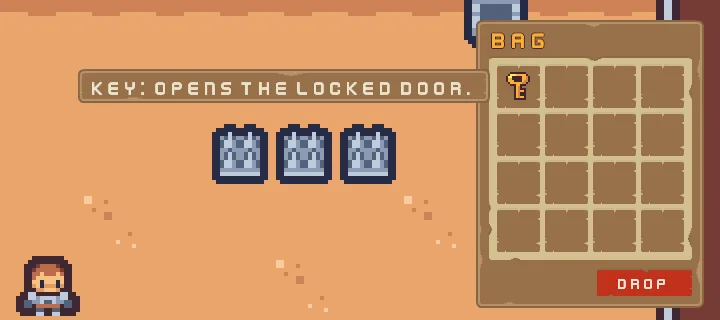
In the HUD’s style
A canvas with no Tooltip Style draws its tooltips in a plain dark box with pale words. A Tooltip Style on the canvas dresses every tooltip under it: a picture for the box, the colour of the words, their size and the room round them. The Delve’s tooltips wear the HUD’s own brown plate.
- Select
hud, click Add component and choose TooltipStyleComponent. - Set Texture to
panel_brown.png, Border to8, Scale to0.625and Padding to14,8. - Click the swatch of Edge and set its alpha to
0. Its colour,54,67,63, stays as it comes. - Press Apply theme, at the foot of
hud’s Theme. It writes Panel, white, and Ink, the palette’s cream, from the Theme, as it did for the controls in chapter 4.
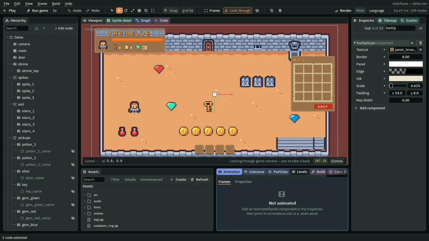
- Texture
- A Tooltip Style’s Texture: the picture the box is drawn with, stretched to its words. Empty, the box is flat, a plain block of its Panel colour.
panel_brown.pngis the plate the HUD itself wears. - Border
- How many pixels in from each edge of the picture are its frame, in the picture’s own pixels, as a Panel’s Border is:
8keeps the plate’s corners their size whatever the words make the box.0stretches the whole picture. - Panel
- The box’s colour, or the tint on its picture. White,
255,255,255, alpha255, draws the plate as it is. Apply theme writes it from the Theme’s Panel, and always opaque: a tooltip opens over the game. - Edge
- The colour of a thin frame just outside the box. Fully see-through, alpha
0, draws none, and the plate has a frame of its own, so none is wanted. The colour behind the alpha is the style’s default. Apply theme paints a frame only while the style draws one. - Ink
- The colour of the words: the palette’s cream,
236,227,206, alpha255. Apply theme writes it from the Theme’s Text. - Scale
- How big the words are, as a Text’s Scale is, a share of the face’s
32pixels:0.625is20. They are drawn at the canvas’s own scale, so a tooltip grows with the interface. - Padding
- The room between the words and the box’s edge, across and down, in UI units:
14and8, so the words sit clear of the plate’s frame.
The style’s last row, Max Width, stays 0: a tooltip keeps its words on one line. Chapter 16 gives it a number, for words that need to wrap.
Remove the component, and every tooltip on the canvas goes back to the plain dark box and its pale words.
The tooltips and the tooltip style
The tooltips
| Node | Component | Field | Value |
|---|---|---|---|
key_counter | Tooltip | Text | Opens the locked door, by walking into it. |
| Delay | 0.8 | ||
| Placement | Right | ||
coin_counter | Tooltip | Text | Coins you have found. |
| Delay | 0.8 | ||
| Placement | Right | ||
gem_counter | Tooltip | Text | Gems you have found. |
| Delay | 0.8 | ||
| Placement | Right | ||
health_bar | Tooltip | Text | Health: spikes take it, potions give it back. |
| Delay | 0.8 | ||
hotbar_1 to hotbar_4 | Tooltip | Text | empty |
| Delay | 0.3 | ||
| Placement | Above | ||
| SlotTooltip | Slot | hotbar_1 to hotbar_4 | |
bag_1 to bag_16 | Tooltip | Text | empty |
| Delay | 0.3 | ||
| Placement | Left | ||
| SlotTooltip | Slot | bag_1 to bag_16 |
The tooltip style
| Component | Field | Value |
|---|---|---|
| Tooltip Style | Texture | panel_brown.png |
| Border | 8 | |
| Panel | 255, 255, 255, alpha 255, written by Apply theme | |
| Edge | 54, 67, 63, alpha 0 | |
| Ink | 236, 227, 206, alpha 255, written by Apply theme | |
| Scale | 0.625 | |
| Padding | 14, 8 |
Every other field of every node is as it comes.