Tutorials · Interfaces · Chapter 9
Pause and confirm
By the end
- Escape pauses the delve behind a pause menu that fades in and blocks every click
- Quit to title asks “Leave the delve?”; Drop asks “Empty the bag?”
- Each bag slot holding an item opens a menu: Use, Drop, Inspect
On this page
A pause menu
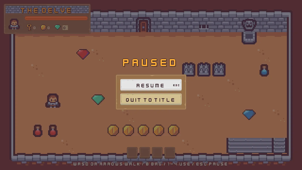
Esc pauses the delve. Everything that runs with the game stops where it is, and a second canvas takes over: it runs only while the game is paused, and it holds a dimmed room, a name and two buttons, Resume and Quit to title.
The key and the canvas
- Copy the two files below into your project’s
artfolder, each from where the list says it is in the unzipped download. Then press Refresh in the Assets panel.
panel_beige.png is the frame of every dialog in this chapter, and panel_beigeLight.png the plate of the bag’s menus.
- Choose View → Input map…. Type
pauseinto New action and press Add. Withpauseselected, press Choose key…, typeescand choose Esc. Esc cancels a recording, so it can only be chosen from the list. Press Save, and close the window. - Select
Delve, click + Add node and choose Canvas. Rename itpause, and set its Scale Mode to ShrinkToFit. - In its Node section, open Advanced and set Process Mode to WhenPaused.
- Select
hud, and set its Theme’s Button Text to63,38,49, alpha255, the dark plum of the title’s buttons in chapter 5. The buttons and menus of this chapter are pale pictures, and cream words would vanish on them. Then open the ≡ menu at the right of its ThemeComponent header and choose Copy values. - Select
pause, open the ≡ menu of its ThemeComponent and choose the paste entry, Paste values. The pause canvas has the same palette as the HUD. - Click Add component and choose FocusRingComponent, on
pauseand then onhud. Its Color is the palette’s Text Accent,254,174,52, alpha255, which Apply theme writes below. Width and Outset stay2. - Select
pause, click Add component and choose TextSize, chapter 6’s script that sizes a canvas by the text size the player chose. Its three sizes,1536by864,1280by720and1066by600, are as the script gives them.
The Input window marks pause and ui_cancel as sharing Esc. That is meant. The menus answer ui_cancel, the game answers pause, and a menu or a dialog that takes an Esc first keeps it from the game, as the notes below say.
- Process Mode
- Whether a node, and everything under it, keeps running while the game is paused. Inherit, the default, follows the parent, and at the top of a scene that stops. WhenPaused runs only while the game is paused, which is what a pause menu is:
pauseand all it holds. Always runs either way, and Pausable stops with the game.
The HUD takes a Focus Ring of its own because the bag’s menus and dialogs are on the HUD, and a canvas draws the ring of the control the keys are on only for its own controls. The pause canvas is added after the HUD, so it draws over it: the interface draws in the Hierarchy’s order wherever two things overlap.
The menu
- Select
pause, click + Add node and choose Fade Group. Rename itpause_menu. Its Rect stays as it comes, so it fills the canvas. Untick Visible in its Node section: the menu stays hidden until the game pauses. - In its Canvas Group, set Alpha to
0and tick Blocks Input. - Click Add component and choose AudioSourceComponent. Untick Positional, and leave Bus as Sfx.
- In its Triggers, press the + beside it twice. Set the first entry’s Name to
clickand its Clip toclick_001.ogg, and the second’s Name tobackand its Clip toback_001.ogg. Each Mode stays Shuffle, and each Pitch and Volume as it comes,1to1. - Select
pause_menu, click + Add node and choose Panel. Rename itpause_dim. Its Rect stays as it comes, so it fills the menu. Set its Panel Color to63,38,49, alpha191: the room goes dark behind it. - Click Add component on
pause_dimand choose ThemeRoleComponent. Set Role to Custom, so that Apply theme leaves the veil’s colour alone. - Select
pause_menu, click + Add node and choose Label. Rename itpause_name. In its Rect, set Anchor Min and Anchor Max both to0.5,0.5, Offset Min to-360,-141, Offset Max to360,-61and Pivot to0.5,1. - In its Text, set Text to
Paused, Scale to1.5and Align to Center. Set Outline to63,38,49, alpha255and Outline Width to2. Under Effects, set Shadow to0,0,0, alpha153, Shadow Offset to3,3and Shadow Softness to0. - Click Add component and choose ThemeRoleComponent. Set Role to Accent. The gold of the word comes from the palette.
- Select
pause_menu, click + Add node and choose Panel. Rename itpause_frame. In its Rect, set Anchor Min and Anchor Max both to0.5,0.5, Offset Min to-150,-45and Offset Max to150,105. - In its Panel, set Texture to
panel_brown.pngand Border to8. Its Color comes from the palette. - Select
pause_frame, click + Add node and choose Stack. Rename itpause_buttons. Its Rect stays as it comes, so it fills the frame. In its Stack, set Fit to Fixed, Spacing to12, Padding to20, Item to49and Align to Center.
The frame is 300 wide and 150 high. Two buttons of 49 and the gap of 12 between them are 110, and the frame’s room, once its padding of 20 is taken from the top and the bottom, is 110 too: the two fill it.
Resume and Quit to title
- Select
pause_buttons, click + Add node and choose Menu Button. Rename itresume. Its Rect stays as it comes: the Stack places it. - In its Panel, set Texture to
buttonLong_beige.pngand Border to8. In its Text, set Text toResume, Scale to0.75and Align to Center. - In its Button, set Action to
resume, Hovered Texture tobuttonLong_grey.png, Pressed Texture tobuttonLong_beige_pressed.pngand Disabled Texture tobuttonLong_blue.png. In its Shortcut, set Action toui_cancel. - Select
pause_buttonsagain, click + Add node and choose Button. Rename itquit_to_title. Give it the same Panel and the same three pictures, and set its Text’s Text toQuit to title, Scale to0.75and Align to Center, and its Button’s Action toquit_to_title. It has no Shortcut. - Click Add component and choose FocusComponent, on
resumeand onquit_to_title. Onresume, set Up, Down, Next and Previous all toquit_to_title, and onquit_to_titleall four toresume. With two buttons every direction goes to the other.
- Blocks Input
- A Canvas Group’s Blocks Input: when it is ticked, a click anywhere in the group’s box stops there and goes no further, whatever is drawn behind it, and at any Alpha, so a menu that is still fading in already shields the room.
pause_menufills the whole canvas, so the HUD and the bag take no click while the game is paused. A group that is hidden blocks nothing, which is why the menu is hidden until it is needed.
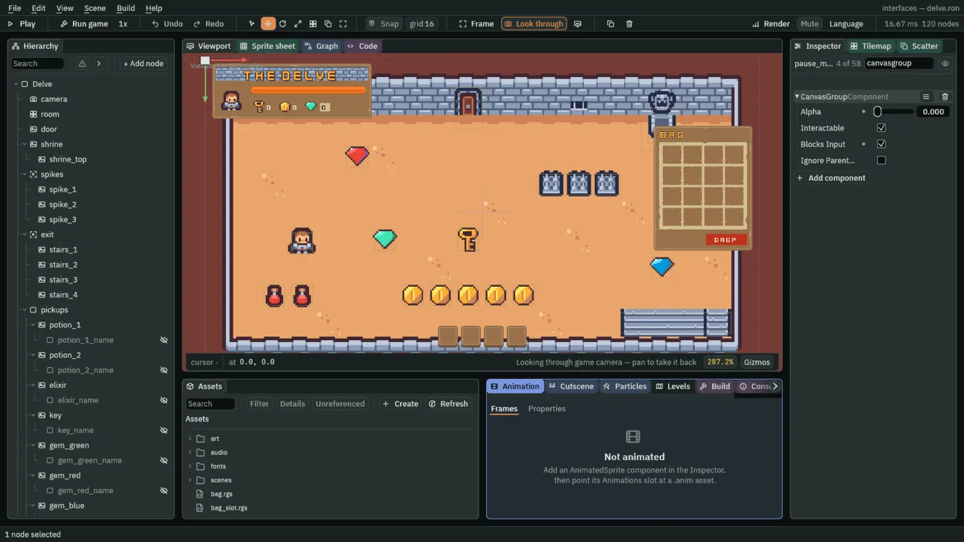
The Canvas Group’s other rows, Interactable and Ignore Parent Groups, stay as they come, and chapter 16 defines them. Alpha is chapter 5’s.
The scripts
- In Assets, press Create, choose New script, type
pause_key, and press Enter. In the Code tab, replace everything inpause_key.rgswith the script below, and press Ctrl+S.
/// Esc, which the input map calls pause, pauses the game: everything that runs
/// with the game stops where it is, and the pause screen, which runs only
/// while the game is paused, takes over. It sits on the HUD, which runs with
/// the game.
component PauseKey {
    fn loop() {
        // An Escape that closed a slot's menu or answered one of the bag's
        // dialogs is spent on that, and reaches the game only once it is let
        // go and pressed again.
        if pressed("pause") {
            pause();
        }
    }
}
- Select
hud, click Add component and choose PauseKey.
pressed("pause") is true for one step: the first after Esc goes down, unless a menu or a dialog has taken that Esc first. pause pauses the game at the end of the step: nodes set to run while paused keep going, and the rest stop where they are. The script sits on hud, which runs with the game, so it hears Esc only while the game is not paused.
- In Assets, press Create, choose New script, type
pause_menu, and press Enter. In the Code tab, replace everything inpause_menu.rgswith the script below, and press Ctrl+S.
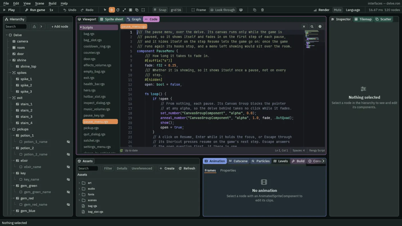
/// The pause menu, over the delve. Its canvas runs only while the game is
/// paused, so it shows itself and fades in on the first step of each pause,
/// and it hides itself on the step Resume lets the game go on: once the game
/// runs again its hooks stop, and a menu left showing would sit over the room.
component PauseMenu {
    /// How long it takes to fade in.
    #[suffix("s")]
    fade: f32 = 0.25,
    /// Whether it is showing, so it shows itself once a pause, not on every
    /// step.
    #[hidden]
    open: bool = false,

    fn loop() {
        if !open {
            // From nothing, each pause. Its Canvas Group blocks the pointer
            // at any alpha, so the delve behind takes no click while it fades.
            set_number("CanvasGroupComponent", "alpha", 0.0);
            anneal_number("CanvasGroupComponent", "alpha", 1.0, fade, .OutQuad);
            show();
            open = true;
        }
        // A click on Resume, Enter while it holds the focus, or Escape through
        // its Shortcut presses resume on the game's next step. Escape answers
        // the open question first, if there is one.
        if pressed("resume") {
            play_sound("back");
            hide();
            open = false;
            resume();
        }
        if pressed("quit_to_title") || pressed("leave") {
            play_sound("click");
        }
        if pressed("stay") {
            play_sound("back");
        }
    }
}
- Select
pause_menu, click Add component and choose PauseMenu. Its Fade starts at the script’s own0.25: leave it.
The pause canvas runs only while the game is paused, so this script’s loop starts on the first step of each pause. A script on a hidden node still runs, which is how a hidden menu shows itself. open is false at first, so the script puts the group’s alpha at 0, anneals it to 1 over fade seconds and shows the node. resume ends the pause at the end of the step, and the script hides the menu on the same step, since once the game runs again its hooks stop and a menu left showing would sit over the room.
pressed("resume") is true for one step: the first after Resume is clicked, or Enter or Space presses it while it holds the focus, or Esc presses it through its Shortcut. pressed("quit_to_title") is true the same way, without the shortcut, and pressed("leave") and pressed("stay") come from the question, below. Resume and Stay play back, and Quit to title and Leave play click, from the node’s Audio Source.
A screen opens with its first control focused, as the title did, so Resume is lit. By keys, Up and Down or Tab walk between the two buttons, Enter presses the lit one, and Esc resumes.
A question first
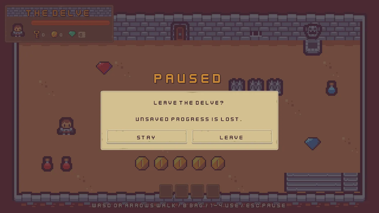
Quit to title throws the run away, so it asks first. A Modal is a dialog that owns the interface until it is answered: a title, a question and up to three answers, drawn over a scrim, and nothing outside it can be reached by any input device while it is up. It is one node, and its answers are a list inside it, not nodes of their own.
- Select
pause_menu, click + Add node and choose Modal. Rename itquit_dialog, and untick Visible. A dialog is open while it is visible, so a hidden one asks nothing. - In its Rect, set Offset Min to
-300,-53and Offset Max to300,147. The preset centres it, so that is a box600wide and200high, a little below the middle, under the word Paused. - In its Panel, set Texture to
panel_beige.pngand Border to8. - In its Modal, set Title to
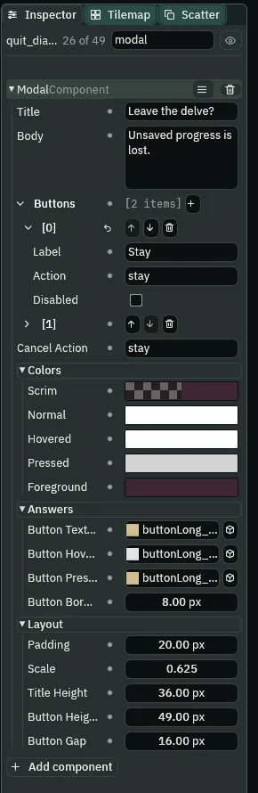
Leave the delve?, Body toUnsaved progress is lost.and Cancel Action tostay. - Under Buttons, set the first answer’s Label to
Stayand its Action tostay, and the second’s Label toLeaveand its Action toleave. - Under Colors, set Scrim to
63,38,49, alpha115. The other four colours are written by Apply theme. - Under Answers, set Button Texture to
buttonLong_beige.png, Button Hovered Texture tobuttonLong_grey.png, Button Pressed Texture tobuttonLong_beige_pressed.pngand Button Border to8. - Under Layout, set Padding to
20, Scale to0.625, Title Height to36, Button Height to49and Button Gap to16. - Select
pauseand press Apply theme, at the foot of its Theme. It writes the gold into the name and the ring, the plain panel colour into the frame, the dialog’s frame and the two buttons, and the plum Button Text into their words and the dialog’s.
- Title
- A Modal’s Title: the heading, drawn in a band of its own at the top of the dialog. Empty, no band is reserved. Here it is
Leave the delve?. - Body
- A Modal’s Body: the question, below the title. Empty, no room is left for it. Here it is
Unsaved progress is lost.. - Buttons
- A Modal’s Buttons: the answers, left to right, from one to three. A new Modal has two, Cancel and OK. They are a list of rows, not nodes, so the ring stops on the dialog and the left and right arrows move between its answers. Press the + to add an answer, and a row’s bin button to remove one.
- Label
- An answer’s Label: the word on its button,
StayandLeave. A row also has Disabled, which turns an answer off: chapter 16 uses it, and here it stays unticked. - Action
- An answer’s Action: the action it fires when it is pressed,
stayandleave, which a script hears withpressed. The dialog does not close itself: it stays up until a script hides it, as the script below does. - Cancel Action
- The action Esc fires on a Modal, whether or not an answer carries it, so a dialog with one answer can still be backed out of.
stay, the first answer’s own: Esc stays. - Scrim
- The colour painted over everything behind a Modal. A dark plum at
115of255, a little under half strength, dims the room and the menu without hiding them. Alpha0draws none. Apply theme leaves it alone: how far the game dims is the author’s. - Normal, Hovered, Pressed
- A Modal’s tints for an answer at rest, under the pointer or the ring, and held down, as a Button’s are. Apply theme writes them: white, white and
211,211,211, since the pictures carry the look and the tint only darkens one that is held. - Foreground
- The colour of the title, the question and every answer’s label: the plum Button Text,
63,38,49, which Apply theme writes. - Button Texture, Button Hovered Texture, Button Pressed Texture
- The pictures every answer wears, at rest, under the pointer or the ring, and held down: the same three as the menu’s buttons,
buttonLong_beige.png,buttonLong_grey.pngandbuttonLong_beige_pressed.png. Empty, the answers are flat boxes. - Button Border
- The nine-slice border of the answers’ pictures, in the pictures’ pixels, so their corners keep their size however wide an answer is:
8, as the Panel on a button has it. - Padding
- A Modal’s Padding: the inset of its contents from the dialog’s edge, in UI units:
20. - Scale
- A Modal’s Scale: the size of the title’s, the question’s and the answers’ words, a share of the face’s
32pixels:0.625is20. - Title Height
- The height of the band kept for the title, in UI units:
36. Ignored when the title is empty. - Button Height
- The height of the row of answers, in UI units:
49, as tall as the buttons of the menu. - Button Gap
- The gap between two answers, in UI units:
16.
Next, the script.
- In Assets, press Create, choose New script, type
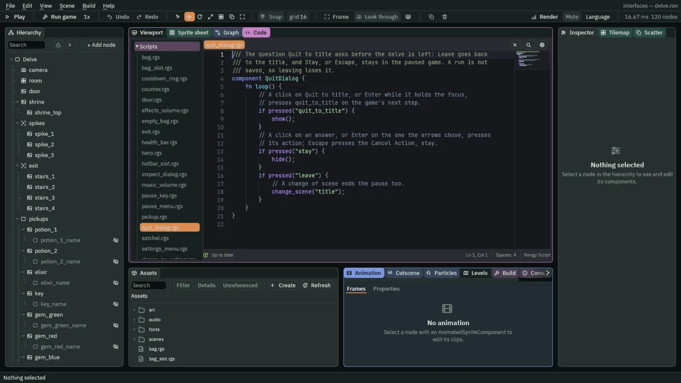
quit_dialog, and press Enter. In the Code tab, replace everything inquit_dialog.rgswith the script below, and press Ctrl+S.
/// The question Quit to title asks before the delve is left: Leave goes back
/// to the title, and Stay, or Escape, stays in the paused game. A run is not
/// saved, so leaving loses it.
component QuitDialog {
    fn loop() {
        // A click on Quit to title, or Enter while it holds the focus,
        // presses quit_to_title on the game's next step.
        if pressed("quit_to_title") {
            show();
        }
        // A click on an answer, or Enter on the one the arrows chose, presses
        // its action; Escape presses the Cancel Action, stay.
        if pressed("stay") {
            hide();
        }
        if pressed("leave") {
            // A change of scene ends the pause too.
            change_scene("title");
        }
    }
}
- Select
quit_dialog, click Add component and choose QuitDialog.
pressed("quit_to_title") is true for one step: the first after the Quit to title button is clicked, or Enter presses it while it holds the focus. The script shows the dialog on that step. pressed("stay") and pressed("leave") are true for the first step after an answer is clicked, or Enter presses the one the arrows chose, and stay is true after Esc too, since it is the Cancel Action. Stay hides the dialog, and the menu is still there under it. Leave changes the scene to the title, and a change of scene ends the pause too.
A menu for each slot
A click on a slot of the bag should offer what to do with what is in it: use it, throw it away, or look at it. A Popup Menu is a list of commands that opens where you click, and each slot of the bag gets one. A Popup Menu draws only while it is open. Open, it answers keys as well: a row’s Shortcut chooses it, and Enter chooses the lit row.
- Select
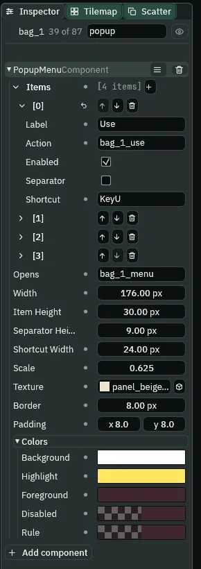
bag_1, click Add component and choose PopupMenuComponent. - Under Items, the list starts with one row,
Item. Press the + beside Items three times, so that there are four rows, and open each in turn. Set the first row’s Label toUse, its Action tobag_1_useand its Shortcut toKeyU. Set the second’s Label toDrop, Action tobag_1_dropand Shortcut toKeyT. - Set the third row’s Label and Action to nothing, untick its Enabled and tick its Separator: it is a divider. Set the fourth’s Label to
Inspect, Action tobag_1_inspectand Shortcut toKeyI. Every row but the divider is enabled, as a new row comes. - Set Opens to
bag_1_menu, Width to176, Item Height to30, Shortcut Width to24and Scale to0.625. Separator Height stays9. - Set Texture to
panel_beigeLight.png, Border to8and Padding to8,8. The colours are written by Apply theme.
- Items
- A Popup Menu’s Items: its rows, from the top, a list, each with the five fields below. Press the + to add a row, and a row’s arrows to move it.
- Label
- A row’s Label: the word it reads. A divider ignores it.
- Action
- A row’s Action: the action it fires when it is chosen, by a click or by its key, which a script hears with
pressed. The number of the slot is in it,bag_1_use, so every slot’s menu fires actions of its own. - Enabled
- Whether a row can be chosen. A row that is not enabled is drawn in the Disabled colour and takes no click and no key. A script can switch it as the game runs, as the slot’s script does for Use: a key cannot be used.
- Separator
- Whether a row is a divider between two groups instead of a command: a thin line in the Rule colour in a row of its own height. It takes no click, and its label and action are ignored.
- Shortcut
- A row’s Shortcut: the key that chooses it while the menu is open, named as the input map names keys,
KeyUfor U, or with a modifier,Ctrl+KeyS. The row draws it at its right edge as its label,U. - Opens
- A Popup Menu’s Opens: the action whose click opens the menu, at the pointer, with its top left corner there. The slot’s own Button fires
bag_1_menu, which chapter 7 gave it, so a click on the slot is what opens its menu. Empty, nothing opens it. - Width
- How wide the menu opens, in UI units:
176. - Item Height
- The height of a command row, in UI units:
30. A divider has its own, Separator Height, which chapter 16 sets. - Shortcut Width
- The room kept at the right of every row for its key, in UI units:
24. - Scale
- A Popup Menu’s Scale: the size of a row’s label and its key, a share of the face’s
32pixels:0.625is20. - Texture
- A Popup Menu’s Texture: the picture the menu is drawn on,
panel_beigeLight.png. Only the lit row is filled on it. Empty, the menu is a flat fill of its Background. - Border
- A Popup Menu’s Border: the picture’s nine-slice border, in its pixels, so the corners keep their size as the menu grows:
8. - Padding
- A Popup Menu’s Padding: how far the rows sit inside the menu’s edge, across and down, and the words inside their row:
8and8. - Background
- The menu’s colour, or the tint on its picture. White draws the picture as it is. Apply theme writes it from the palette’s Panel, opaque, since a menu opens over the game.
- Highlight
- The colour behind the row under the pointer or the ring: a warm yellow,
254,231,97, the palette’s Panel Accent, which Apply theme writes. - Foreground
- The colour of a row’s label: the plum Button Text,
63,38,49. - Disabled
- A Popup Menu’s Disabled: the colour of a label that cannot be chosen, the plum at half strength, alpha
128, as a disabled button’s word is drawn. - Rule
- The colour of the line a divider draws: the same plum at alpha
128.
The other fifteen slots take the same menu, with their own numbers. Copy the values across, then change the numbers.
- Select
bag_1, open the ≡ menu of its PopupMenuComponent and choose Copy values. - Select
bag_2, then Ctrl-clickbag_3tobag_16, click Add component and choose PopupMenuComponent. Open its ≡ menu and choose the paste entry, Paste values: all fifteen now holdbag_1’s menu. - Select each slot in turn,
bag_2tobag_16, and in its Popup Menu change Opens and the three Actions to its own number:bag_2_menu,bag_2_use,bag_2_dropandbag_2_inspect, and so on.
What each slot does
- In Assets, press Create, choose New script, type
bag_slot, and press Enter. In the Code tab, replace everything inbag_slot.rgswith the script below, and press Ctrl+S.
/// A slot of the bag, and the menu a click on it opens: Use drinks a potion or
/// the elixir as a hotbar slot does, Drop throws the item away, and Inspect
/// says what it is. A key cannot be used, and a click on an empty slot opens
/// no menu.
component BagSlot {
    /// The slot it is, which is kept by that name: bag_1 to bag_16. A click
    /// on it presses this name with _menu after it, which opens its menu, and
    /// the menu's rows press it with _use, _drop or _inspect after it.
    slot: String = "bag_1",
    /// The health a potion gives back.
    heal: f32 = 3.0,
    /// The most health the hero can have.
    max_health: f32 = 10.0,
    /// How long the elixir hastens the hero for.
    #[suffix("s")]
    haste: f32 = 5.0,

    fn loop() {
        // The satchel and the slots keep what each slot holds: 1 a potion, 2
        // the elixir, 3 a key, 0 nothing.
        let item = kept_number(slot, 0.0);
        // The menu opens on a click that presses the action its Opens names.
        // An empty slot has nothing to offer, so its menu names no action and
        // the click opens nothing; one holding an item names the slot's.
        if item == 0.0 {
            set_text("PopupMenuComponent", "opens", "");
        } else {
            set_text("PopupMenuComponent", "opens", slot + "_menu");
        }
        // The menu's rows, from the top: Use, Drop, the rule, Inspect. Only
        // a potion or the elixir can be used. A slot that empties while its
        // menu is open has nothing left to drop or inspect.
        set_flag("PopupMenuComponent", "items.0.enabled", item == 1.0 || item == 2.0);
        set_flag("PopupMenuComponent", "items.1.enabled", item != 0.0);
        set_flag("PopupMenuComponent", "items.3.enabled", item != 0.0);

        // A click on a row, or its key while the menu is open, presses its
        // action on the game's next step. Each empties the slot on the step
        // the count goes down, so the satchel finds the two agreeing.
        if pressed(slot + "_use") {
            let health = kept_number("health", 0.0);
            if item == 1.0 && health < max_health {
                add_number("health", min(heal, max_health - health));
                add_number("potions", -1.0);
                keep_number(slot, 0.0);
            } else if item == 2.0 {
                keep_number("haste", haste);
                add_number("elixirs", -1.0);
                keep_number(slot, 0.0);
            }
        }
        if pressed(slot + "_drop") {
            // The count goes down only while there is one to take: the door
            // spends a key from the count, and the satchel takes it out of
            // its slot a step later, so for one step a slot can hold a key the
            // hero no longer owns.
            if item == 1.0 && kept_number("potions", 0.0) >= 1.0 {
                add_number("potions", -1.0);
            } else if item == 2.0 && kept_number("elixirs", 0.0) >= 1.0 {
                add_number("elixirs", -1.0);
            } else if item == 3.0 && kept_number("keys", 0.0) >= 1.0 {
                add_number("keys", -1.0);
            }
            keep_number(slot, 0.0);
        }
        if pressed(slot + "_inspect") {
            // The bag's Inspect dialog shows whatever is kept under inspect.
            keep_number("inspect", item);
        }
    }
}
- Select all sixteen bag slots, click Add component and choose BagSlot. Then select each slot in turn and set its Slot to its own name,
bag_1tobag_16. Heal, Max Health and Haste stay at the script’s3,10and5.
The script writes the menu as the game runs. A slot with nothing in it writes an empty Opens, so a click on it opens nothing. One with an item names bag_1_menu. Use is enabled for a potion or the elixir only, and Drop and Inspect for anything. A click on a row, or its key while the menu is open, presses its action on the game’s next step: pressed("bag_1_use") is true for that one step.
Use drinks the potion as the hotbar’s slot does, or takes the elixir, and empties the slot. Drop throws the item away and takes it from the counts, so a key dropped is a key the counter no longer shows. Inspect keeps the item’s number under inspect, which the dialog below reads.
Two dialogs for the bag
- Select
hud, click + Add node and choose Modal. Rename itinspect_dialog, and untick Visible. In its Rect, set Offset Min to-300,-100and Offset Max to300,100. In its Panel, set Texture topanel_beige.pngand Border to8. - Select
quit_dialog, open the ≡ menu of its ModalComponent and choose Copy values. Selectinspect_dialog, open the ≡ menu of its ModalComponent and paste them. Its colours, pictures and sizes are the quit question’s. - In its Modal, set Title to
Potionand Body toPotion: restores 3 health.. Remove the second answer with its bin button, and set the first answer’s Label toOKand its Action toinspect_ok. Set Cancel Action toinspect_ok. - Select
hudagain and add a second Modal,empty_dialog, hidden, with the same Rect, Panel and pasted values. Set its Title toEmpty the bag?and its Body toEverything in it is lost.. Set the first answer’s Label toKeepand its Action tokeep_bag, the second’s Label toEmptyand its Action toempty_bag, and Cancel Action tokeep_bag.
The Inspect dialog’s title and words are only what the item will overwrite: the script writes them from the item the slot held. Next, the two scripts.
- In Assets, press Create, choose New script, type
inspect_dialog, and press Enter. In the Code tab, replace everything ininspect_dialog.rgswith the script below, and press Ctrl+S.
/// The dialog a bag slot's Inspect opens: it names the item kept under
/// inspect and says what it does, and OK, or Escape, shuts it.
component InspectDialog {
    fn loop() {
        // A slot's Inspect keeps its item under inspect: 1 a potion, 2 the
        // elixir, 3 a key, and 0 once the dialog is shut.
        let item = kept_number("inspect", 0.0);
        // A click on OK, Enter, or Escape through the Cancel Action presses
        // inspect_ok on the game's next step.
        if pressed("inspect_ok") {
            keep_number("inspect", 0.0);
            hide();
        } else if item > 0.0 {
            // The item's name over what its tooltip says.
            if item == 1.0 {
                set_text("ModalComponent", "title", "Potion");
                set_text("ModalComponent", "body", "Potion: restores 3 health.");
            } else if item == 2.0 {
                set_text("ModalComponent", "title", "Elixir");
                set_text("ModalComponent", "body", "Elixir: you walk faster for 5 seconds.");
            } else {
                set_text("ModalComponent", "title", "Key");
                set_text("ModalComponent", "body", "Key: opens the locked door.");
            }
            show();
        }
    }
}
- Select
inspect_dialog, click Add component and choose InspectDialog. - In Assets, press Create, choose New script, type
empty_bag, and press Enter. In the Code tab, replace everything inempty_bag.rgswith the script below, and press Ctrl+S.
/// The question the bag's Drop button asks: Empty throws away everything in
/// the bag's sixteen slots, and Keep, or Escape, keeps it. The hotbar is not
/// the bag, and keeps what it holds.
component EmptyBag {
    fn loop() {
        // A click on Drop presses drop on the game's next step.
        if pressed("drop") {
            show();
        }
        // A click on an answer, or Enter on the one the arrows chose, presses
        // its action; Escape presses the Cancel Action, keep_bag.
        if pressed("keep_bag") {
            hide();
        }
        if pressed("empty_bag") {
            // Every slot of the bag emptied, and what was in them taken from
            // the counts on the same step, so the satchel finds the two
            // agreeing.
            let potions = 0.0;
            let elixirs = 0.0;
            let keys = 0.0;
            for i in 1..17 {
                let slot = "bag_" + text(i);
                let item = kept_number(slot, 0.0);
                if item == 1.0 {
                    potions += 1.0;
                } else if item == 2.0 {
                    elixirs += 1.0;
                } else if item == 3.0 {
                    keys += 1.0;
                }
                keep_number(slot, 0.0);
            }
            // Never more than the counts hold: a key the door spent stays in
            // its slot for a step, until the satchel takes it out.
            add_number("potions", -min(potions, kept_number("potions", 0.0)));
            add_number("elixirs", -min(elixirs, kept_number("elixirs", 0.0)));
            add_number("keys", -min(keys, kept_number("keys", 0.0)));
            hide();
        }
    }
}
- Select
empty_dialog, click Add component and choose EmptyBag.
pressed("inspect_ok") is true for one step: the first after OK is clicked, or Enter presses it, or Esc does, the Cancel Action. The script reads the item kept under inspect and writes its words into the dialog every step, then shows it. pressed("drop") is the bag’s Drop button of chapter 4, pressed by a click let go on it, true for one step, the first after. The two answers press keep_bag and empty_bag the same way, and keep_bag also on Esc. Empty empties all sixteen slots and takes what they held from the counts.
- Select
key_hintsand set its Text’s Text toWASD or arrows walk / B bag / 1-4 use / Esc pause. - Open
title_menu.rgs. A new game must not open a stale Inspect dialog, so it forgets what was being inspected. The lines below are as they now read, from the comment above the two loops to the end of the run: the comment is one line longer, and the last line is new. Make them so, and press Ctrl+S.
            // And every slot of the hotbar and the bag empty, no haste, and
            // nothing being inspected.
            for i in 1..5 {
                keep_number("hotbar_" + text(i), 0.0);
            }
            for i in 1..17 {
                keep_number("bag_" + text(i), 0.0);
            }
            keep_number("haste", 0.0);
            keep_number("inspect", 0.0);
- Select
hudand press Apply theme, at the foot of its Theme. It writes the colours of the two dialogs and of every slot’s menu from the palette.
Now try it. Walk onto the key, press B to open the bag, and click the key’s slot. Its menu opens at the pointer.
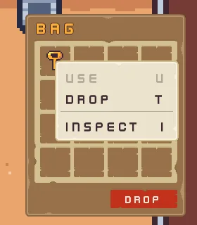
Use is greyed, since a key cannot be used. Choose Inspect with a click, or press I: the key’s dialog opens, and OK, Enter or Esc closes it. The bag’s own Drop button asks before it empties the bag.
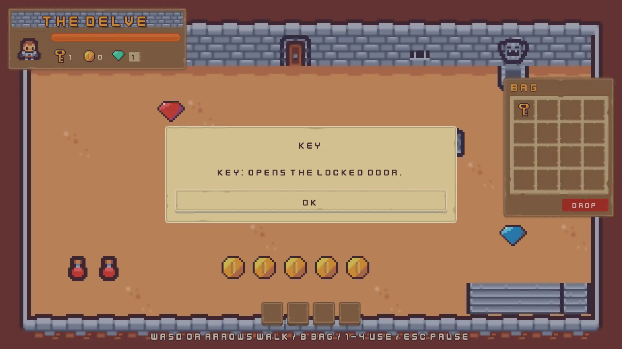
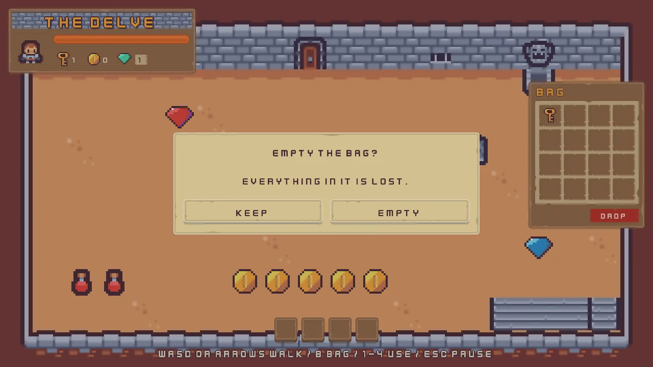
The pause menu, the question and the bag’s menus
The pause menu
| Node | Component | Field | Value |
|---|---|---|---|
hud | Theme | Button Text | 63, 38, 49, alpha 255 |
| Focus Ring | Color | 254, 174, 52, alpha 255, written by Apply theme | |
key_hints | Text | Text | WASD or arrows walk / B bag / 1-4 use / Esc pause |
pause | Node | Process Mode | WhenPaused |
| Canvas | Scale Mode | ShrinkToFit | |
| Theme | Panel | 255, 255, 255, alpha 255 | |
| Panel Accent | 254, 231, 97, alpha 255 | ||
| Panel Danger | 232, 69, 55, alpha 255 | ||
| Text | 236, 227, 206, alpha 255 | ||
| Text Accent | 254, 174, 52, alpha 255 | ||
| Text Danger | 255, 228, 220, alpha 255 | ||
| Button | 255, 255, 255, alpha 255 | ||
| Button Text | 63, 38, 49, alpha 255 | ||
| Hover Lift | 0.15 | ||
| Press Sink | 0.35 | ||
| Focus Ring | Color | 254, 174, 52, alpha 255, written by Apply theme | |
| TextSize | Small | 1536, 864 | |
| Normal | 1280, 720 | ||
| Large | 1066, 600 | ||
pause_menu | Node | Visible | unticked |
| Canvas Group | Alpha | 0 | |
| Blocks Input | ticked | ||
| Audio Source | Positional | unticked | |
| Triggers | two: Name click, Clip click_001.ogg; Name back, Clip back_001.ogg. Each Mode Shuffle, Pitch and Volume 1 to 1 | ||
| PauseMenu | Fade | 0.25 | |
pause_dim | Panel | Color | 63, 38, 49, alpha 191 |
| Theme Role | Role | Custom | |
pause_name | Rect | Anchor Min | 0.5, 0.5 |
| Anchor Max | 0.5, 0.5 | ||
| Offset Min | -360, -141 | ||
| Offset Max | 360, -61 | ||
| Pivot | 0.5, 1 | ||
| Text | Text | Paused | |
| Scale | 1.5 | ||
| Color | 254, 174, 52, alpha 255, written by Apply theme | ||
| Align | Center | ||
| Outline | 63, 38, 49, alpha 255 | ||
| Outline Width | 2 | ||
| Shadow | 0, 0, 0, alpha 153 | ||
| Shadow Offset | 3, 3 | ||
| Shadow Softness | 0 | ||
| Theme Role | Role | Accent | |
pause_frame | Rect | Anchor Min | 0.5, 0.5 |
| Anchor Max | 0.5, 0.5 | ||
| Offset Min | -150, -45 | ||
| Offset Max | 150, 105 | ||
| Panel | Color | 255, 255, 255, alpha 255, written by Apply theme | |
| Texture | panel_brown.png | ||
| Border | 8 | ||
pause_buttons | Stack | Fit | Fixed |
| Spacing | 12 | ||
| Padding | 20 | ||
| Item | 49 | ||
| Align | Center | ||
resume | Panel | Color | 255, 255, 255, alpha 255, written by Apply theme |
| Texture | buttonLong_beige.png | ||
| Border | 8 | ||
| Text | Text | Resume | |
| Scale | 0.75 | ||
| Color | 63, 38, 49, alpha 255, written by Apply theme | ||
| Align | Center | ||
| Button | Action | resume | |
| Normal | 255, 255, 255, alpha 255, written by Apply theme | ||
| Hovered | 255, 255, 255, alpha 255, written by Apply theme | ||
| Pressed | 211, 211, 211, alpha 255, written by Apply theme | ||
| Hovered Texture | buttonLong_grey.png | ||
| Pressed Texture | buttonLong_beige_pressed.png | ||
| Disabled Texture | buttonLong_blue.png | ||
| Shortcut | Action | ui_cancel | |
| Focus | Up | quit_to_title | |
| Down | quit_to_title | ||
| Next | quit_to_title | ||
| Previous | quit_to_title | ||
quit_to_title | Panel | Color | 255, 255, 255, alpha 255, written by Apply theme |
| Texture | buttonLong_beige.png | ||
| Border | 8 | ||
| Text | Text | Quit to title | |
| Scale | 0.75 | ||
| Color | 63, 38, 49, alpha 255, written by Apply theme | ||
| Align | Center | ||
| Button | Action | quit_to_title | |
| Normal | 255, 255, 255, alpha 255, written by Apply theme | ||
| Hovered | 255, 255, 255, alpha 255, written by Apply theme | ||
| Pressed | 211, 211, 211, alpha 255, written by Apply theme | ||
| Hovered Texture | buttonLong_grey.png | ||
| Pressed Texture | buttonLong_beige_pressed.png | ||
| Disabled Texture | buttonLong_blue.png | ||
| Focus | Up | resume | |
| Down | resume | ||
| Next | resume | ||
| Previous | resume |
The quit question
| Component | Field | Value |
|---|---|---|
| Node | Visible | unticked |
| Rect | Anchor Min | 0.5, 0.5 |
| Anchor Max | 0.5, 0.5 | |
| Offset Min | -300, -53 | |
| Offset Max | 300, 147 | |
| Panel | Color | 255, 255, 255, alpha 255, written by Apply theme |
| Texture | panel_beige.png | |
| Border | 8 | |
| Modal | Title | Leave the delve? |
| Body | Unsaved progress is lost. | |
| Buttons | Label Stay, Action stay; and Label Leave, Action leave | |
| Cancel Action | stay | |
| Scrim | 63, 38, 49, alpha 115 | |
| Normal | 255, 255, 255, alpha 255, written by Apply theme | |
| Hovered | 255, 255, 255, alpha 255, written by Apply theme | |
| Pressed | 211, 211, 211, alpha 255, written by Apply theme | |
| Foreground | 63, 38, 49, alpha 255, written by Apply theme | |
| Button Texture | buttonLong_beige.png | |
| Button Hovered Texture | buttonLong_grey.png | |
| Button Pressed Texture | buttonLong_beige_pressed.png | |
| Button Border | 8 | |
| Padding | 20 | |
| Scale | 0.625 | |
| Title Height | 36 | |
| Button Height | 49 | |
| Button Gap | 16 |
The bag’s menus
| Component | Field | Value |
|---|---|---|
| Popup Menu | Items | four rows: Use, Action bag_1_use, Shortcut KeyU; Drop, Action bag_1_drop, Shortcut KeyT; a divider, Enabled unticked and Separator ticked; Inspect, Action bag_1_inspect, Shortcut KeyI. Each slot’s own number in its actions |
| Opens | bag_1_menu to bag_16_menu | |
| Width | 176 | |
| Item Height | 30 | |
| Shortcut Width | 24 | |
| Scale | 0.625 | |
| Texture | panel_beigeLight.png | |
| Border | 8 | |
| Padding | 8, 8 | |
| Background | 255, 255, 255, alpha 255, written by Apply theme | |
| Highlight | 254, 231, 97, alpha 255, written by Apply theme | |
| Foreground | 63, 38, 49, alpha 255, written by Apply theme | |
| Disabled | 63, 38, 49, alpha 128, written by Apply theme | |
| Rule | 63, 38, 49, alpha 128, written by Apply theme | |
| BagSlot | Slot | bag_1 to bag_16 |
| Heal | 3 | |
| Max Health | 10 | |
| Haste | 5 |
The bag’s two dialogs
| Node | Component | Field | Value |
|---|---|---|---|
inspect_dialog | Node | Visible | unticked |
| Rect | Anchor Min | 0.5, 0.5 | |
| Anchor Max | 0.5, 0.5 | ||
| Offset Min | -300, -100 | ||
| Offset Max | 300, 100 | ||
| Panel | Color | 255, 255, 255, alpha 255, written by Apply theme | |
| Texture | panel_beige.png | ||
| Border | 8 | ||
| Modal | Title | Potion | |
| Body | Potion: restores 3 health. | ||
| Buttons | one answer: Label OK, Action inspect_ok | ||
| Cancel Action | inspect_ok | ||
| Scrim | 63, 38, 49, alpha 115 | ||
| Normal | 255, 255, 255, alpha 255, written by Apply theme | ||
| Hovered | 255, 255, 255, alpha 255, written by Apply theme | ||
| Pressed | 211, 211, 211, alpha 255, written by Apply theme | ||
| Foreground | 63, 38, 49, alpha 255, written by Apply theme | ||
| Button Texture | buttonLong_beige.png | ||
| Button Hovered Texture | buttonLong_grey.png | ||
| Button Pressed Texture | buttonLong_beige_pressed.png | ||
| Button Border | 8 | ||
| Padding | 20 | ||
| Scale | 0.625 | ||
| Title Height | 36 | ||
| Button Height | 49 | ||
| Button Gap | 16 | ||
empty_dialog | Node | Visible | unticked |
| Rect | Anchor Min | 0.5, 0.5 | |
| Anchor Max | 0.5, 0.5 | ||
| Offset Min | -300, -100 | ||
| Offset Max | 300, 100 | ||
| Panel | Color | 255, 255, 255, alpha 255, written by Apply theme | |
| Texture | panel_beige.png | ||
| Border | 8 | ||
| Modal | Title | Empty the bag? | |
| Body | Everything in it is lost. | ||
| Buttons | Label Keep, Action keep_bag; and Label Empty, Action empty_bag | ||
| Cancel Action | keep_bag | ||
| Scrim | 63, 38, 49, alpha 115 | ||
| Normal | 255, 255, 255, alpha 255, written by Apply theme | ||
| Hovered | 255, 255, 255, alpha 255, written by Apply theme | ||
| Pressed | 211, 211, 211, alpha 255, written by Apply theme | ||
| Foreground | 63, 38, 49, alpha 255, written by Apply theme | ||
| Button Texture | buttonLong_beige.png | ||
| Button Hovered Texture | buttonLong_grey.png | ||
| Button Pressed Texture | buttonLong_beige_pressed.png | ||
| Button Border | 8 | ||
| Padding | 20 | ||
| Scale | 0.625 | ||
| Title Height | 36 | ||
| Button Height | 49 | ||
| Button Gap | 16 |
Every other field of every node is as it comes.